Where we stop, nobody knows! This week’s Friday Focus showcases designs that spin around. First it was the fascination with rounded corners, and circles, and now it’s rotating objects that’s all the rage these days.
Designs of the Week

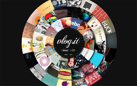
Every video is displayed in one of the three concentric wheels turning in opposite directions against one another. Clicking on the image loads a lightbox, one of two black-and-white transition animations, and plays the video. You can pick from either Vimeo or YouTube, as these are the designer’s liked/favorited ones on each site. This concept is quite the feat and a bit intensive of some computers, but that’s how experimental websites roll (pun intended). I guess my only comment would be that when you’re not doing anything on the site, i.e. the static state, it’s not animated, and you miss the movement between the welcoming animation and the ones that appear when you do clicks.

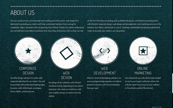
Not visible here but: the logo sports a stylized teardrop/lowercase ‘a’ shape pointing to the lower left, and this form is echoed in the navigation at its right, every link corner except the bottom left is rounded. Aside from the large images in the portfolio section which resize with the layout accordingly, there’s this secion which contains large circular icons that turn when you hover on them.

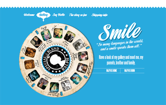
Lots of strong imagery in this one-pager; for a baby announcement site it’s very mature with lots of browns and rough textures and its overall imported coffee theme, mixed with this carousel and a rocketship a couple of screenfuls below. Another thing I noticed here is that the anchor links use period (.) instead of the usual hashes (#), which is quite surprising.

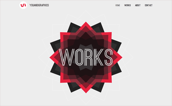
There’s another animation going on in this site and it’s one of a pointing hand pressing a button behind an array of stripes. There are only two images laid on top of the other (the stripes and the hand graphic) but a simple horizontal movement creates the optical illusion of something more. Now, these section headings have several more layers of shapes piled on, rotating in different directions and speeds when you scroll past. All fun ideas and the only concern I have is semantics in the markup.
Pagelines lets you build WordPress websites and it’s as easy as drag and drop, go check it out!
Social Media Weekly
CSS, JavaScript – Making Love To WebKit
“This idea started with an accidental discovery: if you put a CSS perspective on a scrollable <DIV>, then 3D elements inside that <DIV> will retain their perspective while you scroll. This results in smooth, native parallax effects, and makes objects jump out of the page, particularly when using an analog input device with inertial scrolling.”
CSS – CSS1K
“A demonstration of what can be accomplished with only 1 K (Kibibyte) of CSS.”
User Experience – Five skills you need to make AB testing work
“Multivariate and split testing can be crucial for sales conversions but how do you get the most out of it?”
Build on DIYThemes’ Thesis Framework for rock solid SEO and great layout customization options.
