This week’s Friday Focus feature sites that don’t only looks great, but tell you how to build great-looking websites as well!
Designs of the Week
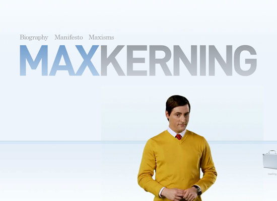
Barring the fact that it’s done entirely in Flash, this is such a beautiful and hilarious site. Very clean and light—in more ways than one.
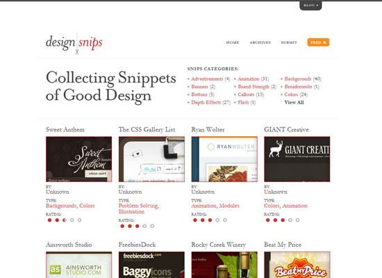
Even if there’s a lot of information on this site, it does not feel heavy or overwhelming at all. The number of thumbnails aren’t too many, and the width of the layout isn’t too wide. The use of serifs makes this inspiration gallery more elegant than the rest.
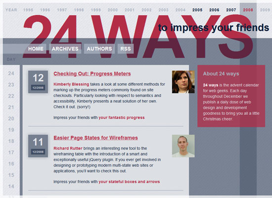
Love it or hate it, this site has an innovative look this year (you probably need a browser that supports opacity). And hooray for the boxy look!
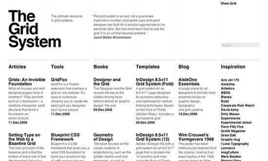
Do all grid-focused sites have to be in black and white? Does it matter? Very little use of anything other than text. And laying that out is either a joy or a pain, depending on your expertise.
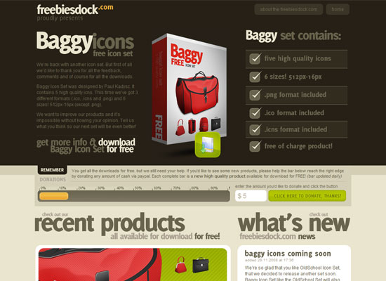
Now here’s a site that depends a fair amount on imagery, including image-replaced text. The headings are well-pronounced, and the use of green and orange brighten up the otherwise monochromatic brown.
Social Media Weekly
Design – 10 Common Typography Mistakes
If typography is the backbone of good design, then this is an invaluable article.
Programming – Extending CSS Spriting
New CSS sprite technique that does away with background images and improve accessibility.
