• Home
  • About
  • Contact
  • Advertise

Devlounge

Design, Develop, and Grow

ateşli sevgilisi fantezisini yaşamak istediğini söyler porno ona arkadaşları varken onunla gizli saklı seks yapmak istediğini sikiş söyleyen kız hafta sonu için gelen arkadaşının görmediği bir sikiş açıdan sakso çekmeye başlayınca adamın yarağını bu altyazılı porno şekilde indiremez ve açık şekilde salonda sikişimeye sex izle başladıklarında misafir kızı da bu sekslerine rokettube konuk ederler seks yapacağını düşünmeyerek onun sex izle oyun oynadığını zanneder sabah olur ve herkes uyanır hd porno bu sırada yanında şişme mankenini de getiren sapık erotik hikayeler genç sınav haftası ders çalışan genç adam üvey annesinin sikiş eve gelmesiyle hayatının şokunu yaşar

  • Home
  • Code
  • Design
  • Design Focus
  • Interviews
  • Publishing
  • Strategy
  • Webapps
  • Extras

Design Focus: Stories To Tell

May 10, 2014 By Sophia Lucero

Some of the best-designed websites have brilliantly crafted illustrations, animations, and copy that come together to create a new world which you can explore and journey through. Let’s the turn the page and journey through these online stories.

Designs of the Week

Ready to go out and design your next website? Try building with the Catalyst Framework.

Fountain of Youth Coconut Water

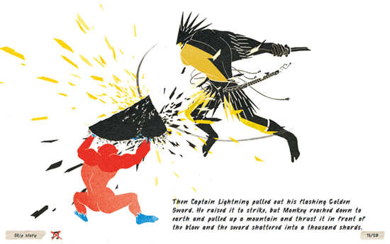
I enjoy the graphic style and interactions employed in this storybook, reminiscent of exotic and ancient texts, with a 3D and a humorous twist.

The Future of Travel

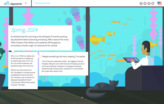
This is a bit of the “flat” aesthetic here with the bright colors and subtle shading. The text boxes have arrows pointing in the order that you’re supposed to read them.

Seize Your Power
Seize Your Power

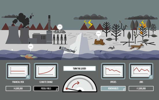
Another site by the WWF on important environmental issues that’s interactive in more ways than one as it lets you control the scene to symbolically take action.

A Search For Better Information Management

Has the same spirit of Ben the Bodyguard in a couple of ways: the bird’s eye view perspective and the comic book touches with particular dialogue panels in between scenery changes.

Social Media Weekly

Search Optimized, Turn-Key Designs, Unlimited Everything. Start building with the Genesis Framework today.

Responsive Web Design – Web Fundamentals
“Web Fundamentals is a comprehensive resource for multi-device web development.”

Design – Redsgned
“A showcase of the very best redesigns from across the web and design-focused websites, featuring web designs, branding, app designs, UI and GUI, and product design.”

Web Design – Designing design tools
“Designers are building tools to help them explore, prototype and be more creative.”

Design Focus: Horizontal Storytelling

August 3, 2012 By Sophia Lucero

This week’s featured designs use the not-so-common method of horizontal scrolling to tell their stories, each screenful an idea to absorb on your way to getting to know them fully.

Designs of the Week

Create unique, extraordinary websites with Squarespace. No experience necessary!

Small Studio website
Small Studio

I love the illustrations, which fit the whole storybook vibe that most horizontal scrolling sites carry. Especially that wide panorama “painting” inside the frame—you don’t see that sort of thing online! There’s no ‘you are here’ indicator in the fixed top left menu, but it’s kind of a good idea that it fades in and out while in the process of scrolling, like a visual cue that you’re doing something. Even the way the site stops on the far right, with book spines, is pretty brilliant.

Reality LA Ruth Series website
Reality LA Ruth Series

Walking animated character, flying in and moving objects, and subtle parallax effects—all token components of this design genre. I also appreciate that the text in each banner uses true webfonts.

ParaNorman website
ParaNorman

The whole look and feel of the movie touches everything here, even the social media icons on the lower right. The fly-out menu meanwhile slides vertically from the bottom, which isn’t too usual, and it’s one big collection of images, which also makes sense since the site is extremely visual and users will remember the pages better by the scenes they’re about.

Social Media Weekly

Search Optimized, Turn-Key Designs, Unlimited Everything. Start building with the Genesis Framework today.

Responsive Web Design, Email Newsletter Design – Responsive Email Design
“In this guide, we’ll look at why designing for mobile has become a necessary skill for email designers, cover the fundamentals of designing and building a mobile-friendly email and back it all up with some neat tips and techniques.”

SEO, Semantics, Web Standards – On web semantics
“Up until today authors were not always certain about what HTML element to use for what functional unit in their HTML page, though, and “living” specs like HTML 5 require authors to keep an eye on what elements will be there going forward to mark up what otherwise calls for “meaningless” fallback elements like div or span.”

CSS – Creeps and Weirdos in the CSS Spec
“So in this post, I’ll run through a bunch of things from the CSS specifications that you might not have heard of yet. None of this is even close to ready to use (unless it degrades really gracefully), but it will serve to get you familiar with some of the rounded corners and drop shadows of the future.”

Web Standards – A future friendly workflow
“User experience director Luke Brooker explains the thinking behind the Future Friendly initiative and how it can help adjust your workflow.”

Design Focus: Book Figures

May 25, 2012 By Sophia Lucero

This week’s crop of design inspiration all carry a traditional, handcrafted air about them with illustrations used in textbooks, journals, and storybooks.

Designs of the Week

Build on DIYThemes’ Thesis Framework for rock solid SEO and great layout customization options.

Bloom website
Bloom

Most designs prefer the rough, monochrome illustrations to really push that vintage look, but it’s also nice to see bold color in such graphics, and in this case the images straddle both the highly detailed and the outline-only. Each section on the site has a corresponding plant, which are featured as icons in the drop-down menu. The way the plant is placed in the logo is so lovely and elegant, too. One more neat thing about this website: at the very bottom of the page there’s a selection of biscuits you can choose from should you wish to pay their studio a visit!

Marcelo Henrique's website
Marcelo Henrique

Two-column layouts that are split right in the middle are gaining popularity and we continue to see why it works. Nice touch with the traditional initials too.

More Than Twenty website
More Than Twenty

Love the fabric patterns applied everywhere, including the header logo and the form fields.

La Piuma website
La Piuma

Each section fades out as you scroll down, which is an interesting technique to keep focus (I believe the opposite fade in effect is also in vogue right now). It’s also nice that the icons and text have texture. I’m just a little concerned using the illustrations in the works section (the birds) that way is less effective since they sacrifice content for aesthetics.

Social Media Weekly

Need help in promoting your site? INeedHits has been in the search engine marketing since 1996!

Responsive Web Design – Which responsive images solution should you use?
“To choose which technique is right for you and your project these questions may help as a guide. Many of the questions may apply to your project, so you’ll have to sort out which techniques fit what scenarios and find the overlap.”

Typography – Type Study: Pairing typefaces
“Let me rip off the bandaid quickly: there are no clear formulas for pairing typefaces. There are no absolute rights and wrongs. But, this is good news. Without formulas, you can create beautiful surprises so your websites won’t look exactly like the one you have open in your browser three tabs over.”

CSS, JavaScript – How I’m implementing Responsive Web Design
“I don’t pretend to have all the answers. But, clever use of the tools available to us can make it a much easier pill to swallow.”

Friday Focus 12/24/10: Scroll & Peekaboo

December 24, 2010 By Sophia Lucero

Merry Christmas Devlounge readers! This week’s Friday Focus features designs that tell awesome stories with scrolling and now-you-see-it-now-you-don’t effects.

Designs of the Week

Ben the Bodyguard

I really don’t have much to say about this except that it’s so addictive! The animations and illustrations are fantastic. This is just a “coming soon” website, but I don’t want them to change it when the product officially launches.

Rob Edwards

Predominantly black and white/gray so the colors from the portfolio stand out. Love the carnival theme and its rich ornate typography.

Design Made in Germany 5

A lot of nice things at play here: lovely layering, social media hidden until hovered over, infinite scrolling, translucency, custom type everywhere, and a completely fluid layout. It’s an edgy approach to web-based magazines.

Javascript für Designer Workshop

Simpler than the others but equally impeccable, with abundant amounts of whitespace. The embossed effect of the logos in the footer is a very nice touch.

Just a Few Cards

Besides the excellent mailbox animation, I really like the card previews. It’s interesting how the add to cart buttons have both plus and cart icons in them.

The Open Internet

This site reads like a vertical storybook, with captions changing for each screenful. The “why is this important?” section is also a nice implementation of the ordered list.

Social Media Weekly

Typography – Happy Holidays from TypeKit
Read how they made this website here.

JavaScript – Merry Christmas in 1KB of JS
View more Christmas 2010 demos here.

Content – The Twelve Days of Contentmas
“This is a simple little plan to make sure that your personal site, blog or portfolio is not just looking good at the end of these twelve days, but is also a really useful repository of really useful content.”

Friday Focus 11/14/08: Navigation Techniques

November 14, 2008 By Sophia Lucero

Our featured sites this week all have fresh and brilliant navigation techniques you’ll surely envy. Be sure to click on the links to see them in action. Ready to be inspired with this week’s Friday Focus?

Designs of the Week

Corporate Risk Watch

You might not notice how disciplined it looks at first glance, so look more closely at how everything revolves around the grid. No fancy graphics here, because it’s the variation of lines (light, dark, solid, broken, handwritten) that bring personality and texture to the site.

Contrast

The best designs tell great stories. This site comes to life as though its speaking to you and telling a story. It takes your hand and brings you to different places, and you’ll certainly come back for more.

Brooks & Aguirre Consultores

To tell a good story, “show, don’t tell”. Now apply that concept a website with the help of illustrations or in this case, photographs. I love you can still see them as the text sections expand below, acting as header and background to the whole design.

Social Media Weekly

Design – Design Top 10 – The monthly pick of online design
This site also has excellent navigation, but more importantly, it’s another great resource to keep your eyes on every month.

Design – 7 Usability Mistakes Usability Experts Commit
In commemoration of world usability day (November 13), try to follow the tips from this article to improve the overall experience websites provide.

Code & Tutorials

Which Front-End Development Languages Will Grow in 2017?

Your Guide to Leveraging APIs as a Developer

Bitcoin Processing Website Integration For Web Developers

Website Security For 2016 That All Developers Need To Know

5 Reasons You Need to Be Using jQuery

About Devlounge

Want to read more about Devlounge, or maybe you want to contact us, or even advertise? Oh, and don't forget to subscribe to updates!

The Best of Devlounge

Randa Clay On Breaking Barriers

Search