Error pages control a lot more of our destiny than you may think. If a visitor has the unfortunate coincidence of reaching an error page on your site, chances of them attempting to access the page again are slim to none, especially if they were referred to the page from a direct link. How can you prevent this? Don’t let your error pages, especially 404, go un-noticed.
A lonely 404 leads to a lonely site
Every site is going to face a 404 at some point. No matter how well you manage your links, you can not control how outside sources will link in to your site, and what visitors will attempt to access. Unfortunately, with every time a visitor reaches an error on your site, it makes you look bad, even if the visitor was referred to the page by another person or site who was wrong with their linking.
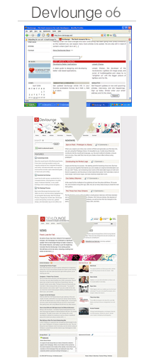
For example, I manage all the Devlounge links as best as possible, but for the month of February 2007 alone, I had 12,279 hits to just 404 pages! Upon further inspection, many of this bad links came from people trying to go directly to pages on Devlounge, like the prebuilt page, simply by going to www.devlounge.net/prebuilt. Luckily for myself, my 404 page contained links back to the homepage, articles, and interview indexes. And that brings up the whole point of custom 404 pages – keeping your traffic.
Don’t let that traffic escape
If you leave your error pages alone, visitors are going to leave by the flock-full every time they run into the dead end that is an error page. The easiest and simplest way of keeping people from hitting that back button or closing the tab is to put together informative and helpful error pages that lead visitors back into the site, and not away from it.
The route you take to do this depends entirely on how you want to go about your error pages. You may want to take a sarcastic approach to error pages, to give visitors something to laugh at while redirecting them back to your homepage. Or you may want to take a more straightforward approach, like we’ve done, in which case you point out all the most important / significant sections of your site.
Some things to keep in mind when creating error pages:
- Users don’t give a shit that they’re on an error page, so simply saying “404” isn’t going to cut it, because at this point they’ve already figured out they’re not on the page they wanted to get to. Lead them back to the site with an automatic redirect after a few sections or a link.
- Just automatic redirects don’t work either. If you are redirecting all your visitors back to your homepage when they access a missing page, good for you. But if you’re not telling them they reached a 404 or some other kind of error, how are they supposed to know why the page just redirected to your homepage? Many visitors would then just go back and try the page again, so make sure some how or another you give them a heads up that they hit an error!
- Keep advertisements out! If your error page is not styled to match your site design, than do not include ads. Visitors already annoyed with a missing page, don’t make it seem like you’re trying to capitalize on their misfortunes now.
And some good things to include in error pages that don’t automatically redirect:
- Archives – If you’re running a blog or any kind of site with a large collection of posts / news, include an archives list for visitors to browse.
- Search box – If you’re in the same situation as above, include a search so visitors can maybe find the page / post they were looking for to begin with.
- Site logo – If you are not styling the error pages to match the site design, be sure to include a logo or something so visitors know they are indeed on the right site.
- Small site description – Let visitors know what’s up. Also helps if search engines grab a wrong url for a few days that may be leading new visitors in for the first time, only to discover that what they were hoping to see isn’t there.
Tying the site and error pages together
When designing error pages, there are really two ways in which you can display them without annoying the visitor. Either (A) incorporate the error pages into the current sites design or (B) use a blank slate (for example, plain white background) with an error message or graphic and required links. Doing something “in between” can just become rather annoying.
Most of us do not need clinics on how to setup custom error pages. It can be done in Cpanel or just by using a few extra lines in the htaccess and creating the pages themselves. There are plenty of tutorials on the subject out there, so I don’t really believe it bears repeating. It’s not that we don’t know how to setup error pages, it’s just that many times the importance of error pages goes un-noticed.
A Quick(er) Error Fix for WP
If your using WP, you can use the Dunstan Error Page plugin to quickly turn your 404 error page into a much more informational and convenient page for visitors when they run into it. The Dunstan Error plugin allows visitors to submit an error report, send feedback, and view the latest 5 posts. This adds news functionality quickly and easily and requires little work to get up and running.
Simple steps for keeping your misplaced visitors
So in the end, it’s up to you whether or not you want to take a few moments to customize your error pages or if you’d rather have host and browser default messages displayed to visitors instead. Believe me when I say this, custom error pages are a lot more beneficial than they may seem, and they can be extremely helpful in keeping visitors on your site.
Now it’s your turn. Have you seen a really informational or fun error page? Leave the link in the comments, and some of them will be attached and featured in this article later in the week.


