I’ll always remember Flickr as the site that capitalized on this color scheme, but it’s great to see sites that express their love for pink and blue to this day. Check out our featured designs this week!
Designs of the Week
Ready to go out and design your next website? Try building with the Catalyst Framework.
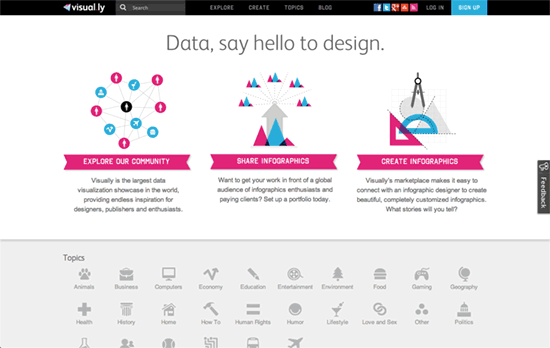
Even the category icons right after the header/blurb are two-toned. Although the ones on the top right of each infographic, it’s not immediately clear what they mean (although digging a little bit shows me it’s a marker for static and interactive graphics).

I like that the left and right “arrows” use fairly large photo thumbnails instead, although retaining arrow shows would have been nice to maintain the visual cues. There’s an cool, differently-arranged slider in the Products page: it scrolls vertically—the product slides down while the text slides up—and a vertical column of stars in the middle serves as navigation. Which fits the whole Hollywood motif of the site.

The odds were pretty high that we’d see these colors on a baby website, right? Everything that could carry them does, and the same applies for the dashed borders and uneven but textured swatches for content boxes.
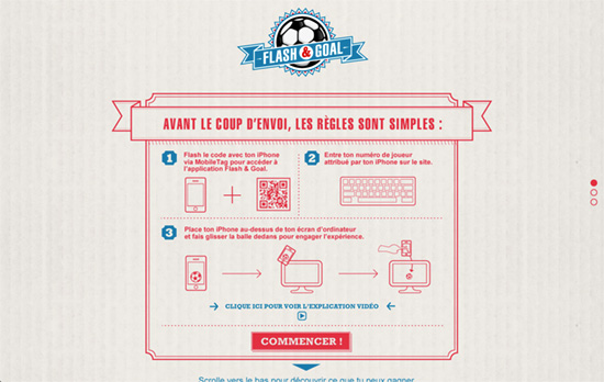
Very bold move to put all the text, borders, and illustrations in this color, but it does make for a striking effect, like that of a stamp on a cardboard box or a blueprint. When you reach a certain point while scrolling, it snaps to the next screen for you. Another cool idea: putting an input box in an object like a t-shirt. It transforms from a plain user interface element to a more user-friendly one.
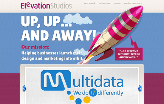
Lots of trendy elements here, from rockets to moving clouds. Not to mention letterpressed text, the execution of which isn’t too subtle. The illustrations and the metaphors they represent are lovely though, e.g. eyedropper icons for sample work.
Social Media Weekly
Pagelines lets you build WordPress websites and it’s as easy as drag and drop, go check it out!
Responsive Web Design – Responsive Design’s Dirty Little Secret
“Responsive Web design, as Ethan Marcotte defines it, is simply a fluid grid, fluid images and media queries. But fluid grids have a dirty little secret: rounding errors.”
Design – A Style Guide
“He asked me to write up a list of “best practices,” if you will, for him to base his visual style work off of. This list is a compilation of my AEA notes, articles and links I’ve saved, experience, and my ideal of what our process may be going forward.”
Web Standards – W3C and WHATWG finalize split on HTML5 spec, forking ‘unlikely’
“Until last year, the WHATWG and W3C had essentially been working together on a single HTML(5) specification, but in January of 2011, Ian Hickson of the WHATWG described a new development model for web standards: the WHATWG would now focus on an evolving, “living standard,” while the W3C would stick to producing static “snapshots” using its traditional numbered versioning system.”
