Welcome to the first Friday Focus for the month of July. This week: strong bursts of color and collapsible content. Curious combination? Read on!
Designs of the Week
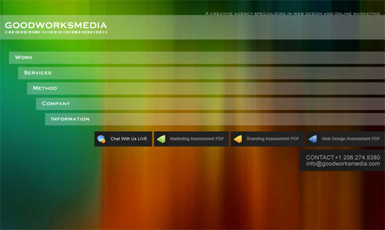
This is probably the “most different” from the rest of the designs here. But it’s a good thing. It’s 100% fluid, makes good use of to show the striking background, and is very colorful.
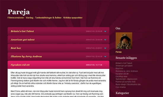
A blog implementation of the collapsible content technique. Simple and effective design that pops.
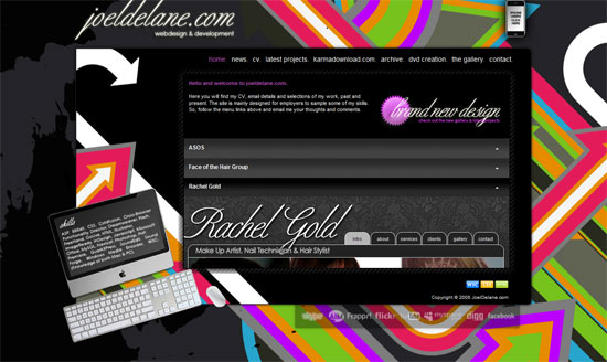
I personally am not a fan of what he did to the background, it’s a little too busy and competes with the portfolio images, but it’s a nice design nonetheless.
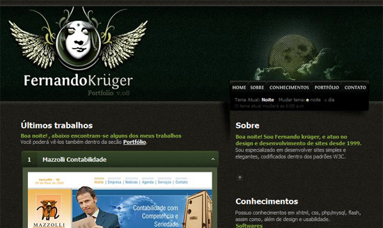
It’s not colorful, but dark, monochromatic color schemes can be as rich as the rainbow too. The collapsing headers distinctly remind me of the legendary portfolio of Marius Roosendaal, but this design is unique in its own right.
Social Media Weekly
Design – 99 Free Canvas, Paper, Paint, and Metal Textures
People say grunge is the new “Web 2.0 look”. Whether or not you agree, it takes a lot more work to put together a nice textured design, but this page can help you out.
Design – Style Switchers Contest Results
Smashing Magazine held a contest that had designers coming up with creative presentations of website style switchers. Tons of inspiration here.
Programming – Improved Flash indexing
Google starts indexing Flash content. It’s what web designers have been waiting for…or is it?
Programming – Top 10 Fatal URL Design Mistakes
If there is one part of a website that you should make sure works properly, it’s the URL. Some SEO advice for ideal URL design.


