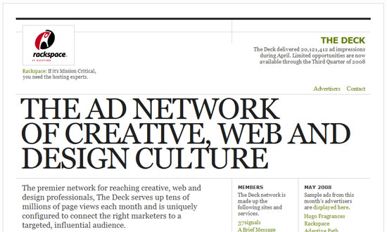
At one point in our internet lives, we learned to avoid typing in all caps, because it meant we were yelling. At another point, we became attachmented to typing in lowercase, because it looked and felt cool. We see a lot of designs going lowercase in many portions of text, but nowadays, going uppercase is is all the rage. These designs seem to pull that off quite well.
Designs of the Week
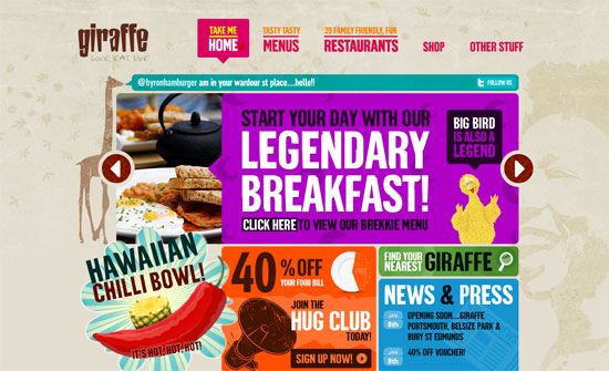
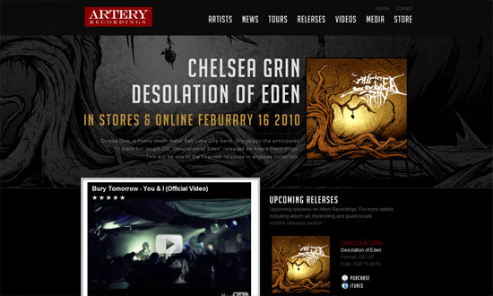
The largest amount of custom web fonts and uppercase text I’ve seen, methinks. But oh my goodness does it work. I can’t stop looking at it!
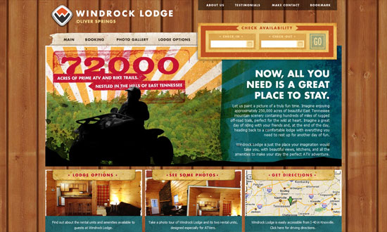
Looks good overall, but I have a problem with the typeface in the body. Why use a different one from the logo?
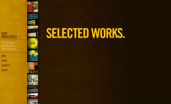
Enjoying the minimal treatment here—just because you’re using a bold fonts you should be all in-your-face with your design. I just wish the About pullout section were styled a little bit more similar to the rest of the site.
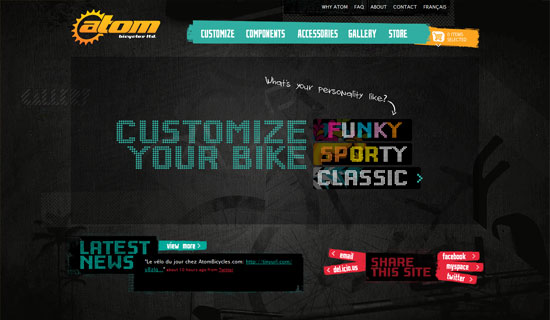
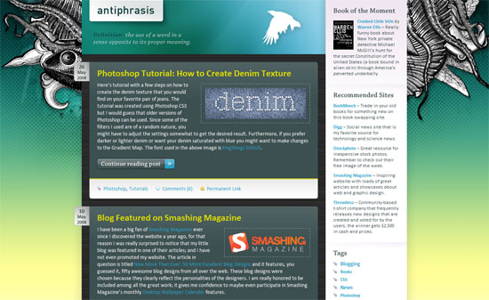
There are several different fonts on this site but it doesn’t go too far.
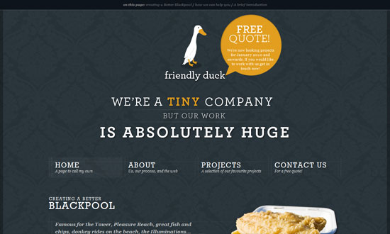
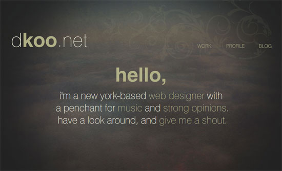
I’m liking the center-aligned header/blurb here. Very nicely spaced too.
My gripes are under the hood: using JavaScript for image hovers, tables, and <br />s (instead of <p>s). Tsk tsk tsk.
The inner pages need to be more consistently styled with the overall grungy look, but points for almost getting there.
Social Media Weekly
CSS – 8 Free & Best CSS Editors For Web Designers
JavaScript – jQuery 1.4 Released: The 15 New Features you Must Know
