One way to produce an immersive experience is to lay out your content such that it takes up the entire screen and even beyond, so your audience is compelled to explore every part. It can get a little overwhelming, so the trick is for each item to be striking enough but still also cohesive when combined side by side with the rest.
Designs of the Week
Get solid WordPress themes, plugins, and web design training from iThemes.
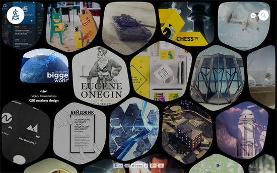
The organically shaped tiles look great, and even morph a little on hover. Inside, the portfolio photos that only differ slightly from each other blend in a similarly organic way. I also love the ornate and almost mystical-looking category icons (e.g. ouroboros as an infinity symbol linking to all projects) that help you navigate the rest of the site.
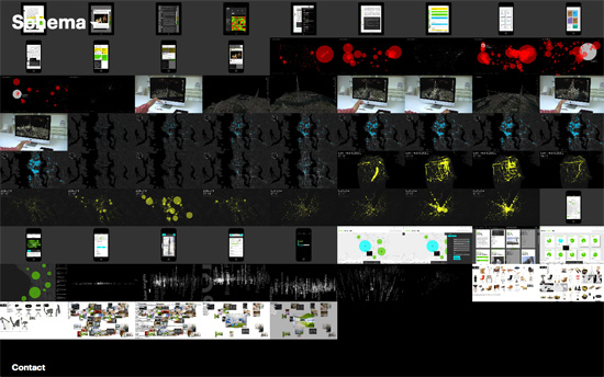
Like one of the designs in a previous feature, the images for each project vary in length and carry over to new lines when need but get highlighted all the same. Text areas are in boxes either black on white or white on black, sliding in when the need arises.
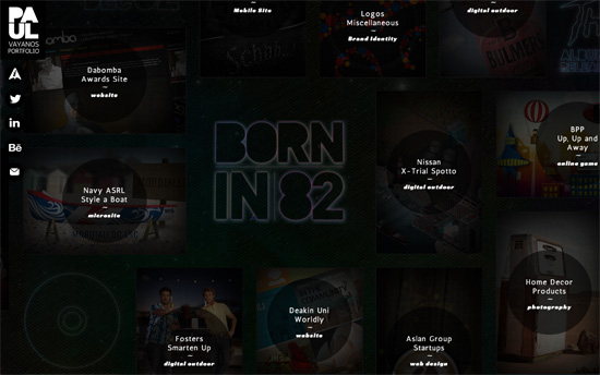
I wish the Born In 82 title were a little brighter but the sparkling effects are nice, and even cooler is the easter egg game you can play when you click on it.
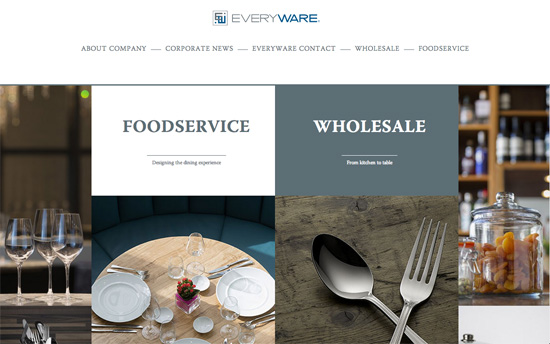
There’s a very interesting choice here to put the slider at the bottom of the “wall” instead of the usual top, probably ’cause that was all navigation they wanted you to get to first.
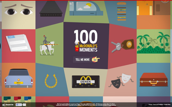
Love the bubbly, gel-like effect on hover—instantly making those hard corners more fun. Even the way the modals slide in to the center is so snazzy.
Social Media Weekly
Ready to go out and design your next website? Try building with the Catalyst Framework.
Design, Mobile – What Screens Want
“Choosing the proper amount of abstraction is tricky, because each user comes to what you’re making with their own amount of experience. Experience gaps are not unique to computing, but I think it matters more here than in many other situations.”
Interaction Design, User Experience – Make It So
“IxD Lessons from Sci-Fi”
Business – What My Mom Taught Me About Client Services
“The way a seamstress approaches her work isn’t too far off from a designer. They decide to take on a client.”
User Experience – What Exactly Is….. The 300ms Click Delay
“In this article we’ll discuss why the delay exists, what browser vendors are doing about it, and what you can do to workaround the issue right now.”
