We’re celebrating All Hallows Eve Friday Focus with dark designs. Trick or treat!
Designs of the Week
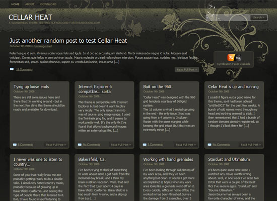
This is actually a WordPress theme that happens to have a site of its own. Gives off a gothic feel with a touch of translucency.
Break the monotony (and possibly the eerieness) with something brighter, quirkier, or both.
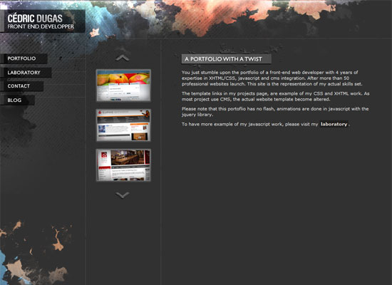
I like that the grunge effect here is peeking at the sides, when normally you’ll find it all over the background. I also like that it’s got different hues.
I like this site’s color scheme, even though that brick red is close to becoming unreadable on that denim blue. It’s a clean (though a little grungy) one-page site.
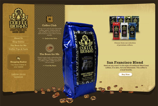
Despite being predominantly black and gray, a splash of red (literally) and touches of gold brighten the whole site up. Another simple and effective technique with the help of color. (Sometimes it’s all you need.)
Social Media Weekly
Design – 15 Key Elements All Top Web Sites Should Have
Be sure to keep these elements in mind when designing a website.
Design – 19 Creative Halloween Advertisements
Laugh, scream, and be inspired by these ad campaigns for Halloween!
Programming – Are More Programmers Using Ruby or Just Window-Shopping?
Good question. Is Ruby living up to its hype?
