• Home
  • About
  • Contact
  • Advertise

Devlounge

Design, Develop, and Grow

ateşli sevgilisi fantezisini yaşamak istediğini söyler porno ona arkadaşları varken onunla gizli saklı seks yapmak istediğini sikiş söyleyen kız hafta sonu için gelen arkadaşının görmediği bir sikiş açıdan sakso çekmeye başlayınca adamın yarağını bu altyazılı porno şekilde indiremez ve açık şekilde salonda sikişimeye sex izle başladıklarında misafir kızı da bu sekslerine rokettube konuk ederler seks yapacağını düşünmeyerek onun sex izle oyun oynadığını zanneder sabah olur ve herkes uyanır hd porno bu sırada yanında şişme mankenini de getiren sapık erotik hikayeler genç sınav haftası ders çalışan genç adam üvey annesinin sikiş eve gelmesiyle hayatının şokunu yaşar

  • Home
  • Code
  • Design
  • Design Focus
  • Interviews
  • Publishing
  • Strategy
  • Webapps
  • Extras

Friday Focus 07/09/10: Background Repeat

July 9, 2010 By Sophia Lucero

This week on Friday Focus: it’s backgrounds with repeating patterns, a well-loved technique that doesn’t go out of style.

Designs of the Week

Bullet PR

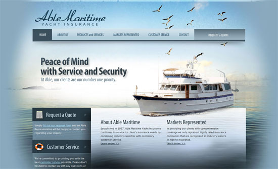
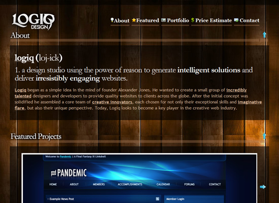
The logo doesn’t quite match the vintage look but it draws enough attention like the other elements: large headers, power lines, icons.

LaMalla.cl

Love the snappy slide out animations on the images and the gray/pink color scheme. The details are pretty much perfect and it’s just the social media buttons that look out of place.

Shierly Tjipto & Richard Pham

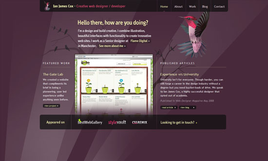
Great treatment on the text, and the purple/black/white theme is quite elegant.

Chalet Graal

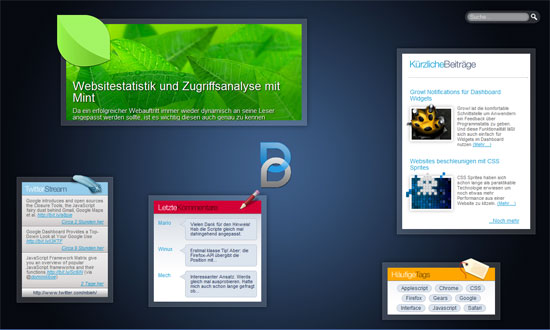
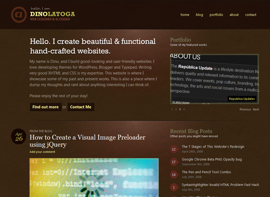
I absolutely adore the idea of using not just a flat graphic pattern as a repeating background, but multiple patterns and photos in boxes. The only question is if it’s too distracting for the content, which I think isn’t, because if anything it keeps me glued to this page!

Brice Lechatellier

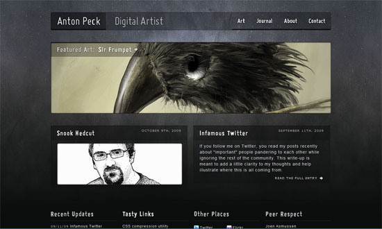
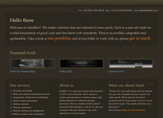
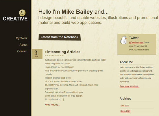
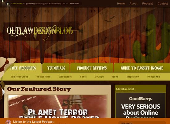
Extremely subtle pattern, but it’s there. Social media buttons look better blended; the letterpressed look helps.

CannyBill

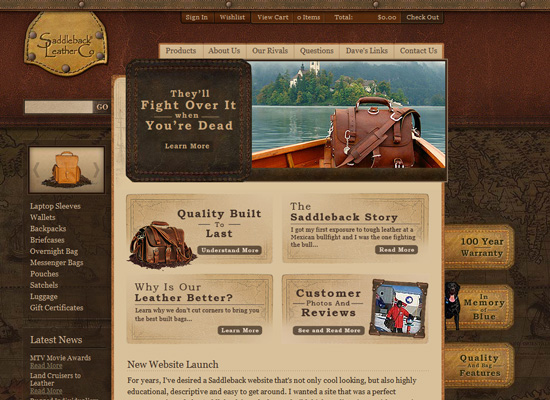
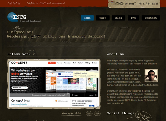
Using your logo as your background pattern? Brilliant.

Evan Eckard

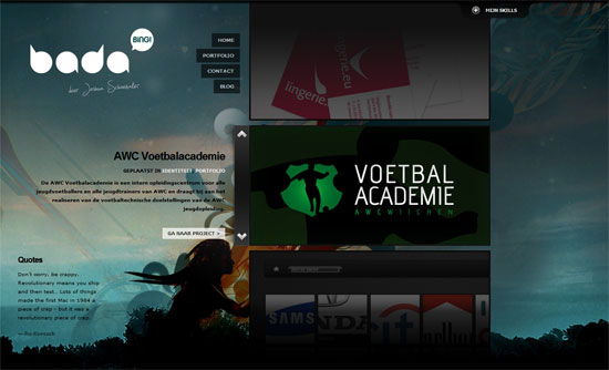
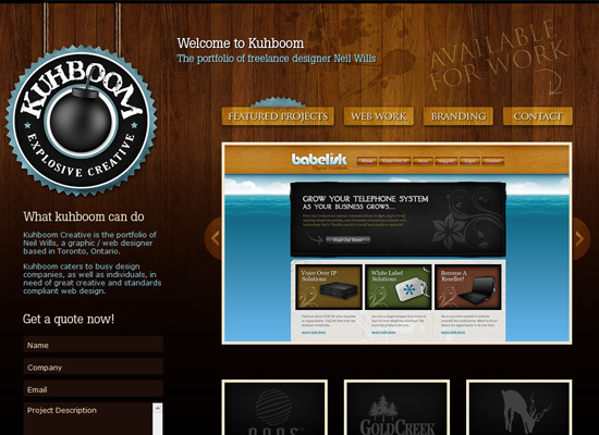
Again, logo as background pattern, but what really catches my attention here is the transparent and angled images in the carousel.

Wawa Coffeetopia

Love how there’s barely a straight edge in this design, just mostly ribbons and fancy frames.

Ray Anthony

Striking, but is that Comic Sans I see in the footer?

Victory Church

I actually like that the background is a much larger pattern than what we usually see, which makes it look different from the wallpapered look. It’s also great that the images blend in the same pattern to reinforce rhythm and consistency.

Hailey Jayne Designs

I’ve run into this look so many times now, but I don’t really tire of it, and it’s done really well here. However, for such a sweet and elegant design, I’m wondering if the gray in the navigation is a bit too dark.

Danilo Nobre

Doesn’t this make you nostalgic for the high-gloss designs that have now been replaced by the more subtle ones these days? And actual sparkles! What a fun design.

Social Media Weekly

Community – HOW TO: Get the Most Out of Q&A Sites
“There are ways to ask the best questions, provide great answers and ultimately build your reputation; here are eight guidelines that can help.”

Design – Icon Reference Chart
“A comprehensive chart of icon information for various platforms and devices”

Design – 365psd
“Download a free psd every day for a year”

Friday Focus 04/16/10: Slanted

April 16, 2010 By Sophia Lucero

This week on Friday Focus: designs that tilt to one side and keep the perpendicular lines away.

Designs of the Week

Synch Media

Love the warm hues, transparency, and even the tiny polka dots. Everything blends in nicely.

Crealo design

I like how the logo is used as a prominent design element, not just as a header. One thing you will notice with these slanting designs is how they usually mean they’re left-aligned too. More often than not that leaves a lot of whitespace on the right side, which may be a good or bad thing.

Living Lyric

Really simple design, but looks fresh with the bold colors changing in each page and the boxy look.

Incrediblend

The nice thing about a vertical user-generated gallery is you only have to browse from top to bottom and not from left to right. I really like how the fixed footer has the logo slashed out!

ASOS plc

Forget rounded corners, slanting edges is the next big thing! Love the subtle, translucent shapes in the background and behind the content area.

Adesivos Decorativos Coolar

An extremely fun-looking design with not one traditional design pattern in sight! Love how the plus icons turn into arrows.

SWAG Designs

Instead of the usual horizontal lines to separate sections of a one-page site, this design slopes them upward.

Amanda Wakeley

There’s something about slashes and slanted shapes that just fit with designy sites including fashion. Love the hover effect in the inner pages reinforcing this.

Ignaty Nikulin

That other trend that’s also getting popular, circles, is in here too, but there’s an animated twist. The rainbow-colored header breaks the gray-filled design.

The Student Project

The hand-drawn effect is always a good way to add to slanting lines.

Panic Blog

And finally: the easiest, most modern way to implement the slanting look in your design? Use CSS3 transforms!

Social Media Weekly

Design – Holistic Web Browsing: Trends Of The Future
“The future of the Web is everywhere. The future of the Web is not at your desk. It’s not necessarily in your pocket, either. It’s everywhere.”

Design – Designing with Lenses
“A design lens allows you to view the user experience through the eyes of a single design principle. Lenses were originally created for game design but are just as powerful for user experience design.”

HTML – Introduction to HTML 5
“Are you interested in HTML 5 and what’s coming down the pipeline but haven’t had time to read any articles yet?”

JavaScript – RequireJS
“RequireJS can help you manage the script modules, load them in the right order, and make it easy to combine the scripts later via the RequireJS optimization tool without needing to change your markup.”

Friday Focus 02/19/10: Fixed

February 19, 2010 By Sophia Lucero

This week on Friday Focus: excellent websites that happen to have fixed elements in them.

Designs of the Week

Adii Rockstar

Not only do we have a light on dark design here, but a glowing light on dark design. It’s colorful too, because of the thick demarcations color-coded by content type. My only wish is for the search bar to be part of the fixed area; I think that’s just as important a navigation element as pagination.

Taylor Frassinelli

Interesting choice of content in the fixed area: name and contact info (very important), quick links to portfolio items grouped by year, and quick links to additional info about the designer. Overall, neat and nicely organized.

Ryan O'Rourke

Another split, one page site. Cool hover effect on the brain graphic, and interesting combination of background patterns (one ornate, one techie).

Fresh01

Brilliant effect on the blue markers, telling you exactly where you are on the page and keeping things dynamic.

Rich Brown

A custom font makes a big difference. Big, bold, boxy, but not overwhelming.

177Designs

Not so exciting fixed area (they’re more for utility anyway) but does well in presenting the portfolio.

Jon Leverrier

More than half of the page is fixed—narrow content areas isn’t quite dead yet!

Fuel Brand Inc

I like how you start with a practically blank screen when you load the site. Then you get a simple yet dramatic transition animation to load each section’s content.

EMQuinn

Another thing that isn’t dead: left-aligned layouts. No skimping on the amount of whitespace either.

Vuu Media

The thing about changing backgrounds is the foreground has to match, and amazingly enough, this site pulls it off. Other than that, graceful details everywhere.

Jaype

I like the three different shades of blue in three different columns. Not too thrilled about the use of the drop shadows and inner shadows here though.

Rather Splendid

I love endless scrolling. I’m on the fence about the stark black icons, although they give a quirky feel to a text-filled site.

Drew Wilson

What really sets this design apart is the carefully chosen and crafted custom photos for each post, everything blends well. Not to mention custom type everywhere.

Social Media Weekly

Usability – Why Not a User

CSS – CSS gradients for all web browsers, without using images

CMS – 10 Simple and Light Weight CMS Solutions

Friday Focus 11/06/09: Playing with Transparency

November 6, 2009 By Sophia Lucero

This week on Friday Focus: another roundup of sites that play the transparency card very well.

Designs of the Week

Bieh

I love a good freeform layout. It does get more organized in the inside pages, though, so best of both worlds!

Ian James Cox

The translucent effects are so subtle, it makes for an elegant design.

Joshua Schoenaker

Lots of great things going on here: how the portfolio items that aren’t in focus are darkened, the pull-out panel that displays the designers skillset, and the overall edgy look for the site.

Anton Peck

Custom type and lovely art both go a long way for this site!

Able Maritime Yacht Insurance

The not so subtle way the content area fades into the background is stunning to look at. But the boat images need improvement, ironically in the transparency department. Still, a gorgeous site.

Social Media Weekly

Design – The Future of Interface Design

Programming – The 3 Basic Rules for Writing HTML

Friday Focus 05/01/09: Brown Bunch

May 1, 2009 By Sophia Lucero

It doesn’t happen a lot on Friday Focus, but this week we have a bunch of websites featured, all dressed up in brown.

Designs of the Week

Saddleback Leather Company

Dino Latoga

Satellite7

Idea Foundry

Timothy van Sas

Mike Bailey

Neil Wills

Styled by Akhil

Logiq Design

Outlaw Design Blog

We Love Icons

Social Media Weekly

Design – How Much Intelligence Does Good Design Really Require?

Design – An Ode To border-radius

Programming – Using XAMPP for Local WordPress Theme Development

Next Page »

Code & Tutorials

Which Front-End Development Languages Will Grow in 2017?

Your Guide to Leveraging APIs as a Developer

Bitcoin Processing Website Integration For Web Developers

Website Security For 2016 That All Developers Need To Know

5 Reasons You Need to Be Using jQuery

About Devlounge

Want to read more about Devlounge, or maybe you want to contact us, or even advertise? Oh, and don't forget to subscribe to updates!

The Best of Devlounge

Should You Start a Business or Remain Independent?

Search