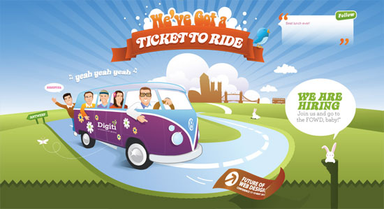
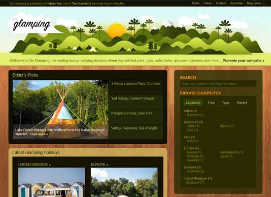
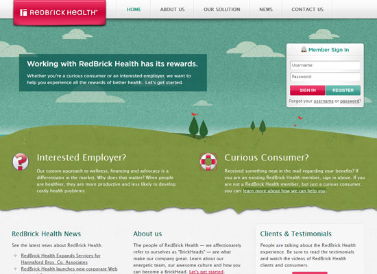
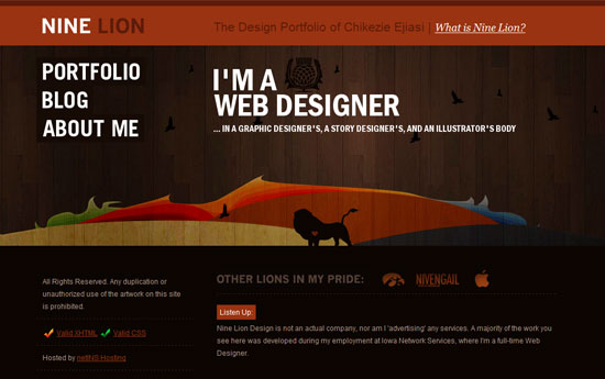
This week on Friday Focus: illustrations that appear front and center in these websites, because we want them big, bright, and beautiful.
Designs of the Week
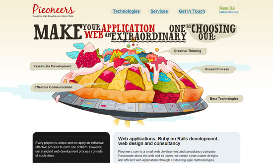
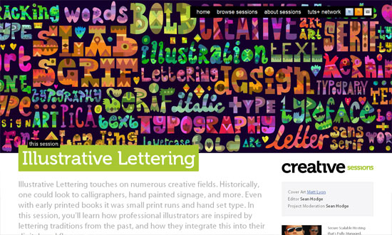
Highly detailed and scrumptious “pie chart”! The colorful illustration style and metaphors all the way into the footer not only adds interest but are artfully done.
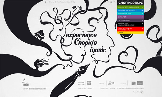
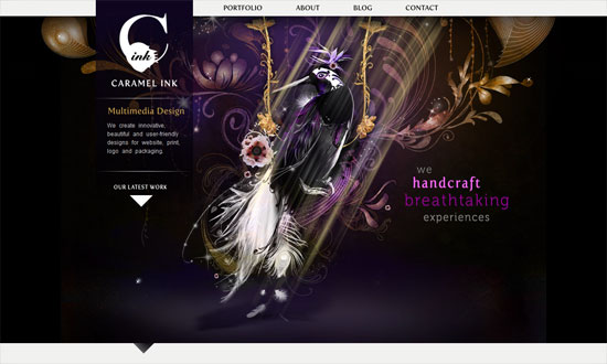
I just love a design that breaks out of the box. Once again this is a lovely work of art, with touches of calligraphy and fascinating shapes growing out of the swirls. The inside page design is more organized but keeps this look in the header.
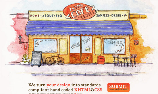
It’s great that you can find lots of clickable elements in the illustration itself, and the metaphor really works. The hand-drawn, watercolor style carries over to the other page elements like the icons. I wish the form fields and buttons joined in the fun too.
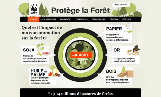
The center-focused layout works well, as does the bold black text and buttons, greens, and oranges.
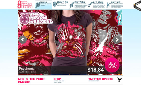
Showcasing your work in the biggest, widest way possible is a surefire way to set the look and feel of your site. In this case it’s spilling with bright pinks and trendy type.
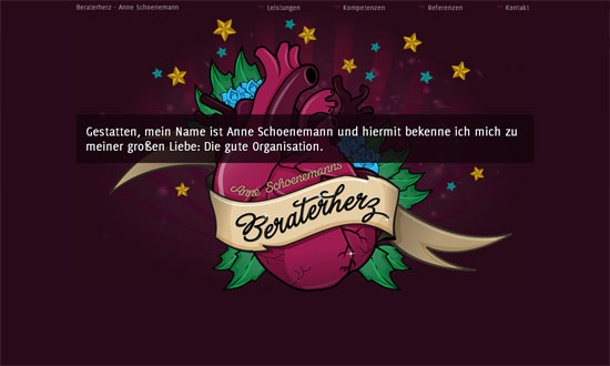
Some quieter shades of pink in here but still striking. Notice the recycling of the hearts, stars, roses, and leaves in the rest of this one page site.
Super-wide layout with a sprinkle of parallax, -webkit-transform, and subtle jQuery hover effects. The most exciting portion is the contact form at the footer.
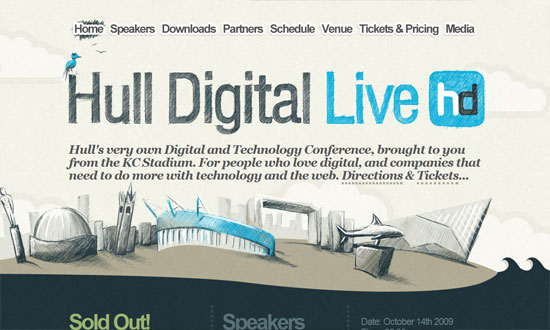
I love this sketchy look accompanied by a pattern of ocean waves. (You can actually download it as a wallpaper if you want.)
This isn’t a groundbreaking layout or look but it somehow feels different. A case of letting the picture speak a thousand works, perhaps?
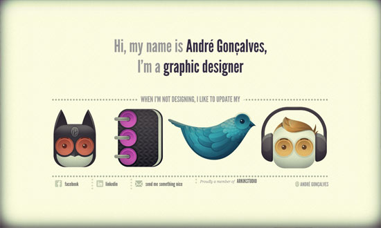
Topnotch icon work and typography. Just look at it. The vignettes in the corners are a bonus.
Fantastic illustrations, but other design details fall a little short of its elegance and whimsy.
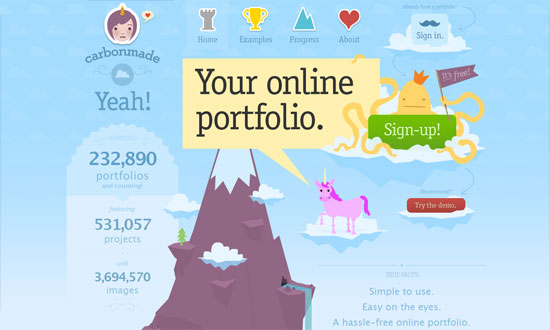
This one, on the other hand, overflows with whimsy! Nothing says it like a unicorn and a mustache sign in icon.
I like that the rabbit and its hole is a mini power line leading in to the next section’s boxes. The slanting boxes and buttons are great too.
Social Media Weekly
CSS – Efficiently Rendering CSS
“I admittedly don’t think about this idea very often… how efficient is the CSS that we write, in terms of how quickly the browser can render it?”
CSS – Using CSS3 Transitions, Transforms and Animation
“These demos are showing of CSS transitions, transforms (2D and 3D) and animations”
JavaScript – Javascript shorthand for cleaner code
“A few ways to save on some bytes in your Javascript code, as well as making it more readable and quicker to write”
Optimization – 46 CRO/Conversion Rate Optimization Resources for Web Design, SEO & Social Media Experts
