It’s August already and we’re kicking off our first Friday Focus of the month with some Flash-based sites.
Designs of the Week
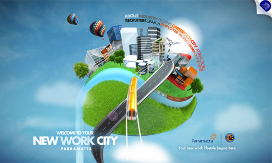
The 3D art here is superb, but what I enjoy most about this site is the floating effect achieved through continuously moving elements, like the hot air balloons, the rays of light, the flock of birds, and the sliding effect that loads the text.
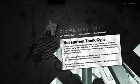
I like that this layout is tilted—Flash gives you the liberty of doing that. I also like the feeling of “stiffness” from the graphical effects as it goes well with the theme of the website.
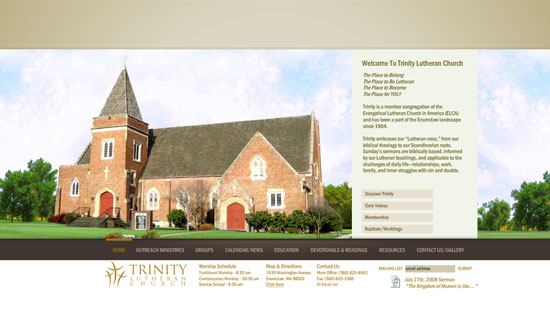
What a sleek site. Narrow type and neutral hues give it a modern yet dignified look. But it’s the beautiful photography that adds flavor to each section. Sometimes all you need are nice pictures.
Social Media Weekly
Design – 400+ High Quality Patterns
A huge collection of patterns all ripe for the picking.
Programming – Unit PNG Fix
Here’s another solution to the PNG transparency problem in IE6. A very compact and easy to install script.


