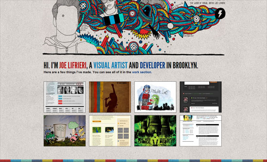
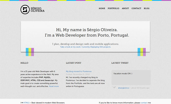
It’s another round of colorful websites on this week’s Friday Focus, but this time they’re done in discrete blocks at the edges of the designs.
Designs of the Week
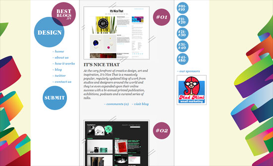
This is what could be considered a vertical design, which more people should be doing since sites are actually tall, not just contained in a single screenful. It also feels narrow but in a good compact way.
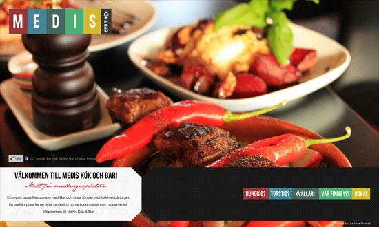
I love the color block effect in the inner pages. Not too thrilled that even paragraph text is in the condensed uppercase font that people are so fond of these days but other than that the arrangement of information on this site is excellent.
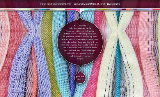
This homepage makes quite an impact showing off one’s wares in an artful way. The uncovering effect is also nice.
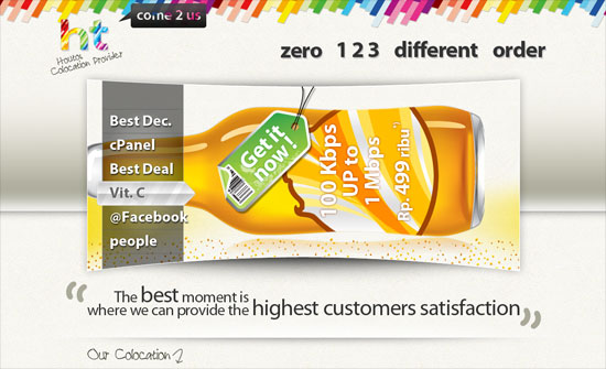
This looks extremely fun and inviting for a service provider, but not a very good idea to repeat the pattern on the logo, which now looks drowned out.
The illustrations look great but I feel they could be better integrated into the design. The Work section, for example, display thumbnails of the portfolio on top of the header illustration and it’s overpowering them.
Another thing I noticed, a lot of people into gray all over the design. But it’s nicely offset by these bright colors here. Bonus points for integrating the Konami code.
Social Media Weekly
Design – A Little Bit About Enthusiasm and Hype
“I did a workshop last week at the wonderful Build conference on Enthusiasm, and more specifically, how to get people enthusiastic about the work one does. And I forgot to say the most important thing.”
Design – You can’t grow, unless you bow low.
“Here are some pointers on taking and giving constructive design criticism.”
HTML – On the hgroup element
“The more I try to explain it to people at workshops and in a marvellous book, the more uncomfortable I become with <hgroup>.”
HTML – The shortcomings of HTML5
“As professional Web designers and developers, we can use and support HTML5, but at the same time we need to be able to discuss the shortcomings and limitations of the technology.”
CSS – Keep Margins Out of Link Lists
“The simple truth: bigger link targets are easier for people to click and lead to better user experience.”
