If you want to learn lessons about how to run a great business, you should look no further than the most successful and respected businesses of our era—and few businesses have grown as big or have maintained their reputation as well as Google. When you boil down the factors for why Google has become such a dominant force in the tech world, you can cite a number of possibilities, from the way it treats its workers to its drive for constant reinvention—but when it comes down to its product popularity, it’s all about user experience. [Read more…]
Friday Focus 05/11/12: Rainbow Flavored
Today we’re looking at designs that don’t shy away from a broad color palette and completely embrace the rainbow. Happy Friday Focus!
Designs of the Week
Make Headway, make intuitive layouts, make it your WordPress theme of choice!
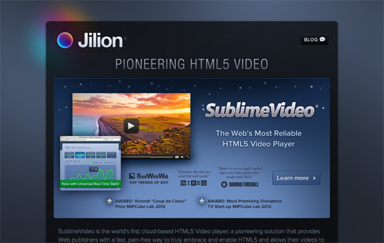
The top section is a little confusing, it doesn’t quite say that the video player graphic is just a product of the company by the way it appears, and it takes a little longer for you to make that conclusion (even if it’s milliseconds in your brain). The form elements and icons are lovely, and especially so for the logo, which even casts a rainbow glow behind it. The site’s got a nice dark, but not intimidating feel.
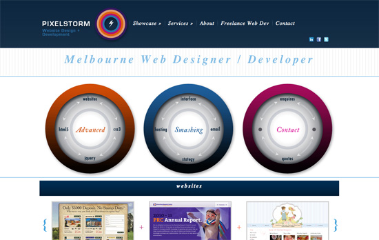
This site is far from perfect but I like a few of the concepts that went into it, like the circular elements and the reuse of patterns.
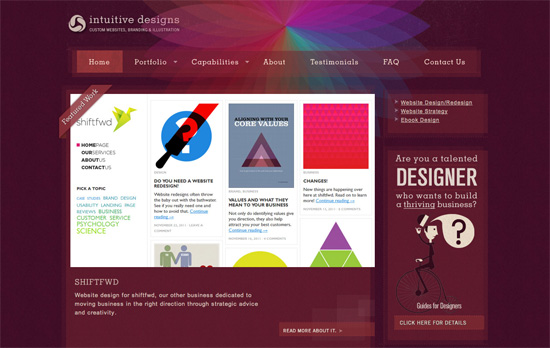
I enjoy the background graphic, the color scheme, and the little detail of texture that appears when you hover over the menu links. I also like the layers of translucent boxes that don’t line up. It was also a good idea to space out the letters given the dark background for better readability.
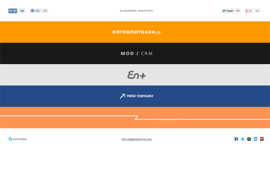
Each strip represents the dominant hue in the project, with the logo on it. Clicking on it expands to display the sample work on it with matching background color, so it’s like you’re completely transported to that “world” every time. A very simple accordion style one page portfolio that’s all about the content.
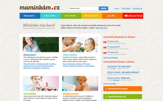
It’s always a challenge to use bright colors as text backgrounds, so I’m concerned it may be difficult to read for certain people. But I like the non-dominating amount of it used in the design. Everything else is warm and cozy, from the illustrated background pattern to the perforated borders in between content blocks and around images.
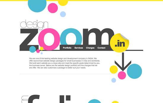
Very mod, color-blocked, and designy! Everything seems to be in the right place. Very bold move to use yellow for the form fields.
Social Media Weekly
HTML – How to Safeguard Your Site with HTML5 Sandbox
“Today’s web applications are mash ups of new experiences into one experience. Think Twitter widgets showing the latest tweets about a product. Or Facebook comments discussing an article. Or even just integrated web pages through an iframe element. These experiences can increase security breaches to your site. Don’t stress … there’s a new kid on the block to help you out: the HTML5 sandbox. But before I get to that, let’s quickly review iframe element issues.”
Mobile Web Design, Debugging – Ringmark
“Ringmark is a web-based test suite that measures how well a mobile browser supports the capabilities that modern mobile web apps require.”
Design – Modularity and Style Guides
“It’s one of many techniques I use in front-end website development. Below I’ll introduce a few more and how I link them together for the ultimate Power Up ★”
User Experience – Principles of User Interface Design
Create unique, extraordinary websites with Squarespace. No experience necessary!
Friday Focus 03/09/12: Chalked Up
It’s back to the classroom this week on Friday Focus as we study designs that feature the chalkboard effect on them.
Designs of the Week
Search Optimized, Turn-Key Designs, Unlimited Everything. Start building with the Genesis Framework today.
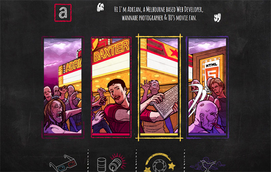
Most blackboard effect designs stick to the the scratchy white on black (sometimes green) look, but this one uses multiple colors (there’s colored chalk, after all). There’s a bit of a movie and zombie apocalypse motif going on in the different pages (even parallaxed on the homepage), all clever ideas as you’ll discover.
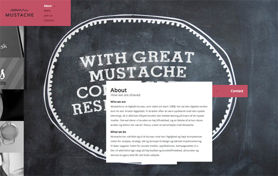
Surprisingly no mustaches in the design, but it’s there in the copy (e.g. “the clients we have shaved”), logo, and favicon. The way this site is laid out isn’t noticeably different at first, but you’ll find things that make you go “hmmm”, like how the portfolio images are in a fixed scrolling panel at the right, and have this stylized “magnifying glass” hover effect. I also find it interesting that the content boxes have uneven edges made up of multiple rectangles.
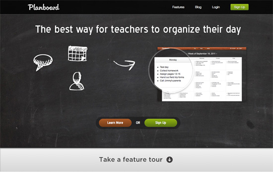
I like how all the info is spaced out nicely and easy to read, but the type in the heading doesn’t match, and for such a tall area, there could have been more info in it. It’s nice how the texture repeats in the footer area though.
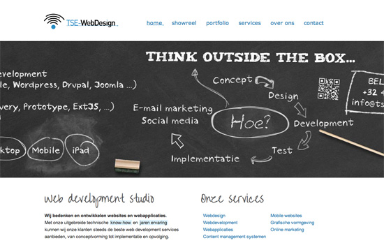
There’s a slide-bounce effect to displaying the “blackboard area” once you load each page, and each heading is a specific design that matches the content. I also like the little underline touch on the menu links and the logo, the kind you find inside Photoshop.
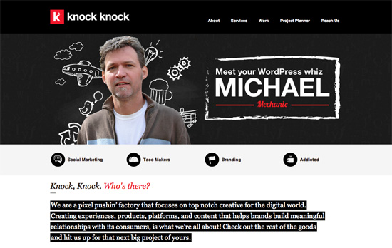
I like the red-white-black color scheme that’s softened a little by the “blackboard area” that mixes actual portraits with scribbled graphic elements. Unfortunately you don’t see that in the rest of the pages, where icons are featured prominently.
Social Media Weekly
Make Headway, make intuitive layouts, make it your WordPress theme of choice!
JavaScript – Thinking Async
“Here’s the rub: when you load JavaScript from a third party you should do it asynchronously. You might want to load your own scripts asynchronously too, but for this article let’s focus on third parties.”
User Experience – Lean ways to test your new business idea
“These techniques allow us to test our business idea while it’s still an idea — before developers have written a single line of code.”
Business – Docracy
“Docracy is a social repository of legal documents. Our mission is to make useful legal documents freely available to the public.”
Web Design – New tools for web design and development: February 2012
“In this new regular feature Mark Penfold rounds up 10 of the best new tools for web designers and developers that we have come across.”
Friday Focus 11/04/11: Side Scrolling
Like the parallax effect, horizontal scrolling is a popular technique to grab people’s attentions and making a website stand out. It also challenges the usual top to bottom browsing we are accustomed to, so it should always be used with caution. Let’s see if this week’s featured designs are on point. Happy Friday Focus!
Designs of the Week
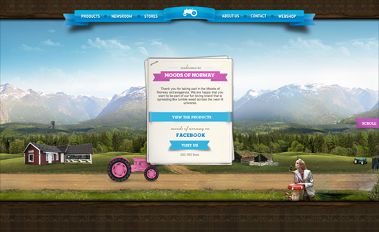
It’s great how before you begin scrolling, when you hover on the “Scroll” button (ribbon actually), the screen goes dark to give you a hint about your scrolling options: it covers all bases from arrow keys, scrollbars, scroll wheel, and even touch. Several vehicles (a pink tractor and boat, a yellow limousine) lead you through different sceneries as different cards in the stack move to the top, each containing descriptions for the current section. Selecting it moves the viewport “up”. The shadow of the floating page is a little too strong, almost looks like a solid border, and the body text could be a little more styled to match all the other elements. One last thing I find weird: the hover color in the navigation is a very strong pink that clashes with the blue ribbon background. Overall though, very pleasant site!
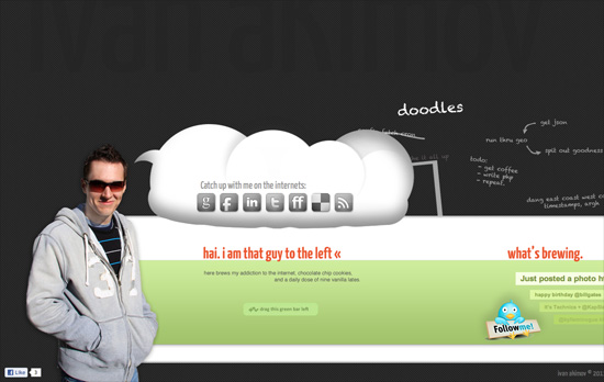
At first I wondered why there was a lot of space at the top then I noticed some very subtle text in the background. Navigation is different from the usual horizontally scrolling sites out there: instead of dragging the scrollbar, you do the dragging action anywhere in the green area. Which isn’t bad at all if you don’t mind inadvertently highlighting elements on the page. I like how the latest tweets are arranged although the social icons seem to have larger emphasis than the rest of the content.
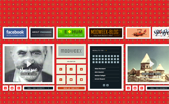
I just wish the background pattern wasn’t so bright so I can enjoy the old school look going on here, between the pixelized fonts and icons. What’s weird, though, is there seems to be no visual hierarchy. The title is mixed with the navigation in between each video, while the About and Blog are displayed alongside the ad-like boxes at the top.
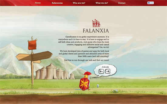
This one captures the platformer video game format with the keyboard navigation, which even accelerates the character (from walking to running) if you press long enough. I also enjoy enjoy the watercolor, storybook-like illustrations on the site.
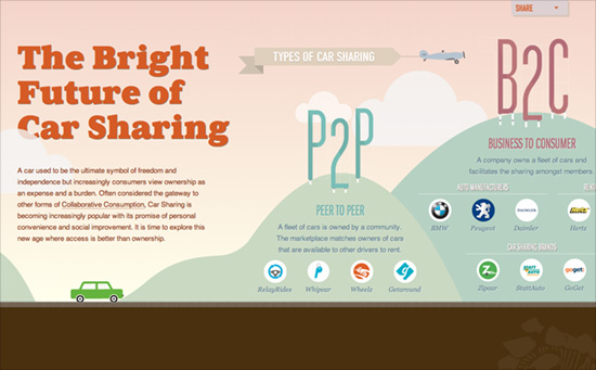
Not only is this a wonderfully animated side-scrolling site, it’s also one long horizontal infographic. It uses both motion and the landscape to take advantage of objects and depict statistics and comparisons through them: flags, trees, houses, you name it.
Social Media Weekly
Responsive Web Design, Mobile Web Design – Multi-Device Web Design: An Evolution
“From responsive Web design to future friendly thinking, here’s how I’ve seen things evolve over the past year and a half.”
Design – Lots of Ipsum
“There is just too many awesome Lorem Ipsum (placeholder) text generators going around lately not to round them up.”
JavaScript – 140byt.es
“140byt.es is a tweet-sized, fork-to-play, community-curated collection of JavaScript”
User Experience – Don’t Give Your Users Shit Work
“We need to get out of this idea that the act of spending time on a project means that you spent your time wisely. Sometimes you’re just wasting your time.”
Friday Focus 09/02/11: Over the Moon
This week’s Friday Focus features designs that incorporate the moon in them.
Designs of the Week
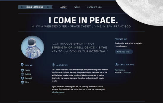
Let’s talk about the moon and how it’s in the top right, in the foreground, spinning oh so slowly—just enough for people to notice it’s moving. Overall look seems simple, but I think it’s effective and still makes an impact. I think it’s interesting that the site labels the homepage as the About page at the same time. One nit to pick, while not visual, is that there are two different email addresses being used in three email links.
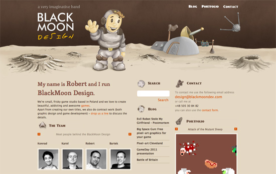
It’s funny how this site also uses the Star Trek logo as one of its icons in keeping with the outer space theme. I love the illustrated, painted look in the header, including the word “design” in the logo (which doesn’t look like just another handwritten typeface). It’d be nice to have the headings as real web fonts now instead of images, but then I discovered that the whole design—and I mean every graphic you see on the page—is one big sprite, so kudos to that!
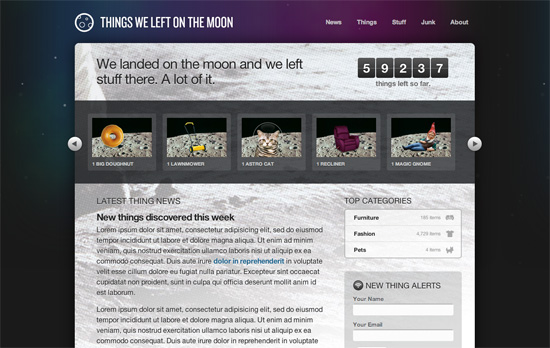
This is just a demo site created by Dan Cederholm for An Event Apart Seattle 2010, but there are a lot of neat things to be inspired by here, particularly CSS3 features in the hover effects and typography. Love the idea of the halftoned moon landing picture as a background. The use of purple is also a nice touch, since it’s easy to just reach out for midnight blue when depicting skies and space.
Social Media Weekly
Mobile Web Design, E-Commerce – Add to Cart: 5 Ways to Improve Shopping on the Mobile Web
Five steps to optimizing online shopping on mobile devices.
HTML5 – The Current State of HTML5 Forms
Check out the latest browser support and techniques for using form attributes in HTML5.
CSS3 – Sizing with CSS3′s vw and vh units
Another set of measuring units included in CSS3, this time based on viewport dimensions.
CSS – The Minimum Page Project
Another iteration on the CSS resets out there. The idea is to avoid redundancy due to broad-sweeping resets.
Design, CSS – Adapted
Reflections on the challenges and options in adapative, responsive web design.
Design, User Experience – Thoughts On Communicating Design
“Communicating design, in general, needs to be less about documentation and more about clear, concise and ongoing two-way communication.”
