It’s blocky and 3-dimensional designs this week on Friday Focus. Oh, and Happy Valentine’s Day!
Designs of the Week
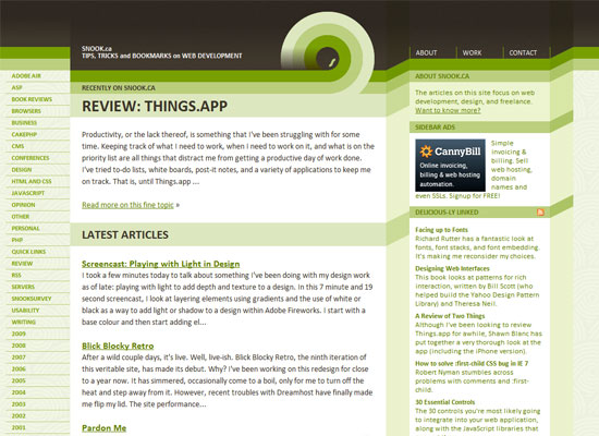
I would say the looped stripes in the header and footer gives a very retro feel to the design. The blockiness makes things look stacked and modular, perfect for sidebar components and additional sections like comments.
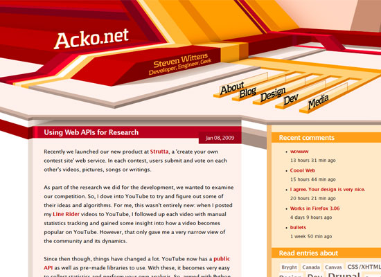
This reminds me of a more recent 3d-abstract design trend in the early ’00s. But I like that the colors are more welcoming than they are cold, and that it’s a little crazy looking but not too crazy!
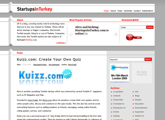
The 3D effect here, on the other hand, is very subtle, and instead of building blocks you can feel folded paper. Red keeps the neutral tones more interesting.
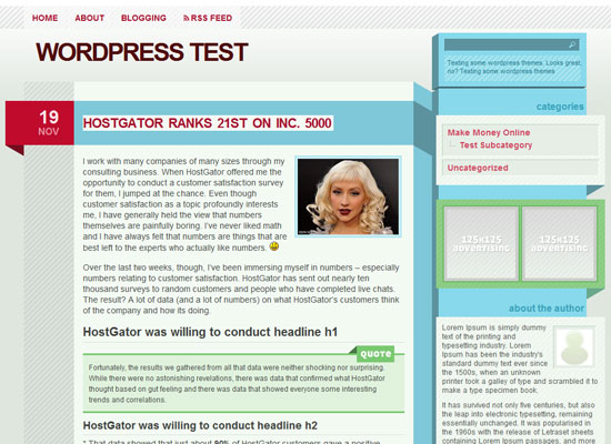
I keep running into WordPress themes that match our weekly themes! Again, another very interesting one. Even the blockquote styling looks impressive. The details are devilish!
Social Media Weekly
Design – 17 Awesome And Colorful Resources For Valentine’s Day
Spread the love bug!
Programming – When can I use…
“Compatibility tables for features in HTML5, CSS3, SVG and other upcoming web technologies”


