Merry Christmas Devlounge readers! This week’s Friday Focus features designs that tell awesome stories with scrolling and now-you-see-it-now-you-don’t effects.
Designs of the Week
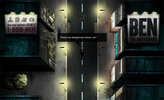
I really don’t have much to say about this except that it’s so addictive! The animations and illustrations are fantastic. This is just a “coming soon” website, but I don’t want them to change it when the product officially launches.
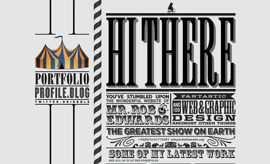
Predominantly black and white/gray so the colors from the portfolio stand out. Love the carnival theme and its rich ornate typography.
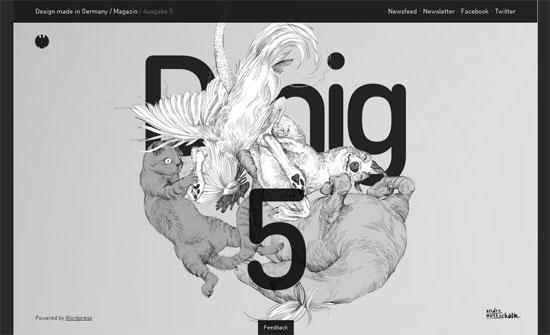
A lot of nice things at play here: lovely layering, social media hidden until hovered over, infinite scrolling, translucency, custom type everywhere, and a completely fluid layout. It’s an edgy approach to web-based magazines.
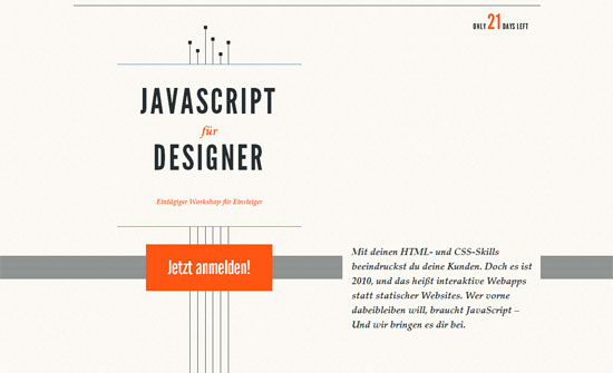
Simpler than the others but equally impeccable, with abundant amounts of whitespace. The embossed effect of the logos in the footer is a very nice touch.
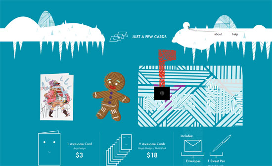
Besides the excellent mailbox animation, I really like the card previews. It’s interesting how the add to cart buttons have both plus and cart icons in them.
This site reads like a vertical storybook, with captions changing for each screenful. The “why is this important?” section is also a nice implementation of the ordered list.
Social Media Weekly
Typography – Happy Holidays from TypeKit
Read how they made this website here.
JavaScript – Merry Christmas in 1KB of JS
View more Christmas 2010 demos here.
Content – The Twelve Days of Contentmas
“This is a simple little plan to make sure that your personal site, blog or portfolio is not just looking good at the end of these twelve days, but is also a really useful repository of really useful content.”
