This week on Friday Focus: designs that use two opposing elements found in nature: fire and water.
Designs of the Week

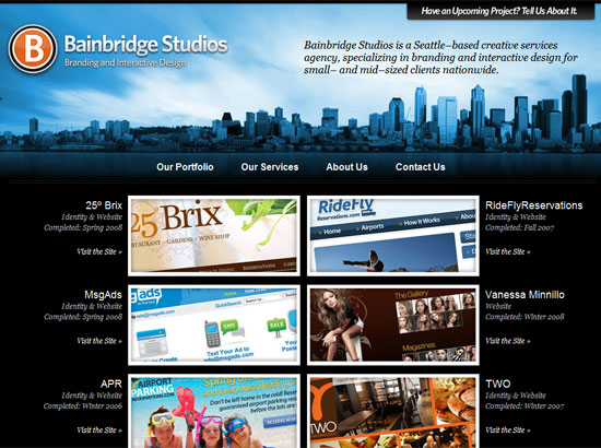
Everything is burning in here, from the wooden background to the strips and sheets of paper—not overdone at all. I really like the little area of blue flames whose color echoes as accents throughout the rest of the site. All in all a striking look.
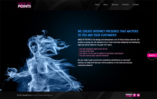
Here pink is the accent color as seen in the logo, navigation, footer, and the loading screen—which seems to be growing popular in non-Flash sites with lots of graphics. Another parallax-driven site with some translucent backgrounds and some very thin arrows.

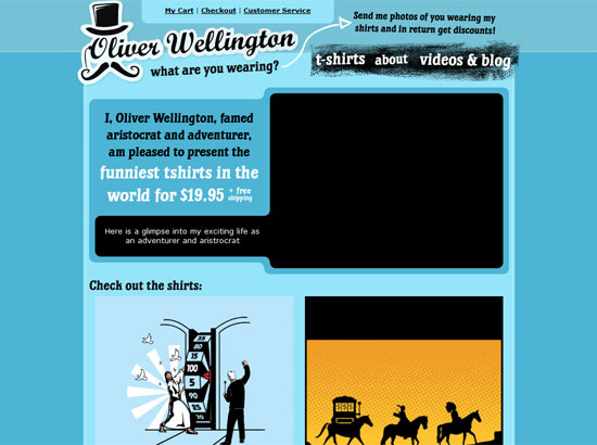
I like the splashes of water everywhere and the lighting that seems to imply an underwater environment (although I’m leaning towards an aurora in the sky). The top navigation is also fixed and the layout breathes easy.
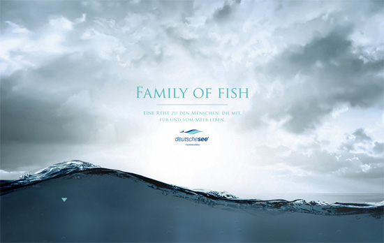
This site prides itself in beautiful photography, and another round of parallax and fixed background peekaboos take advantage of that. The later not just piles on one full-screen image after another though, there are some interesting effects to be had when you make certain areas of a photo transparent. What is unfortunate, though, is that the descriptions in each page are images.
Social Media Weekly
Web Design – What I Learned About the Web in 2011
It’s time to look back on the year that was and see how far we’ve grown as designers and an industry as a whole.
CSS – Six CSS Layout Features To Look Forward To
Several proposed featured by the CSS Working Group to make our laying out webpages easier.
Web Standards – On HTML and CSS best practices
Strive for the best quality possible.
User Experience – Give Your Users A Hollywood Experience
Learn to build for your audience with film metaphors.
