This week’s Friday Focus features designs that incorporate the moon in them.
Designs of the Week
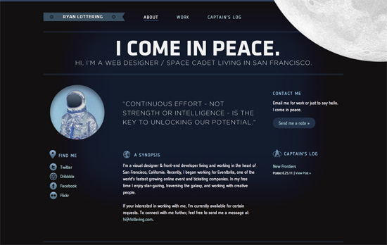
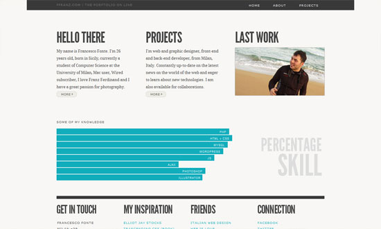
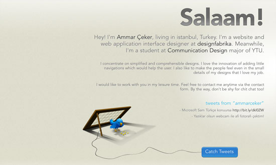
Let’s talk about the moon and how it’s in the top right, in the foreground, spinning oh so slowly—just enough for people to notice it’s moving. Overall look seems simple, but I think it’s effective and still makes an impact. I think it’s interesting that the site labels the homepage as the About page at the same time. One nit to pick, while not visual, is that there are two different email addresses being used in three email links.
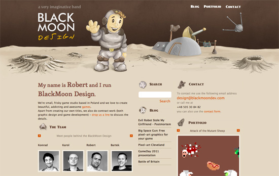
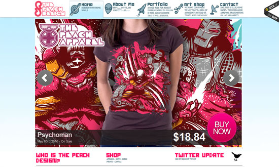
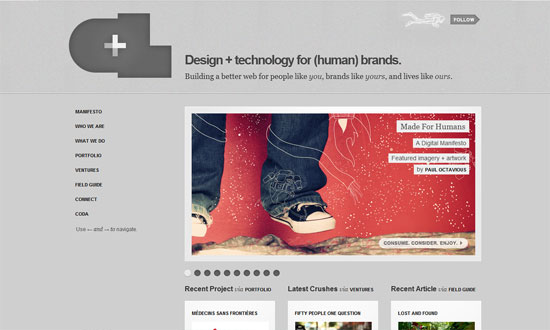
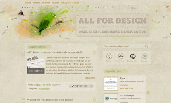
It’s funny how this site also uses the Star Trek logo as one of its icons in keeping with the outer space theme. I love the illustrated, painted look in the header, including the word “design” in the logo (which doesn’t look like just another handwritten typeface). It’d be nice to have the headings as real web fonts now instead of images, but then I discovered that the whole design—and I mean every graphic you see on the page—is one big sprite, so kudos to that!
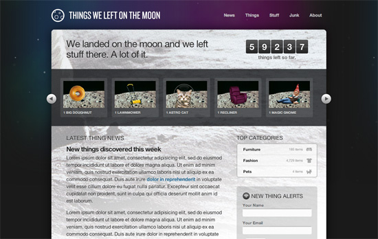
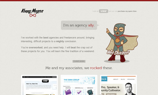
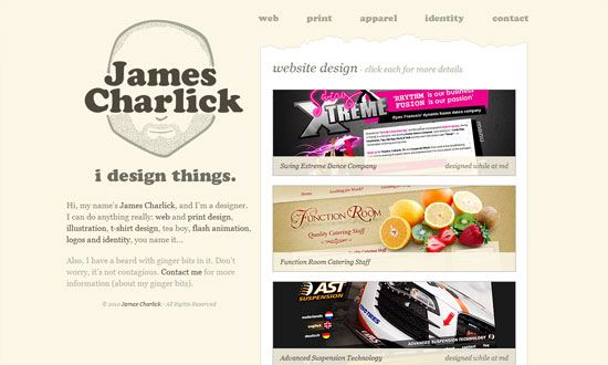
This is just a demo site created by Dan Cederholm for An Event Apart Seattle 2010, but there are a lot of neat things to be inspired by here, particularly CSS3 features in the hover effects and typography. Love the idea of the halftoned moon landing picture as a background. The use of purple is also a nice touch, since it’s easy to just reach out for midnight blue when depicting skies and space.
Social Media Weekly
Mobile Web Design, E-Commerce – Add to Cart: 5 Ways to Improve Shopping on the Mobile Web
Five steps to optimizing online shopping on mobile devices.
HTML5 – The Current State of HTML5 Forms
Check out the latest browser support and techniques for using form attributes in HTML5.
CSS3 – Sizing with CSS3′s vw and vh units
Another set of measuring units included in CSS3, this time based on viewport dimensions.
CSS – The Minimum Page Project
Another iteration on the CSS resets out there. The idea is to avoid redundancy due to broad-sweeping resets.
Design, CSS – Adapted
Reflections on the challenges and options in adapative, responsive web design.
Design, User Experience – Thoughts On Communicating Design
“Communicating design, in general, needs to be less about documentation and more about clear, concise and ongoing two-way communication.”
