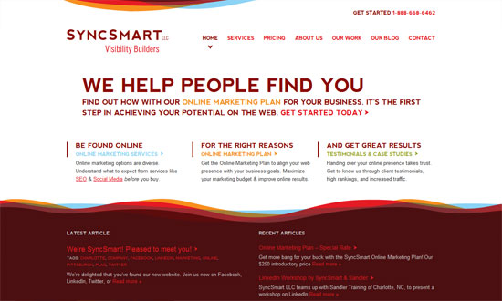
Site layouts are filled with boxes and corners, but not everything has to be so straight-laced. These designs feature touches of something a little more organic: animated waves and curves that soften the look and can even make things more fun. [Read more…]
Friday Focus 05/27/10: In Your Face Illustrations
This week on Friday Focus: illustrations that appear front and center in these websites, because we want them big, bright, and beautiful.
Designs of the Week

Highly detailed and scrumptious “pie chart”! The colorful illustration style and metaphors all the way into the footer not only adds interest but are artfully done.

I just love a design that breaks out of the box. Once again this is a lovely work of art, with touches of calligraphy and fascinating shapes growing out of the swirls. The inside page design is more organized but keeps this look in the header.

It’s great that you can find lots of clickable elements in the illustration itself, and the metaphor really works. The hand-drawn, watercolor style carries over to the other page elements like the icons. I wish the form fields and buttons joined in the fun too.

The center-focused layout works well, as does the bold black text and buttons, greens, and oranges.

Showcasing your work in the biggest, widest way possible is a surefire way to set the look and feel of your site. In this case it’s spilling with bright pinks and trendy type.

Some quieter shades of pink in here but still striking. Notice the recycling of the hearts, stars, roses, and leaves in the rest of this one page site.

Super-wide layout with a sprinkle of parallax, -webkit-transform, and subtle jQuery hover effects. The most exciting portion is the contact form at the footer.

I love this sketchy look accompanied by a pattern of ocean waves. (You can actually download it as a wallpaper if you want.)

This isn’t a groundbreaking layout or look but it somehow feels different. A case of letting the picture speak a thousand works, perhaps?

Topnotch icon work and typography. Just look at it. The vignettes in the corners are a bonus.

Fantastic illustrations, but other design details fall a little short of its elegance and whimsy.

This one, on the other hand, overflows with whimsy! Nothing says it like a unicorn and a mustache sign in icon.

I like that the rabbit and its hole is a mini power line leading in to the next section’s boxes. The slanting boxes and buttons are great too.
Social Media Weekly
CSS – Efficiently Rendering CSS
“I admittedly don’t think about this idea very often… how efficient is the CSS that we write, in terms of how quickly the browser can render it?”
CSS – Using CSS3 Transitions, Transforms and Animation
“These demos are showing of CSS transitions, transforms (2D and 3D) and animations”
JavaScript – Javascript shorthand for cleaner code
“A few ways to save on some bytes in your Javascript code, as well as making it more readable and quicker to write”
Optimization – 46 CRO/Conversion Rate Optimization Resources for Web Design, SEO & Social Media Experts
Friday Focus 12/04/09: Swashes, stripes, swirls
This week on Friday Focus: websites adorned with colorful, abstract flourishes that give movement and energy to the designs.
Designs of the Week
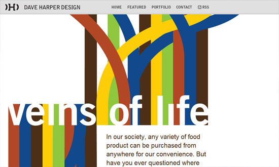
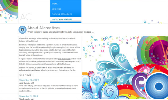
No boxes, barely any straight lines. Just areas of content and the graphics to distinguish the header and footer areas.
The striking graphics here aren’t really part of the overall design but of a specific featured article, and you can expect things to change when the site author publishes a new one. This “art direction” trend/idea is really popular now and a great source of new, ever-changing site designs.
The design needs just a little bit of refining but overall, fun to look at! Check out the icons in the inner pages.
A great photo, a color you can’t go wrong with, and some wavy silhouettes to soften things up, and voila. Stunning.
![]()
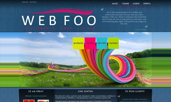
What I really love here is the way the right-side menu was designed. Which is why I’m disappointed the left-side menu doesn’t match. Or why there are two menus on either side like that. Also, there are several fonts used on the site; it can stand to be a little more consistent.
The spacing is a little too tight, and the custom font in the pullquote is not very readable, but other than that I like it.
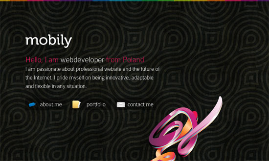
I love how there’s exactly one decorative graphic in the foreground, like a sculpture of sorts. The background pattern is strong too, but not to the point that it’s distracting.
Social Media Weekly
Design – Oldest Design Galleries
Optimization – The real world costs of an heavy website
Business – Contracts 101 – Part 1: Outline
Iceburgg Released
The newest WordPress theme has now been released. Iceburgg sports a white and blue color scheme, intended to give your blog a wintery feeling without being partial to any specific holiday but the season in general. The theme is available for download from the Iceburgg page. If you find any bugs, please report them in the comments of the iceburgg page so I can get them fixed as soon as possible.
Wave for WordPress
While I may have not been writing many new articles lately, I have been doing something else. With the success Prebuilt / Prebuilt 2 has had, I thought it was time to release a new theme, and that theme comes in the form of Wave.
Wave is a three column white / tan / red theme, sporting a clean look while remaining valid XHTML & CSS. Give it a look and download it today.
Leave all your comments about the theme here, as this is serving as the “Announcement Post”.
Note: This is not Prebuilt 3, but an entirely different theme. 🙂
