It’s back to the classroom this week on Friday Focus as we study designs that feature the chalkboard effect on them.
Designs of the Week
Search Optimized, Turn-Key Designs, Unlimited Everything. Start building with the Genesis Framework today.
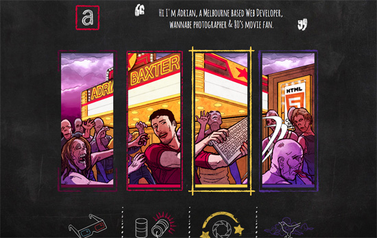
Most blackboard effect designs stick to the the scratchy white on black (sometimes green) look, but this one uses multiple colors (there’s colored chalk, after all). There’s a bit of a movie and zombie apocalypse motif going on in the different pages (even parallaxed on the homepage), all clever ideas as you’ll discover.
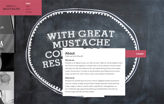
Surprisingly no mustaches in the design, but it’s there in the copy (e.g. “the clients we have shaved”), logo, and favicon. The way this site is laid out isn’t noticeably different at first, but you’ll find things that make you go “hmmm”, like how the portfolio images are in a fixed scrolling panel at the right, and have this stylized “magnifying glass” hover effect. I also find it interesting that the content boxes have uneven edges made up of multiple rectangles.
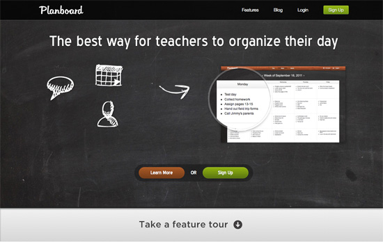
I like how all the info is spaced out nicely and easy to read, but the type in the heading doesn’t match, and for such a tall area, there could have been more info in it. It’s nice how the texture repeats in the footer area though.
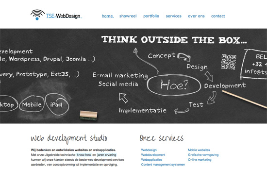
There’s a slide-bounce effect to displaying the “blackboard area” once you load each page, and each heading is a specific design that matches the content. I also like the little underline touch on the menu links and the logo, the kind you find inside Photoshop.
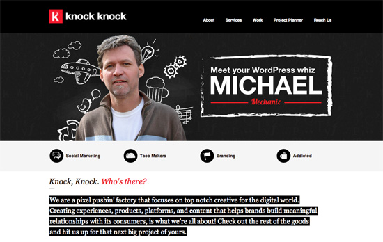
I like the red-white-black color scheme that’s softened a little by the “blackboard area” that mixes actual portraits with scribbled graphic elements. Unfortunately you don’t see that in the rest of the pages, where icons are featured prominently.
Social Media Weekly
Make Headway, make intuitive layouts, make it your WordPress theme of choice!
JavaScript – Thinking Async
“Here’s the rub: when you load JavaScript from a third party you should do it asynchronously. You might want to load your own scripts asynchronously too, but for this article let’s focus on third parties.”
User Experience – Lean ways to test your new business idea
“These techniques allow us to test our business idea while it’s still an idea — before developers have written a single line of code.”
Business – Docracy
“Docracy is a social repository of legal documents. Our mission is to make useful legal documents freely available to the public.”
Web Design – New tools for web design and development: February 2012
“In this new regular feature Mark Penfold rounds up 10 of the best new tools for web designers and developers that we have come across.”
