This week on Friday Focus: websites featuring worlds that will fit right in your browser. It’s an interesting trend and a good exercise in 3D modeling and illustration.
Designs of the Week
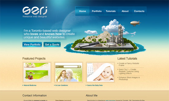
A very beachy color scheme here to match the featured image. I really like the treatment done to the buttons, but I wish the style carried over to the other form elements below. The logo’s really interesting, isn’t it?
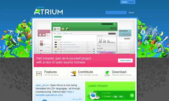
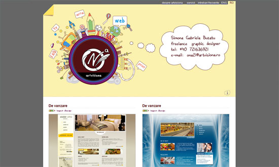
I really love the dark gray mess of icons below the very colorful world above it. But really, every illustration on this site is superb.
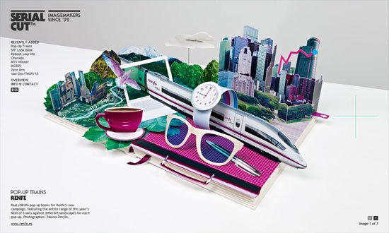
Very simple image-centric design, but the presentation is excellent: clean, full-screen, AJAXy.
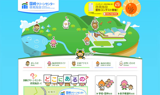
The header image slash world serves as interactive navigation for the site, but there’s also a “formal” navigation menu if the former is too intimidating. As usual the Japanese make use of cuteness (“kawaii”) to communicate ideas, but if you look closer and browse further, you’ll find great attention to detail, usability, and all.
A very straightforward portfolio that is peppered with tiny illustrations as you scroll down. I wish for more quirkiness, but only by a little bit.
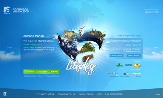
Very blue, very clean, very pleasant. I love that the world is a more creative representation of the original logo. Well-done custom lightboxes everywhere.
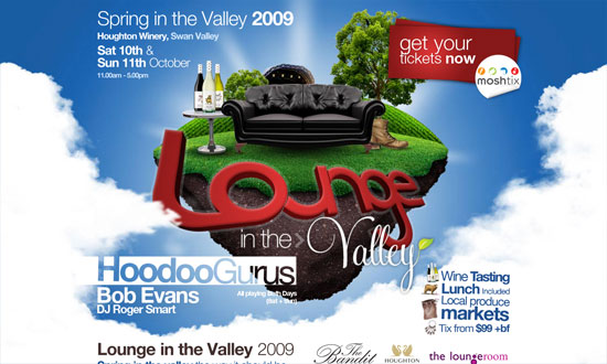
This site looks very similar to the previous one, but it’s very distinct at the same time—in fact it’s bold rather than clean and calm. I like that the upper half of the page is basically an animated poster, and if you’re curious about further details, you can find them below, in the equally fancy footer.
Social Media Weekly
Design – Top 10 UX Myths
Programming – Konami Code: Overview, Examples and Best Practices
Productivity – 10 Awesome Websites That Help You Discover the Best Web Apps
