Happy Friday Focus! Today we’re looking at designs with a bit of a “dip” in them—one content area leading into another with a nice little curve. Can you spot them? Read on!
Designs of the Week
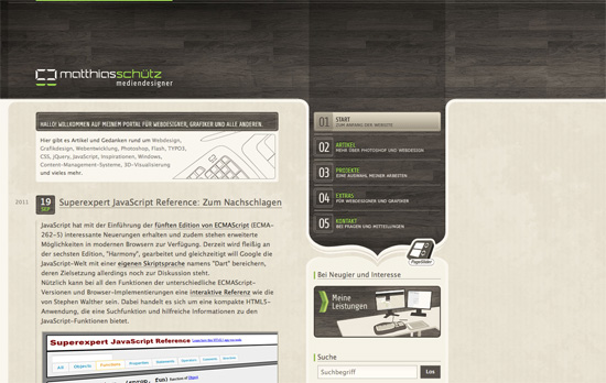
I like the combination of wood, light grunge, stripes, and glossy (web 2.0) green—all used in moderation. This design is the poster child for “the dip” technique I’m talking about: a nice column containing navigation links at the right instead of the usual header area, ending in a curly brace shape pointing downward to the rest of the sidebar.
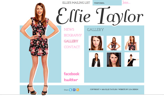
This shade of blue is quite popular for girly sites, especially wedding-themed ones, combined with slab serifs and calligraphic fonts. This one looks a little flat, literally, with no textures or gradients, and the girl looks like a cut-out doll with the stark white shadow!
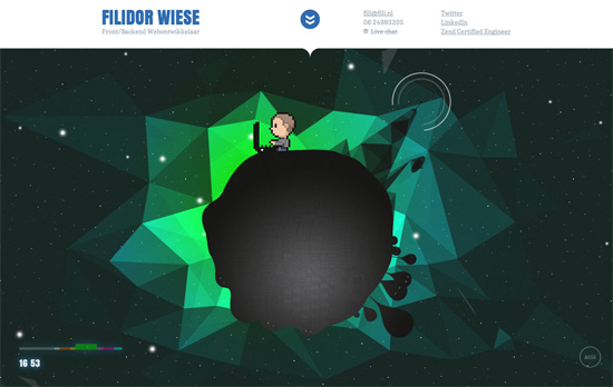
Looking for the content? It’s tucked away in the top drawer. The focus of this design is a parallaxed animation featuring an pixelated rendering of the site owner during different times of the day. Right now the screenshot shows him typing away at his laptop (if you watch long enough, his dog shows up but gets shooed away and floats off into space), but click on the different color swatches at the bottom left and you’ll see him doing other things like dreaming in binary, grabbing coffee from out of nowhere, and playing arcade games. Aside from the fact that the colors per scene are blended really, I think this is a smart, funny way for strangers to get to know this person better, even by a little bit.
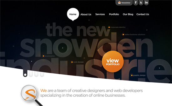
First, while the callouts aren’t interactive, I like how the first slide is styled especially the halo around the “view portfolio” circle. Hovering over the top navigation gives you circular backgrounds, too, but the active ones get pointers and turn into speech bubbles. There are cool slopes marking each section, and inner pages crop off the the very large headings to focus on the content below.
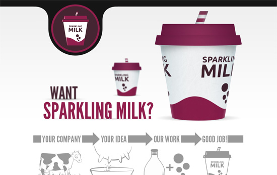
The welcome blurb plays with depth by blurring and resizing objects to make them look like they’re in the background. The illustrations are straightforward, but the use of a patch of grass to separate each section is clever. You must also check out the hover effect on each portfolio item, like a store sign or label. I must say, though, the way the contact form is center-aligned in the footer is a little weird!
Social Media Weekly
Business – How Doing Less Work for More Money Saved Client Work (or) How I Finally Became a Professional Designer
Don’t sell yourself short. Find out how “boundaries will set you free”—as in design itself.
Typography – FontDropper 1000
A bookmarklet that lets you test web fonts on any page.
HTML5 – HTML 5 Canvas Deep Dive
Start learning how to work the canvas, now!
UX, Wireframing, HTML, CSS – Building prototypes in HTML and CSS
A step by step guide to creating frames and flows, live, in the browser.
HTML, Accessibility, SEO – Pagination with rel=“next” and rel=“prev”
Google shows you how to add meaning to your navigation (and help their search engine) with semantic markup.
