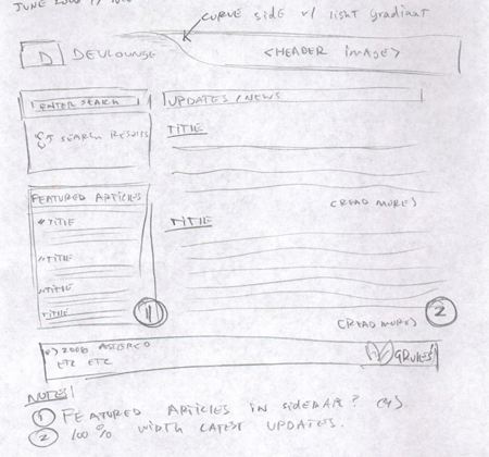
Mock After Mock
With every new week came new ideas from various sources; new things I saw places that I liked, features I wanted to incorporate, and layouting changes I wanted to make. Each week I posted different screenshots on Flickr, getting some valuable responses and suggestions from the community.
In early June, Devlounge would updated to add one of those new features I had planned to add – dubbed Sidenotes. Sidenotes would allow us [the staff] to post tidbits about various tech and web related news – not just full articles. The sidenotes section was just pasted up onto the homepage, with a very simple designed area and a few recent posting links.
That’s when time shifted again, and we began to take the reviews we were getting to seriously. I thought about taking the design, making some changes, and adding huge gradients and larger image headlines – and calling it a day. So much so, that a new picture of “Devlounge 2” went up on Flickr as a messy mock that truly featured nothing different from the actual DL1 design.
Luckily, it was shortly after that I got back on track and started drawing more and more mocks. Finally, I had an idea for one I really liked. It accomplished everything I wanted it to. After turning the rough sketch into a psd and posting it on flickr to a good response (minus a few things here and there that needed tweaking and reworking), I had settled on the DL2 design.

