Finalizing the details
From what the mock looked like on paper, and on screen, DL2 was going to be a nicely redone mod of the original design, with some wholesome AJAX goodness. Upon coding and testing the design for about a month, a lot of those extra features were removed. For example, the ajax search was removed, as well as the concept of a javascript “hot content” rotator, mainly because I never came across the script to accomplish it after I first saw it in action on some random blog.
To make up for it, I added in additional elements, and tweaked out the homepage sidebar to be a lot more functional. Everything on the homepage finally served a purpose – it wasn’t just there for show.
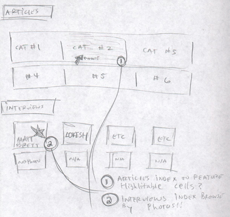
It was now time to put together a few more mocks. After coding up most of the base WP Pages, I sketched out a few more ideas, including one for revamped articles and interviews indexes. They were ideas I had had for awhile, but never got around to implanting.

This included an articles index that was much more organized and easier to navigate then the one that had made an appearance in DL1. Also, I really wanted to have the interviews index be all photos, and very little text. A few days ago, it all came through, after those last two pages were finally completed.
5,4,3,2,1..
Finally, there were a few bugs to workout. It’s extremely important to squash all design bugs prior to a site launch, but I think even more importantly when it’s a redesign launch. Why? Well, as your second, third, fourth time around, etc, visitors will be expected that you get it right – while if the site is fresh and their are a few problems that need working out, visitors will tend to not get as annoyed. I was running into display problems in Opera and for OSX, which pushed relaunch back a day. Finally, I got them figured out, and it was time to go like and put all the months of planning, sketches, wasted papers, and dozens of psds to rest. DL2 was here.
