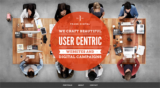
Here’s an interesting micro-trend for website designs: using a bird’s eye view of one’s desk or office workspace as the welcoming image for their pages. Another play with perspective that might surprise you.
Designs of the Week
Pagelines lets you build WordPress websites and it’s as easy as drag and drop, go check it out!
I like the card flip effect in the Portfolio and Blog sections; that diagonal line seems to be the mark of most design agencies out there. There’s a different navigation approach in the About section: services are displayed horizontally with large icons with left and right arrows, but that is just the first sub-section. The four circles with one of them pulsing tell you there’s more content to be had. I’m concerned it might be confusing for some visitors and was done to minimize the page height more than anything.
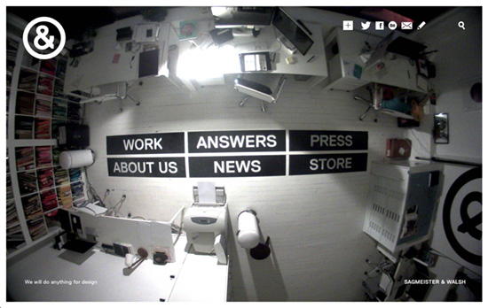
Great that there’s a fisheye effect in addition to the top view, and you can see how grainy and raw it looks compared to other agency “beauty shots”. The design’s in mostly stark black and white. Everything’s contained in a frame as each page slides. On the main portfolio page each work contains multiple thumbnails which you can also go through before drilling down.
Most portfolio sites have dedicated pages for each of their projects, but this may be the first time I’ve seen a site put all of their work on one page and on the homepage with the images in full view, so all you have to do is keep scrolling down. The sticky header keeps track of what you’re browsing with the project title and navigation links. It disappears when you click on the up and down arrows so nothing distracts from the project title/description section, which breaks the flow if you just wanted to skim the page, but ensures you need to scroll down first before you can get a chance to move to the next or previous project.
Social Media Weekly
Ready to go out and design your next website? Try building with the Catalyst Framework.
Web Design – Atomic Design
“Like atoms in nature they’re fairly abstract and often not terribly useful on their own. However, they’re good as a reference in the context of a pattern library as you can see all your global styles laid out at a glance.”
Optimization – Page Weight Matters
“Many of us are fortunate to live in high bandwidth regions, but there are still large portions of the world that do not.”
Javascript – Native JavaScript Equivalents of jQuery Methods: the DOM and Forms
“This is the first in a series of articles showing native JavaScript equivalents of common jQuery methods. While you might wish to wrap some of these in shorter alias-like functions, you certainly don’t need to create your own jQuery-like libraries.”
Design – Google Visual Assets Guidelines Part 1 & Part 2
“In January 2012, expanding on the new iconography style started by Creative Lab, we began creating this solid, yet flexible, set of guidelines that have been helping Google’s designers and vendors to produce high quality work that helps strengthen Google’s identity.”
Typography – British Vogue Gets Top Marks for UX & Branding
“It’s funny. When it comes to design, typography and layout, often we look to the world of print and traditional publishers for examples of ‘getting it right’. After all, for many of the challenges we face in the web design world, they’ve already been there and done that. But while so many of these brands excel in print, a recent study suggests that many are struggling, even failing, to provide their readers with quality experiences online.”