Get a shot of energy by looking at these websites with background animations. How do you tow the line between eye-catching and too-distracting movement? Let’s see:
Designs of the Week
Make Headway, make intuitive layouts, make it your WordPress theme of choice!

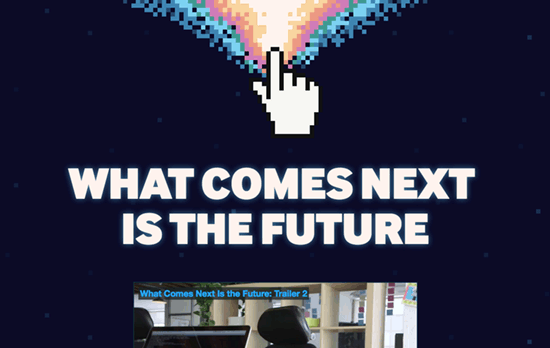
An animated background that spans the whole page longer than a screenful worth of scrolling needs to be subtle enough; here it’s a shower of pixels from that rainbow fountain at the top. I also like the narrow typeface used on the people featured in the documentary, topping off that movie poster feel.

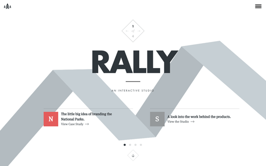
For the most part, the site is your familiar flat and bento look. But the moving folded ribbon in the hero area is just the right amount of hint at something elegantly interactive, which unfolds to become the background of the menu when you click on it and becomes a fixed navigation bar when you scroll down. Simple but brilliant. Another detail I like: the diamond above the name that also folds just a little when you hover on it.

Homepage heros are the new splash / loading screens, but rather than one big, bold photograph, it’s a bunch of smaller icons that also happen to be animated. It makes for a fun, quirky look that immediately transmits what the brand is about.
Social Media Weekly
Get solid WordPress themes, plugins, and web design training from iThemes.
CSS – The Languages Which Almost Became CSS
“It happens that many of these other options include features which developers would love to see appear in CSS even today.”
UX – Hamburger Menus and Hidden Navigation Hurt UX Metrics
“Discoverability is cut almost in half by hiding a website’s main navigation. Also, task time is longer and perceived task difficulty increases.”
