This week we’re looking at online magazines—quarterlies, monthlies, and everything in between. Let’s see what parameters must be taken into consideration when publishing on the web while maintaining that editorial feel.
Designs of the Week
Make Headway, make intuitive layouts, make it your WordPress theme of choice!
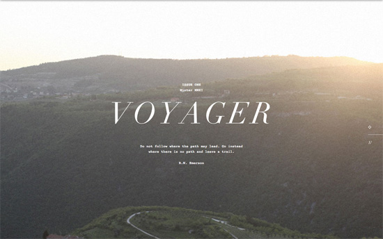
Typewriter text, filtered photographs, and Didone headings all come together for to create that minimal, vintage feel. I love how the text stays put as each “polaroid” scrolls upward, and then the whole page slides up to uncover the next one. There’s also a couple of nice details when you hover on the tiny icons on the right side: you get information on the location, year, camera, and lens used for the photos.

Although there aren’t any unique layouts per article the diversity of photos keeps things interesting. Some articles have slideshows in them, and you’ll see each one stacked on top of the other unless you decide to view all of them in full screen. You can scroll one by one vertically, or check out the slide-out menus: table of contents on the right, categories on the left. It’s also interesting that the design mixes a narrow uppercase font with the serifs.
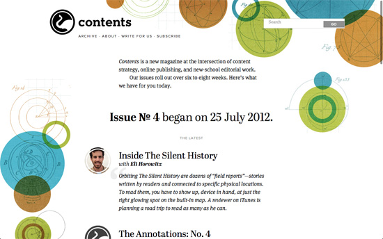
Love the repeating circular elements, from the logo, to the background illustration, to the avatars, to the bullet points.

Another very retro look, between the old baseball photos, the narrow article columns, and the typeface choices. The see-through bar containing the logo is another favorite trick these days.
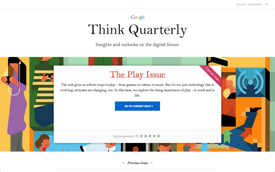
There’s a simple homepage here, with full-width slider backgrounds and a list of issues. Inside you get a side menu for easy access to each article, past issues, and of course, search. What’s cool is when you hover on one you get a big title over the main viewport. Clicking on search produces an even larger, gigantic actually, search box.
Social Media Weekly
Build on DIYThemes’ Thesis Framework for rock solid SEO and great layout customization options.
Web Standards – Why I’m so excited about Web Platform Docs
“I absolutely love developing for the clientside of the web. Delivering the actual interactions and UI that all users feel is an absolutely gratifying experience. However… it’s not a piece of cake to develop for all desktop browsers, mobile browsers, and all the device/OS combinations within.”
CSS – Specificity Calculator
“A visual way to understand CSS specificity. Change the selectors or paste in your own.”
Responsive Web Design – Stop using the viewport meta tag (until you know how to use it)
“Lots of non-responsive websites are using the viewport tag without noticing how harmful it can be for the users, or they are using some of the viewport parameters “just because somebody copied and pasted them there”.”
