Remember when styling website headlines meant choosing between Times New Roman and Arial? How far we’ve come. Today, I want to show you a quick way to jazz up your website or blog headlines by combining @font-face with pure CSS letterpress styles.
You can use your favorite @font-face font, although for the letterpress to shine through you’ll want to stick with a boldfaced font. Go download an @font-face kit of your choice. I’m using the lovely Acknowledgement, which is big and bold and in-your-face, in my example.
This is my sample HTML:
[html]
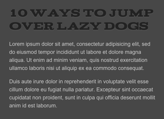
10 Ways To Jump Over Lazy Dogs
Lorem ipsum dolor sit amet, consectetur adipisicing elit, sed do eiusmod tempor incididunt ut labore et dolore magna aliqua. Ut enim ad minim veniam, quis nostrud exercitation ullamco laboris nisi ut aliquip ex ea commodo consequat.
Duis aute irure dolor in reprehenderit in voluptate velit esse cillum dolore eu fugiat nulla pariatur. Excepteur sint occaecat cupidatat non proident, sunt in culpa qui officia deserunt mollit anim id est laborum.
[/html]
Now for my stylesheet. First, I want to define my @font-face style:
[html]
@font-face {
font-family: ‘AcknowledgementMedium’;
src: url(‘Acknowledgement-webfont.eot’);
src: local(‘☺’), url(‘Acknowledgement-webfont.woff’) format(‘woff’), url(‘Acknowledgement-webfont.ttf’) format(‘truetype’), url(‘Acknowledgement-webfont.svg#webfont’) format(‘svg’);
font-weight: normal;
font-style: normal;
}
[/html]
Basically, I’m specifying that the font-family named AcknowledgementMedium can be found in the same directory. Now, for the letterpress style:
[html]
h1.fontface {font: 40px/44px ‘AcknowledgementMedium’, Arial, sans-serif; letter-spacing: 0;color:#222;
text-shadow: 0px 2px 3px #555;}
[/html]
Here, I’m calling the AcknowledgementMedium @font-face, setting the color, and- the letterpress magic bit- the text-shadow.
Remember, the text-shadow element is defined like so (learn more about text-shadow here):
- x-offset or the horizontal offset. Unnecessary for this effect.
- y-offset or the vertical offset. Two pixels is all we need.
- shadow blurriness
- shadow color
And this is what it looks like:

You can see the live example here.
Once you have a good grasp of how text-shadow works, the possibilities are endless. Play with different shades of a color, create drop-shadows, all on a variety of fonts thanks to @font-face.
