• Home
  • About
  • Contact
  • Advertise

Devlounge

Design, Develop, and Grow

ateşli sevgilisi fantezisini yaşamak istediğini söyler porno ona arkadaşları varken onunla gizli saklı seks yapmak istediğini sikiş söyleyen kız hafta sonu için gelen arkadaşının görmediği bir sikiş açıdan sakso çekmeye başlayınca adamın yarağını bu altyazılı porno şekilde indiremez ve açık şekilde salonda sikişimeye sex izle başladıklarında misafir kızı da bu sekslerine rokettube konuk ederler seks yapacağını düşünmeyerek onun sex izle oyun oynadığını zanneder sabah olur ve herkes uyanır hd porno bu sırada yanında şişme mankenini de getiren sapık erotik hikayeler genç sınav haftası ders çalışan genç adam üvey annesinin sikiş eve gelmesiyle hayatının şokunu yaşar

  • Home
  • Code
  • Design
  • Design Focus
  • Interviews
  • Publishing
  • Strategy
  • Webapps
  • Extras

Design Focus: New Age Editors

March 1, 2014 By Sophia Lucero

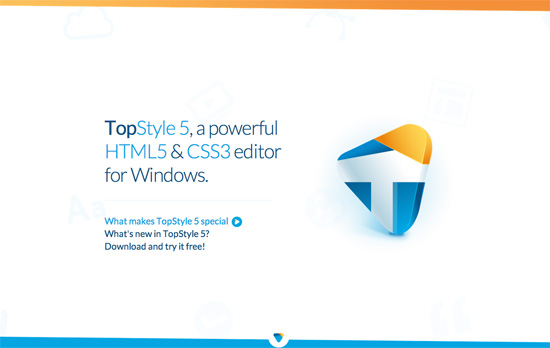
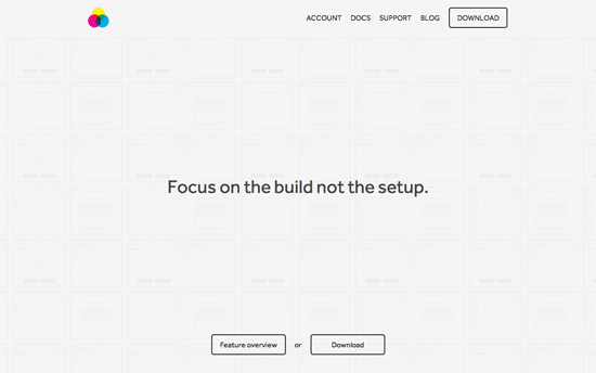
Check out these modern tools that will help you build websites faster and better than ever before, and the design patterns they employed for their landing pages—from animations to familiar color schemes.

Designs of the Week

Want your site to be as good-looking and inspirational as these? Start by choosing a well-designed theme from ThemeForest.
TopStyle
TopStyle
Mixture
Mixture
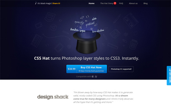
CSS Hat
CSS Hat
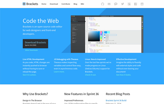
Brackets
Brackets
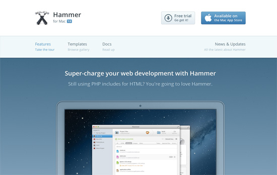
Hammer for Mac
Hammer for Mac
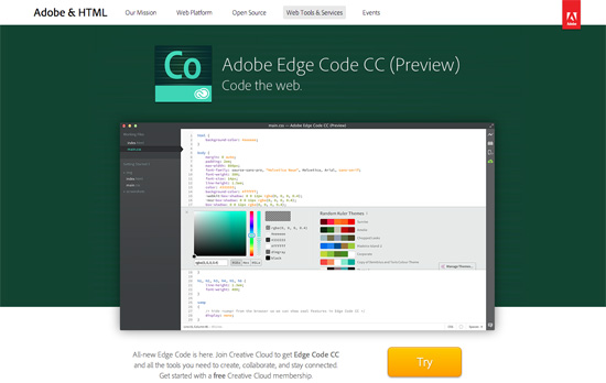
Adobe Edge Code CC
Adobe Edge Code CC
Koding
Koding
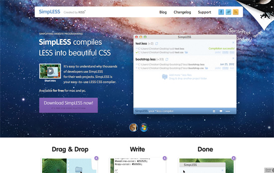
SimpLESS
SimpLESS
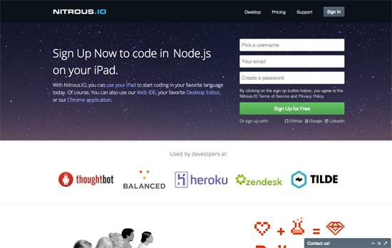
Nitrous.IO
Nitrous.IO
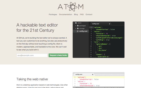
Atom
Atom

Social Media Weekly

Ready to go out and design your next website? Try building with the Catalyst Framework.

Web Standards – Code Guide by @mdo
“Standards for developing flexible, durable, and sustainable HTML and CSS.”

Design – The Troublesome Misconception of Parallax in Web Design.
“The sites above are either using different scroll effects to simulate movement of objects not naturally expected by the user, or simply sliding two planes over one another at different scroll speeds.”

User Experience – How we work
“We always start by trying to understand the problem: the users of the website or product, the organisation on their customer strategy, the goals and needs of the project, who’s in charge and who isn’t.”
Design Focus: Tidy Grid Portfolios

November 30, 2012 By Sophia Lucero

Grids are an absolute must when building any design, but this week’s featured sites apply the rhythm of an even grid to lay out their portfolios, becoming the first and pretty much only thing you see when you come visit them. The result is a very neat look—or perhaps stark to other pairs of eyes—but very honest.

Designs of the Week

Pagelines lets you build WordPress websites and it’s as easy as drag and drop, go check it out!

Ben Quinn's website
Ben Quinn

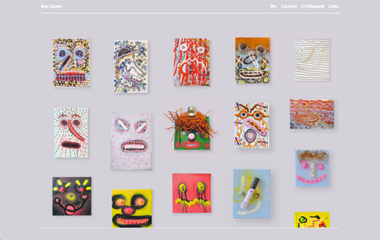
I like the little detail of the fixed header and footer on a layer above the scrolling content. The portfolio items all look similar but they don’t have the same form factor, so there’s an interesting play between uniformity (in the look) and diversity (in the shapes), but still not chaotic. Only question I have is if the white text is readable enough on that shade of gray.

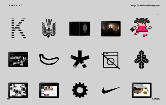
Lanzart website
Lanzart

I find extremely interesting and delightful that animations and icons are used in the portfolio grid instead of the usual thumbnails. Makes you curious enough to see what they are a part of while standing alone as ideas of their own. Fixed elements at the four corners of the screen are at play here, too.

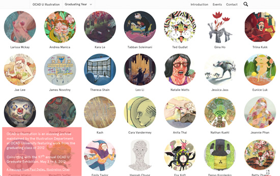
OCAD U Illustration website
OCAD U Illustration

Beautifully responsive and AJAXy, with a little animation applied to the background pattern of the info box in the bottom. GIFs are making a comeback with designy sites. Also expectedly loses the circles and the layout in the inner pages.

Social Media Weekly

Create unique, extraordinary websites with Squarespace. No experience necessary!

Responsive Web Design – Viewport Resizer
“The smartest way to share your defined environment of devices and breakpoints directly with your team and client.”

Responsive Web Design – Responsive Menu Concepts
“Three of them are made with pure CSS and one uses a single line of JavaScript.”

CSS, Debugging – 20 Mobile/Desktop Browser bugs and tricks any Senior Frontend Web Developer should know
“This article is recommended for ADVANCED developers.”

JavaScript, Debugging – You Really Should Log Client-Side Errors
“Too few websites log JavaScript errors. Let’s build a simple system to track client-side errors.”

Interaction Design, User Experience – Hover States
“New & interesting examples of movement in interaction design, curated by Chambers Judd.”

Typography, CSS, User Experience – Please Stop “Fixing” Font Smoothing
“The antialiasing mode is not a “fix” for subpixel rendering — in most cases it’s a handicap.”

Design Focus: Horizontal Storytelling

August 3, 2012 By Sophia Lucero

This week’s featured designs use the not-so-common method of horizontal scrolling to tell their stories, each screenful an idea to absorb on your way to getting to know them fully.

Designs of the Week

Create unique, extraordinary websites with Squarespace. No experience necessary!

Small Studio website
Small Studio

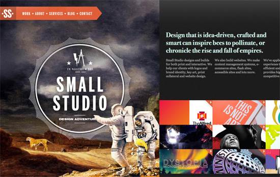
I love the illustrations, which fit the whole storybook vibe that most horizontal scrolling sites carry. Especially that wide panorama “painting” inside the frame—you don’t see that sort of thing online! There’s no ‘you are here’ indicator in the fixed top left menu, but it’s kind of a good idea that it fades in and out while in the process of scrolling, like a visual cue that you’re doing something. Even the way the site stops on the far right, with book spines, is pretty brilliant.

Reality LA Ruth Series website
Reality LA Ruth Series

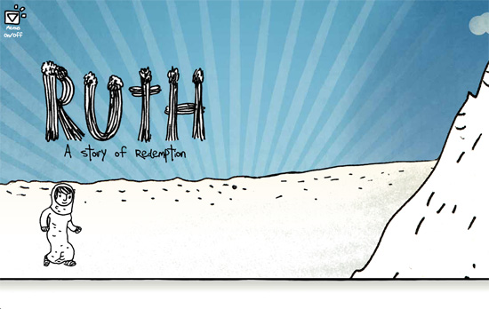
Walking animated character, flying in and moving objects, and subtle parallax effects—all token components of this design genre. I also appreciate that the text in each banner uses true webfonts.

ParaNorman website
ParaNorman

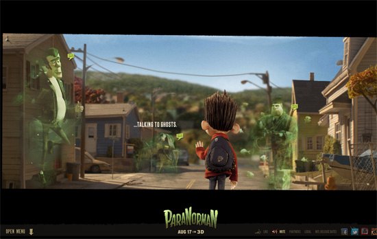
The whole look and feel of the movie touches everything here, even the social media icons on the lower right. The fly-out menu meanwhile slides vertically from the bottom, which isn’t too usual, and it’s one big collection of images, which also makes sense since the site is extremely visual and users will remember the pages better by the scenes they’re about.

Social Media Weekly

Search Optimized, Turn-Key Designs, Unlimited Everything. Start building with the Genesis Framework today.

Responsive Web Design, Email Newsletter Design – Responsive Email Design
“In this guide, we’ll look at why designing for mobile has become a necessary skill for email designers, cover the fundamentals of designing and building a mobile-friendly email and back it all up with some neat tips and techniques.”

SEO, Semantics, Web Standards – On web semantics
“Up until today authors were not always certain about what HTML element to use for what functional unit in their HTML page, though, and “living” specs like HTML 5 require authors to keep an eye on what elements will be there going forward to mark up what otherwise calls for “meaningless” fallback elements like div or span.”

CSS – Creeps and Weirdos in the CSS Spec
“So in this post, I’ll run through a bunch of things from the CSS specifications that you might not have heard of yet. None of this is even close to ready to use (unless it degrades really gracefully), but it will serve to get you familiar with some of the rounded corners and drop shadows of the future.”

Web Standards – A future friendly workflow
“User experience director Luke Brooker explains the thinking behind the Future Friendly initiative and how it can help adjust your workflow.”

Friday Focus 05/04/12: Comic Book Style

May 4, 2012 By Sophia Lucero

This week’s Friday Focus shines the spotlight on designs with comic book-inspired aesthetic, each with its distinct take on the kick-butt art form. Check ’em out after the jump!

Designs of the Week

Get solid WordPress themes, plugins, and web design training from iThemes.

Drift Boys website
Drift Boys

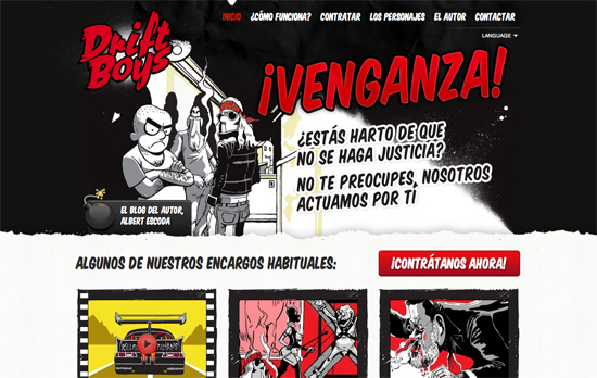
Stylized elements everywhere, from the splatters and tears to the comic book fonts, plus a bold red-black-white color palette for maximum impact. On art portfolio sites it’s always a good idea to showcase your work as much as possible, so using a variety of them in the header of each page, as well as a different character for the contact link that slides in when you reach the bottom, all works out nicely.

Jean Delbrel's website
Jean Delbrel

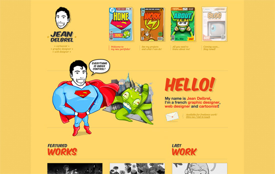
I really like the choices done on this site; it’s clean and simple looking but still carries a lot of personality thanks to the illustrations. Using comic book covers with superhero insignias in the top navigation menu is genius. The striped shadows everywhere are also a neat subtle touch and highlights the attention to detail that went into the design. The yellow, of course, is to cap off the energetic vibe that comes with comic book titles.

Glamour.biz website
Glamour.biz

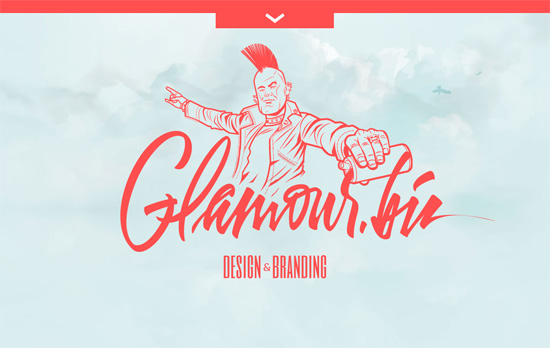
You get a minimal homepage but on the inside, it’s jam-packed with illustrations from corner to corner, also highlighting the foreground-background interplay with blurring and shadow treatments, even overlapping the pull-out menu. The text, meanwhile, is split right in the middle for a two-column layout.

Bobadilium website
Bobadilium

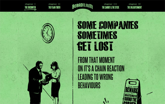
A bit much of the all-caps text (and Courier) for my liking, but a nice storytelling approach going on here, with small animations sprinkled all over the place. It’s also cool how the top menu changes color to match each section. It’s like a masked text with the background peeking through, although upon inspection it’s faked using sprites.

Kitschen Sink website
Kitschen Sink

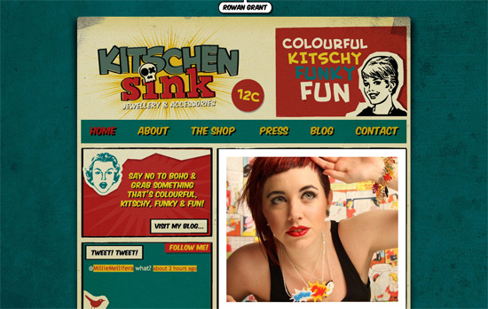
Here’s another popular color palette especially for vintage comics. Comic book panels applied to websites also lend themselves to compartmentalized, bento layouts.

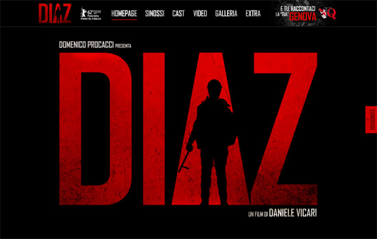
Diaz - Don't clean up this blood website
Diaz - Don't clean up this blood

Some people may be tired or no longer impressed with the parallax effect but it’s still interesting to see what others come up with (e.g. here there’s a broken glass graphic element that turns up in the Cast section). The site also feels like one long movie poster.

Social Media Weekly

Search Optimized, Turn-Key Designs, Unlimited Everything. Start building with the Genesis Framework today.

CSS – Cross-Browser Debugging CSS
“CSS has an underlying design and when you work with it, with the natural flow of how CSS is meant to be used, you will find you have a lot less bugs.”

Mobile Web Design – A non-responsive approach to building cross-device webapps
“The general approach involves classifying your visitor’s device into the right device class, and serving the appropriate version to that device, while maximizing code reuse between versions.”

Web Design – You’re not at the cutting edge and that’s fine
“Feeling like you’re falling behind with the pace of technological change? Don’t worry too much, the cutting edge of any industry moves faster than you can and web is no different.”

Friday Focus 11/11/11: Happening Today

November 11, 2011 By Sophia Lucero

We’re curating a short list of sites celebrating this lovely date. Happy 11-11-11 Friday Focus!

Designs of the Week

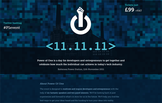
Power of One website
Power of One

It’s interesting how the most important information on this page form this triangle: the hashtag, the ticket price, and the date/venue. What’s really great in this design is how the illustrated portraits have transparent areas so the pixelated background shows through as you scroll. The logo, of course, is also brilliant.

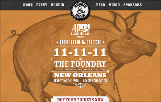
Abita Beer Presents Boudin & Beer website
Abita Beer Presents Boudin & Beer

Beautiful typography and layout per section on this one-page site, although it sometimes gets to the point where the centered logo (which rotates when you hover on it) seems a little too large for the page. The fixed background effect is no parallax, but it’s quite attractive just the same.

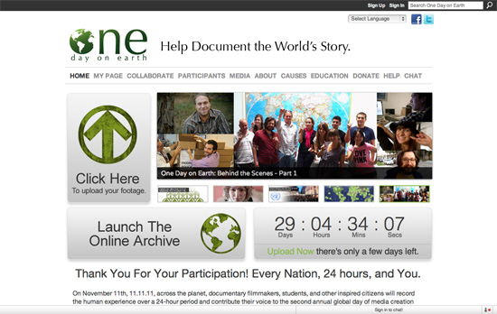
One Day on Earth website
One Day on Earth

I wish we could see more of the textures in the graphic elements elsewhere on the page. Using that particular shade of green as hyperlinks should only be done in moderation, and not everywhere.

Build 2011 website
Build 2011

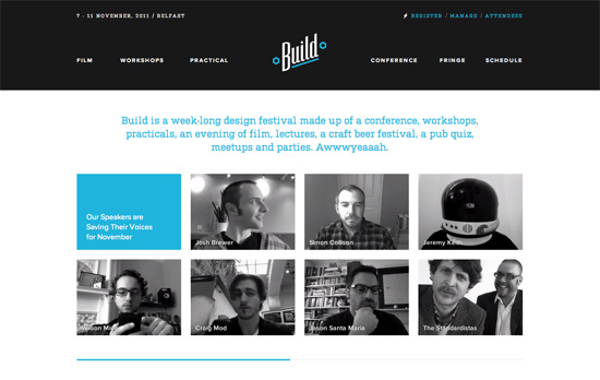
Very clean and seemingly website that just puts everywhere in the right place. What will grab your attention are the “video avatars” of the conference speakers, which play on repeat. I’m a little surprised these weren’t displayed in the Workshops page.

Social Media Weekly

CSS – Centering in the Unknown
“When it comes to centering things in web design, the more information you have about the element being centered and its parent element, the easier it is. So what if you don’t know anything? It’s still kinda doable.”

Accessibility – A common accessibility platform
“There needs to be more of a balance in favor of resources directed towards accessibility, and it is up to us in the community of web professionals to champion web accessibility to browser vendors.”

Next Page »

Code & Tutorials

Which Front-End Development Languages Will Grow in 2017?

Your Guide to Leveraging APIs as a Developer

Bitcoin Processing Website Integration For Web Developers

Website Security For 2016 That All Developers Need To Know

5 Reasons You Need to Be Using jQuery

About Devlounge

Want to read more about Devlounge, or maybe you want to contact us, or even advertise? Oh, and don't forget to subscribe to updates!

The Best of Devlounge

4 Tips to Personalize E-Commerce Websites

Search