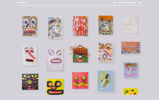
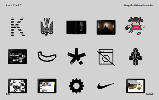
Grids are an absolute must when building any design, but this week’s featured sites apply the rhythm of an even grid to lay out their portfolios, becoming the first and pretty much only thing you see when you come visit them. The result is a very neat look—or perhaps stark to other pairs of eyes—but very honest.
Designs of the Week
Pagelines lets you build WordPress websites and it’s as easy as drag and drop, go check it out!

I like the little detail of the fixed header and footer on a layer above the scrolling content. The portfolio items all look similar but they don’t have the same form factor, so there’s an interesting play between uniformity (in the look) and diversity (in the shapes), but still not chaotic. Only question I have is if the white text is readable enough on that shade of gray.

I find extremely interesting and delightful that animations and icons are used in the portfolio grid instead of the usual thumbnails. Makes you curious enough to see what they are a part of while standing alone as ideas of their own. Fixed elements at the four corners of the screen are at play here, too.

Beautifully responsive and AJAXy, with a little animation applied to the background pattern of the info box in the bottom. GIFs are making a comeback with designy sites. Also expectedly loses the circles and the layout in the inner pages.
Social Media Weekly
Create unique, extraordinary websites with Squarespace. No experience necessary!
Responsive Web Design – Viewport Resizer
“The smartest way to share your defined environment of devices and breakpoints directly with your team and client.”
Responsive Web Design – Responsive Menu Concepts
“Three of them are made with pure CSS and one uses a single line of JavaScript.”
CSS, Debugging – 20 Mobile/Desktop Browser bugs and tricks any Senior Frontend Web Developer should know
“This article is recommended for ADVANCED developers.”
JavaScript, Debugging – You Really Should Log Client-Side Errors
“Too few websites log JavaScript errors. Let’s build a simple system to track client-side errors.”
Interaction Design, User Experience – Hover States
“New & interesting examples of movement in interaction design, curated by Chambers Judd.”
Typography, CSS, User Experience – Please Stop “Fixing” Font Smoothing
“The antialiasing mode is not a “fix” for subpixel rendering — in most cases it’s a handicap.”
