This Friday Focus we’re putting a spotlight on designs that exaggerate pixel sizes for a mosaic, rugged look.
Designs of the Week
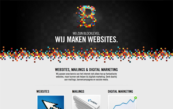
I like the dark on top, light at the bottom look. I also like how the pixel pattern looks random but when you look more closely it’s repeated 3-4 times already. Interesting thing about their portfolio slider is that it goes both sideways and vertically, but the visual cue for the latter appears only on hover. Another notable decision here is that the description of their services comes before the slideshow (which usually appears as the heading).
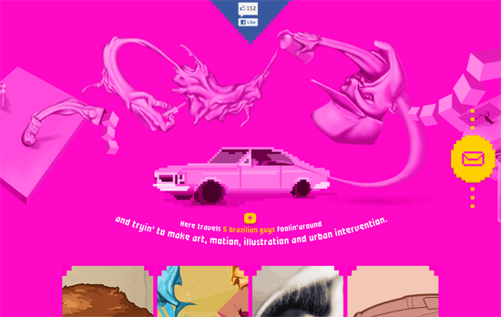
Love the surreal, Escher-esque illustration at the top, its liquid smoothness contrasting with the rough pixeled edges elsewhere. I also like that when you click on a portfolio item, the display is prefaced by “proudly presents”. Only two concerns I noticed would be: that blasted Facebook like button; that close button doesn’t really look like an “x” icon (but it does look like a real life button).
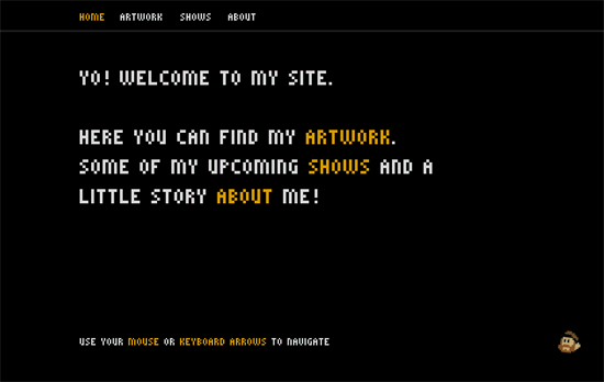
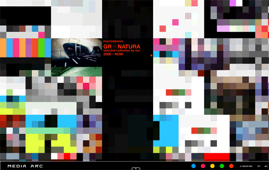
I think pixelated type everywhere eventually tires the eyes, and in this day and age, this Flash site could have very well been done in pure HTML/CSS/JS. The oversized cursors is amusing though.
Simple, colorful, and even has keyboard navigation!
Now this is a good example of using Flash to your advantage, although I’d wish the animations moved more slowly, or could be stopped.
Light, clean, and fresh-looking. I’m surprised the featured project section only contains one site, though—I would’ve added a link to the portfolio below the description.
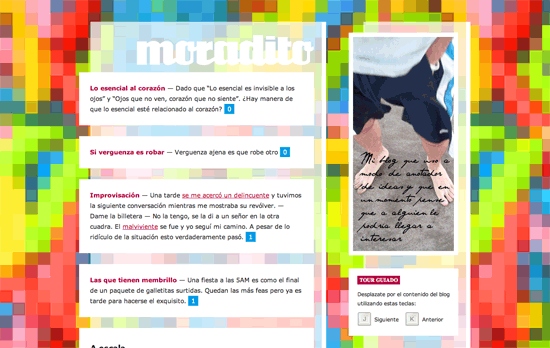
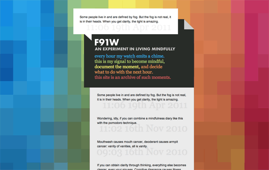
I like the rainbow effect on the description text to echo the background. The search box just needed to be blended in better.
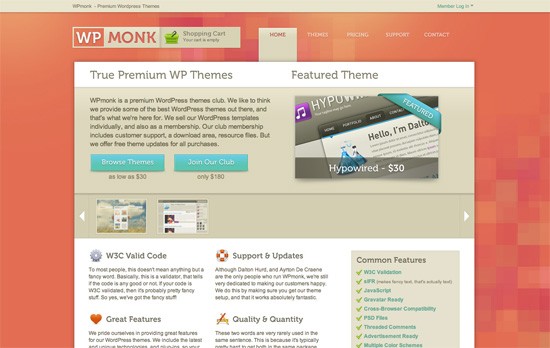
Love the hues and graphic work on the interface elements, which would be even better if they were in native CSS3 effects and custom fonts. Interesting choice to add the shopping cart status right next to the logo.
Dare I say this site is pixel perfect? Everywhere I look, there are details I just fall in love with. Just an excellent model for a pleasant online shopping experience.
Social Media Weekly
Design – How Much Design Is Too Much Design?
“…it does seem to me that, as much as we talk about the cruciality of design to the success of software that it’s also true that having too much design is often counter-productive.”
Optimization – Book of Speed
“The business, psychology and technology of high-performance web apps”
User Interface Design – Asciiflow
Draw tables in ASCII.
HTML5, JavaScript – Learning Canvas: Making a Snake Game
“In this tutorial I’m going to show you how to make a simple snake game using canvas. You know, like you used to get on your Nokia phone.”
CSS – Sprite Cow
“Sprite Cow helps you get the background-position, width and height of sprites within a spritesheet as a nice bit of copyable css.”
