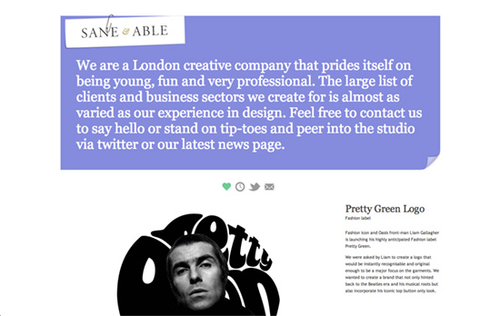
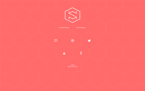
Keeping it colorful is a good technique, and sometimes you don’t have to slap on every color in the rainbow to do it. Switching colors adds a lively, dynamic characteristic to your design.
Designs of the Week
Make Headway, make intuitive layouts, make it your WordPress theme of choice!

Changing the background color as you scroll—into very deep, saturated ones at that—is a tad risky on the accessibility front, but it is quite the attention-grabber.

Apart from the introductory paragraph and a recurring page flip graphic there’s hardly any design elements elsewhere, just straight up content. For a wide site the navigation is extremely minimal as well: just icons on a translucent background which become affixed to the top as you scroll down.

Small icons and even tinier text on a beehive layout. The rippling hover effect and the subtle speed of fading when you click on the logo feels very zen, although the colors are anything but.
Social Media Weekly
Get solid WordPress themes, plugins, and even design training from iThemes.
Web Standards – 20 tips for building modern sites while supporting old versions of IE
“By focusing on stable standards, you’re ensuring that your customers will be able to have the experience they’re expecting and your site will be more maintainable.”
Optimization – Front-end performance for web designers and front-end developers
“Hopefully this article will serve as a decent introduction for anyone wanting to start learning about perf, and making their front-ends blazingly fast.”
Responsive Web Design – The Numbers Behind HigherEd RWD
“The numbers that I track are by no means the whole story when it comes to performance, but I find them interesting.”
Design, User Experience – The Button Test
“Buttons can be your site’s most recognizable brand element besides your logo. A well-designed, unique button style can be the key to establishing and maintaining trust in your site.”
Design – All about Masks in Photoshop
“At the beginning of December I shared some Photoshop Layers tricks and shortcuts that I collected over the years. Today I’m doing something similar in a post that is all about masks in Photoshop.”
Web Design – What We Learned in 2012
“In both the web and in our greater community, I see people despair that change doesn’t happen more quickly. That we can’t make the world better overnight. But if this year has taught me anything, it is that we can’t ignore the hard work that needs to be done.”
