• Home
  • About
  • Contact
  • Advertise

Devlounge

Design, Develop, and Grow

ateşli sevgilisi fantezisini yaşamak istediğini söyler porno ona arkadaşları varken onunla gizli saklı seks yapmak istediğini sikiş söyleyen kız hafta sonu için gelen arkadaşının görmediği bir sikiş açıdan sakso çekmeye başlayınca adamın yarağını bu altyazılı porno şekilde indiremez ve açık şekilde salonda sikişimeye sex izle başladıklarında misafir kızı da bu sekslerine rokettube konuk ederler seks yapacağını düşünmeyerek onun sex izle oyun oynadığını zanneder sabah olur ve herkes uyanır hd porno bu sırada yanında şişme mankenini de getiren sapık erotik hikayeler genç sınav haftası ders çalışan genç adam üvey annesinin sikiş eve gelmesiyle hayatının şokunu yaşar

  • Home
  • Code
  • Design
  • Design Focus
  • Interviews
  • Publishing
  • Strategy
  • Webapps
  • Extras

Design Focus: Highlighted

September 27, 2013 By Sophia Lucero

The sites we’re discussing this week have translucent markings and shapes floating on top of the main content, as though they’ve been annotated with bright, neon highlighter markers. Do they add new depth to the designs or do they look distracting?

Designs of the Week

Want your site to be as good-looking and inspirational as these? Start by choosing a well-designed theme from ThemeForest.

Between Red & Toe
Between Red & Toe

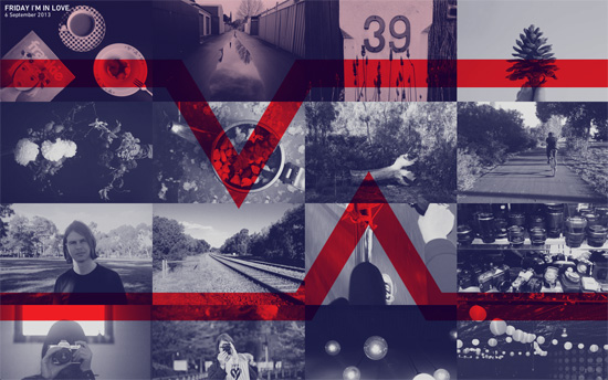
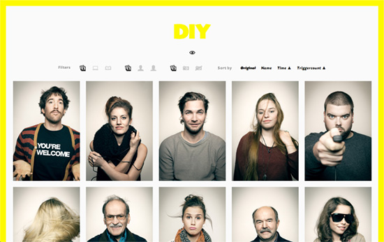
The homepage is a a gallery of pictures included in each of the blog’s posts. There’s no other means of navigation except through those photos. Hover on one box also hovers over the adjacent ones, but because the number of photos per post isn’t a uniform number, the hover state happens across multiple rows. On the post page, the header is parallaxed and hide under the post content as it scrolls into view.

Connect The Dots
Connect The Dots

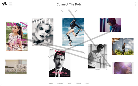
Each time a new screen loads, new line paths animate and cross over the different images and content. You could look at it as the more prominent version of the spinner gif or loading bar. In a way it feels like graffiti that breaks the neutral, minimal look of the site.

Sunera
Sunera

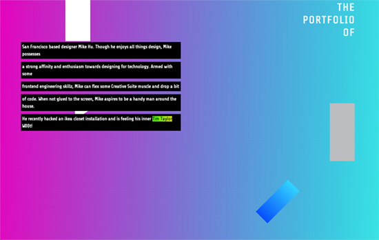
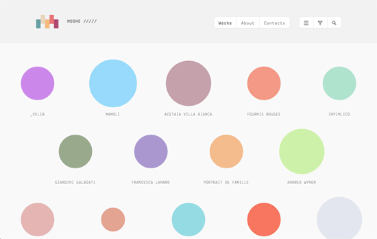
Besides being used as a pattern on the slider photos and the hover tint for the portfolio images, the bright green also highlights other graphic elements to another largely black and white design. It is, however, unreadable as a link color.

Akershus Eiendom
Akershus Eiendom

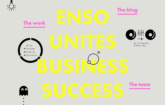
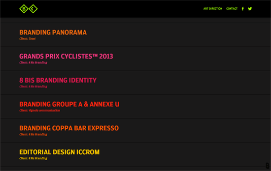
Similar approach here, although it’s basically just rectangles.

Boat Studio
Boat Studio

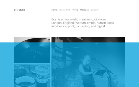
That blue is a little amusing actually because you know that by the name of the studio, it symbolizes a body of water the site is “floating” on. After you leave the site for a while there’s a screen saver effect going on where the content disappears for a while and a slideshow of the portfolio appears.

Social Media Weekly

Search Optimized, Turn-Key Designs, Unlimited Everything. Start building with the Genesis Framework today.

Optimization – Tools for image optimization
“Where possible, it’s best to try automating image optimization so that it’s a first-class citizen in your build chain. To help, I thought I’d share some of the tools I use for this.”

User Interface Design – On Writing Interfaces Well
“Aesthetics are debatable, but writing is essential. Peel away the layers of styling and you’ll be left with words. Writing is the meat of a design, and it’s one of the hardest things to get right.”

CSS, Responsive Web Design – 7 Habits of Highly Effective Media Queries
“t’s important to understand that not every aspect of your design needs to neatly fit into small, medium or large breakpoints.”

Design Focus: Neon

August 23, 2013 By Sophia Lucero

Bright colors are in, and not just any kind of bright, but neon. Are these site designs over the top or on the mark?

Designs of the Week

Want your site to be as good-looking and inspirational as these? Start by choosing a well-designed theme from ThemeForest.

Mikey Hu
Mikey Hu

I like how the header text, with an “origami” styling, breaks into pieces when you start scrolling down; some of which changed colors. The dark background also fades into brighter gradients until you reach the portfolio grid below. Clicking on one item loads a page where the images have neon green placeholder backgrounds—a little painful to the eyes if they take a while for the actual content to load.

Enso
Enso

There’s something increasingly familiar and common about black text and graphic elements on light gray/tan backgrounds, like it’s the new style for design studio sites. In the header, the logo is a circle that rolls out its full word mark on hover. The navigation links are not isolated in one place but are scattered throughout the whole height of the homepage, and a number of them contain blocky drop down menus in a fixed-width typeface.

Spektrum Media
Spektrum Media

Cute animations for the slider and a nice diamond shape for the buttons. An interesting pattern I’ve noticed with these designs is they like to keep the portfolio images in grayscale until the accent colors come in for hover.

DIY
DIY

There’s the framed design pattern as well. Apparently the logo and the border only gain color (for inner pages it’s orange) once a certain amount of the page is loaded and the styles are injected inline, not exactly sure why.

Jean-Maxime Brais
Jean-Maxime Brais

The homepage layout is an accordion style navigation that expands on hover to show a wide thumbnail of the work in focus. The mouse cursor becomes a circle matching the space it occupies, but not just on one row but on two if necessary, splitting its color at times. It’s also in that same space that a progress bar loads. The logo, top right navigation, and progress bar changes color to match the item you clicked on.

Social Media Weekly

Create unique, extraordinary websites with Squarespace. No experience necessary!

Responsive Web Design – Responsive Web Design is Solid Gold
“You can build responsive designs that are fast enough that the benefits of responsive design outweigh the potential performance improvements you might get from separate sites.”

CSS – Responsive Content Using CSS Regions
“The beauty of CSS Regions is that you can separate the content from the layout.  And with that comes the ability to create some responsive content very easily.”

Design – Hollow Icons
“Choosing to use hollow icons for the sake of lightness / very-modern aesthetic is not the issue, it’s that to sacrifice the usefulness of what an icon does (aide in reading speed) for aesthetic feeling is really bad.”

Design Focus: Sprinkles on Top

June 7, 2013 By Sophia Lucero

Here’s a fun and colorful trend for this week: icons scattered on the page in ice cream-flavored hues, breaking out of the grid while still looking neat on top of their playfulness.

Designs of the Week

Want your site to be as good-looking and inspirational as these? Start by choosing a well-designed theme from ThemeForest.

Matt Luckhurst
Matt Luckhurst

The letters that spell out the designer’s name look almost random enough to not be noticed. It’s nice that there are squiggles in the spaces between, which add dynamism and quirkiness—further reinforced by the shape in the top right menu. Hovering on it opens the left eye, giving you a wink; it feels tiny bit like a Picasso painting. I think the flyout menus could be spaced a little better, in the stylish way the portfolio images slide out from under the letters.

Days
Days

Moving your mouse cursor over the top area shifts the icons in the background accordingly. Interestingly, no hand on the phone here. The cute motif continues and becomes more apparent in the features section, with cartoony characters framing the images.

Mosne
Mosne

Circles have been insanely popular for the last few years, and in this design they take center stage, jiggling around with a few random animations even! Hovering on them shows the representative icon for each work, colored black (I might have preferred white to keep with that pastel palette). In keeping with the theme there’s an animated rainbow that appears at the top of the screen as the next page loads. That in turn carries the background color of the circle you clicked on. If the arrangement is a little difficult to sift through (they’re not alphabetically arranged, after all), there are controls in the menu: the first arranges them into a compact list, while the next two let you filter and search.

Social Media Weekly

Make Headway, make intuitive layouts, make it your WordPress theme of choice!

User Interface Design – On Scope and Time
“UI excellence is highly dependent on how much space the teams are given to explore different directions and to refine even the smallest details on the final product.”

Typography, User Interface Design – 2013 Tesla Model S Dashboard Display
“Automobile in-dash displays are traditionally the poster children of poor UX design. Tesla’s is the antidote — thoughtfully laid out with intuitive controls inspired by the best iPad apps. And most notably, clean typography.”

Web Design – How to keep up to date on Front-End Technologies
“Hundreds of blog posts and articles are published every day, but there is no way you can read all of them. We think you should have a strategy to keep up to date, so we have created this recipe.”

Design Focus: Color Changing

February 1, 2013 By Sophia Lucero

Keeping it colorful is a good technique, and sometimes you don’t have to slap on every color in the rainbow to do it. Switching colors adds a lively, dynamic characteristic to your design.

[Read more…]

Friday Focus 05/11/12: Rainbow Flavored

May 11, 2012 By Sophia Lucero

Today we’re looking at designs that don’t shy away from a broad color palette and completely embrace the rainbow. Happy Friday Focus!

Designs of the Week

Make Headway, make intuitive layouts, make it your WordPress theme of choice!

Jilion website
Jilion

The top section is a little confusing, it doesn’t quite say that the video player graphic is just a product of the company by the way it appears, and it takes a little longer for you to make that conclusion (even if it’s milliseconds in your brain). The form elements and icons are lovely, and especially so for the logo, which even casts a rainbow glow behind it. The site’s got a nice dark, but not intimidating feel.

PixelStorm website
PixelStorm

This site is far from perfect but I like a few of the concepts that went into it, like the circular elements and the reuse of patterns.

Intuitive Designs website
Intuitive Designs

I enjoy the background graphic, the color scheme, and the little detail of texture that appears when you hover over the menu links. I also like the layers of translucent boxes that don’t line up. It was also a good idea to space out the letters given the dark background for better readability.

Alexander Zhestkov's website
Alexander Zhestkov

Each strip represents the dominant hue in the project, with the logo on it. Clicking on it expands to display the sample work on it with matching background color, so it’s like you’re completely transported to that “world” every time. A very simple accordion style one page portfolio that’s all about the content.

Maminkám.cz website
Maminkám.cz

It’s always a challenge to use bright colors as text backgrounds, so I’m concerned it may be difficult to read for certain people. But I like the non-dominating amount of it used in the design. Everything else is warm and cozy, from the illustrated background pattern to the perforated borders in between content blocks and around images.

Designzoom website
Designzoom

Very mod, color-blocked, and designy! Everything seems to be in the right place. Very bold move to use yellow for the form fields.

Social Media Weekly

HTML – How to Safeguard Your Site with HTML5 Sandbox
“Today’s web applications are mash ups of new experiences into one experience. Think Twitter widgets showing the latest tweets about a product. Or Facebook comments discussing an article. Or even just integrated web pages through an iframe element. These experiences can increase security breaches to your site. Don’t stress … there’s a new kid on the block to help you out: the HTML5 sandbox. But before I get to that, let’s quickly review iframe element issues.”

Mobile Web Design, Debugging – Ringmark
“Ringmark is a web-based test suite that measures how well a mobile browser supports the capabilities that modern mobile web apps require.”

Design – Modularity and Style Guides
“It’s one of many techniques I use in front-end website development. Below I’ll introduce a few more and how I link them together for the ultimate Power Up ★”

User Experience – Principles of User Interface Design

Create unique, extraordinary websites with Squarespace. No experience necessary!

Next Page »

Code & Tutorials

Which Front-End Development Languages Will Grow in 2017?

Your Guide to Leveraging APIs as a Developer

Bitcoin Processing Website Integration For Web Developers

Website Security For 2016 That All Developers Need To Know

5 Reasons You Need to Be Using jQuery

About Devlounge

Want to read more about Devlounge, or maybe you want to contact us, or even advertise? Oh, and don't forget to subscribe to updates!

The Best of Devlounge

How to Personalize Forms with CaptainForm

Search