Remember when adding circular elements to your design was a novelty and a breakthrough thanks to CSS3? These days it’s not all that surprising to see them, but this week’s featured sites take it to the next level with interactions and layouts that spin, rather than just look round.
Designs of the Week
Get solid WordPress themes, plugins, and web design training from iThemes.

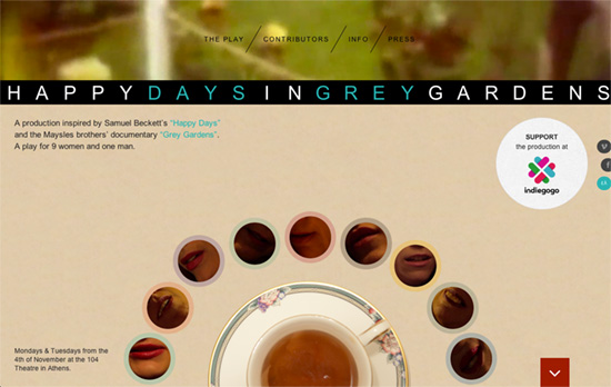
Video background for a header, and other interactive parts including a controllable chorus around that tea cup, as well as a collage of vintage photos and videos further below.

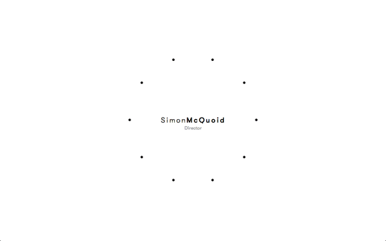
The circular navigation remains text-less even when you hover and donut-shaped thumbnails appear.

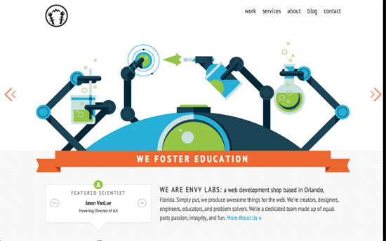
The slider pattern has new life breathed into it with a spinning animation with the sci-fi themed illustrations. I like the floating heads of the team members right below and how the dropdown menus are styled—lightning sparks on top and a connecting green line for sub-items. Simple but cleverly matching.
Social Media Weekly
Build on DIYThemes’ Thesis Framework for rock solid SEO and great layout customization options.
CSS – Conical Gradients in CSS
“We still have to wait for the W3C to formalize the feature and for the browsers to implement it, which might still take quite some time. In the meantime, I will show you how to simulate a conical gradient using CSS3 only.”
Web Design – Development Is Design
“In order to effectively design for today and tomorrow’s Web, we must replace outdated design artifacts with real collaboration and communication.”
Optimization – Gone In 60fps – Making A Site Jank-Free
“Jank-free rendering performance has been shown to positively affect user engagement and experience in many large sites, but remains an area many are unaware of how to diagnose or optimize.”
Workflow – GitHub Fundamentals
“We use git for two main reasons. It helps us manage the changes that multiple team members are making to the same files and it helps us keep track of who made what changes and when.”
