Go on a virtual sparring match with these websites that pit one person or concept against the other. Which design reigns supreme?
Designs of the Week
Search Optimized, Turn-Key Designs, Unlimited Everything. Start building with the Genesis Framework today.

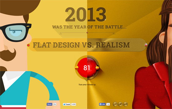
A visual scrolling feast, with the right message at the end. My main problem with this page is how resource-heavy it is and how difficult it gets to scroll.

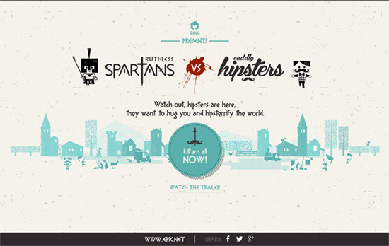
I like the halftone shadow effect on the buttons and borders. For a highly stylized browser-based game it still gives off a clean, minimal feeling.

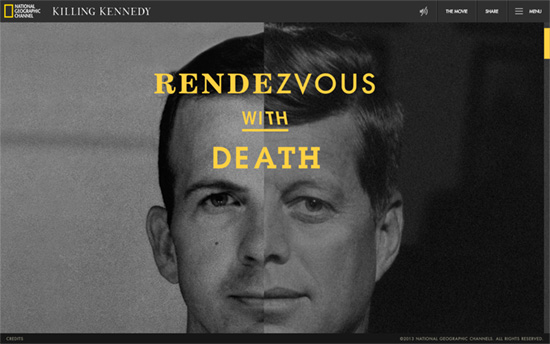
A perfect subject to use a split design. I like how the canvas moves around when your mouse cursor does, simulating three-dimensional space with the foreground and background animation.
Social Media Weekly
Make Headway, make intuitive layouts, make it your WordPress theme of choice!
Interaction Design – UI Animation and UX: A Not-So-Secret Friendship
“Animation on the web has hit some pretty sad lows, there’s no arguing that. But adding motion to our work can be meaningful and functional—when we find the right circumstances.”
Design – 10 Things Nobody Told You About Being Creative
“In a world that is changing every day, it is too hard to find out who we are before we start taking action. So, Austin urges us to just go with it until we actually figure it out.”
Accessibility – Designing apps for the visually impaired
“With the ever growing ownership of smartphones, computers and various other digital interfaces it is more important than ever to ensure that what we create is accessible to the largest amount of people possible.”
User Experience – A Guerilla Usability Test on Dropbox Photos
“Part 1 in a series on reimagining the Dropbox Photos experience.”
