• Home
  • About
  • Contact
  • Advertise

Devlounge

Design, Develop, and Grow

ateşli sevgilisi fantezisini yaşamak istediğini söyler porno ona arkadaşları varken onunla gizli saklı seks yapmak istediğini sikiş söyleyen kız hafta sonu için gelen arkadaşının görmediği bir sikiş açıdan sakso çekmeye başlayınca adamın yarağını bu altyazılı porno şekilde indiremez ve açık şekilde salonda sikişimeye sex izle başladıklarında misafir kızı da bu sekslerine rokettube konuk ederler seks yapacağını düşünmeyerek onun sex izle oyun oynadığını zanneder sabah olur ve herkes uyanır hd porno bu sırada yanında şişme mankenini de getiren sapık erotik hikayeler genç sınav haftası ders çalışan genç adam üvey annesinin sikiş eve gelmesiyle hayatının şokunu yaşar

  • Home
  • Code
  • Design
  • Design Focus
  • Interviews
  • Publishing
  • Strategy
  • Webapps
  • Extras

Design Focus: Versus

February 15, 2014 By Sophia Lucero

Go on a virtual sparring match with these websites that pit one person or concept against the other. Which design reigns supreme?

Designs of the Week

Search Optimized, Turn-Key Designs, Unlimited Everything. Start building with the Genesis Framework today.

Flat Design VS Realism

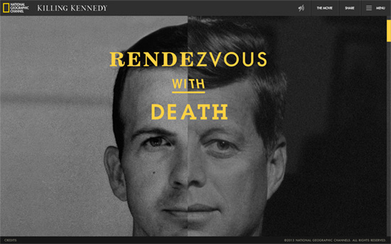
A visual scrolling feast, with the right message at the end. My main problem with this page is how resource-heavy it is and how difficult it gets to scroll.

Ruthless Spartans vs Cuddly Hipsters

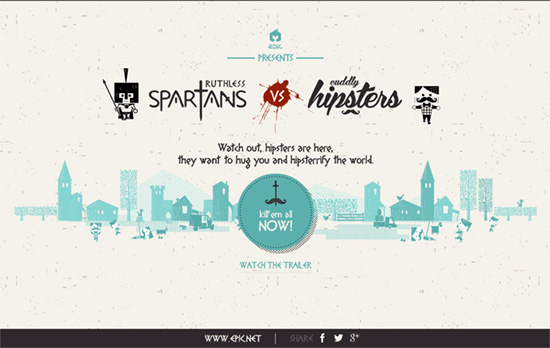
I like the halftone shadow effect on the buttons and borders. For a highly stylized browser-based game it still gives off a clean, minimal feeling.

Killing Kennedy
Killing Kennedy

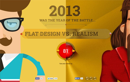
A perfect subject to use a split design. I like how the canvas moves around when your mouse cursor does, simulating three-dimensional space with the foreground and background animation.

Social Media Weekly

Make Headway, make intuitive layouts, make it your WordPress theme of choice!

Interaction Design – UI Animation and UX: A Not-So-Secret Friendship
“Animation on the web has hit some pretty sad lows, there’s no arguing that. But adding motion to our work can be meaningful and functional—when we find the right circumstances.”

Design – 10 Things Nobody Told You About Being Creative
“In a world that is changing every day, it is too hard to find out who we are before we start taking action. So, Austin urges us to just go with it until we actually figure it out.”

Accessibility – Designing apps for the visually impaired
“With the ever growing ownership of smartphones, computers and various other digital interfaces it is more important than ever to ensure that what we create is accessible to the largest amount of people possible.”

User Experience – A Guerilla Usability Test on Dropbox Photos
“Part 1 in a series on reimagining the Dropbox Photos experience.”

Friday Focus 04/20/12: Unfolded

April 20, 2012 By Sophia Lucero

Our featured designs on this week’s Friday Focus put the paper motif to good use once more, focusing on its creases and folds. Not just in the corners and as borders, but as a way to demarcate sections of content at a time.

Designs of the Week

Wing Cheng's website
Wing Cheng

The entire site, except for the fixed navigation on the bottom right, is presented in an accordion-type notebook with all the text and graphics done in the designer’s own handwriting, contact form included. It’s only when you click on the images that you get the actual version of the logos. There are tradeoffs of course: legibility, seeing the real logos without having to click anything, accessibility, and so on.

3D Polystyren website
3D Polystyren

I always enjoy a good “power line” and this one, although yellow and chunky looking against the huge 3D header, is not distracting but a welcome trail all the way down. The text blocks are a bit long and heavy though.

Granville Island website
Granville Island

Love the worn quality to the background paper, like an opened and laid out map. Color block is also hot right now! Also, in the top left menu there’s a small “you are here” sign, again reinforcing the travel theme.

Spreads for iPad website
Spreads for iPad

Another accordion sheet of paper, except this time the folds aren’t equal heights. Love the pop of read against the blue, which gradients into pitch black when you reach the bottom of the page. Also interesting is the decision to put a screenshot of the app nowhere above the fold, with introductory paragraphs coming first.

Build on DIYThemes’ Thesis Framework for rock solid SEO and great layout customization options.

Social Media Weekly

Programming – Light Table – a new IDE concept
“We need to be able to move things around, keep clutter down, and bring information to the foreground in the places we need it most.”

Design – Startups, this is how design works.
“This handy guide will help you understand design and provide resources to help you find awesome design talent.”

CSS, Tables – A #CSS grid system for tables, for you
“A neat way of aligning the columns in tables up with each other — a table grid system of sorts.”

Pagelines lets you build WordPress websites and it’s as easy as drag and drop, go check it out!

Friday Focus 12/09/11: Hello, My Name Is

December 9, 2011 By Sophia Lucero

This week’s featured designs business card websites, some of them looking literally like cards containing contact information of their owners. That means very minimal layouts but still all compelling experiences.

Designs of the Week

Tim Van Damme's website
Tim Van Damme

First up, the site that started this trend. The design may be over a year old but the graphical details are still all the rage today. One of the most important features for this genre of a site are the vCard download link and the social media links, accompanied of course by the colorful icons for each site. No tabs here, but each section in the menu loads with a vertically sliding animation, while the hover effects use horizontally sliding effects.

Mehmet Aksoy's website
Mehmet Aksoy

The shooting star in the background is actually animated with Flash. So are the stars which twinkle. There’s a touch of the Aero (Windows Vista/Windows 7) interface in this design (particularly the avatar) but I feel it’s the custom font used on this page that gives a different look to the whole site.

Benjamin De Cock's website
Benjamin De Cock

This site greets you with the owner’s name then displays a closed box, which you click on so it pops open to reveal this card. The animation even contains accompanying smoke effects. Other visual treats to enjoy on this page: an icon-based website tooltip on the text link for “interface designer”, glowing hover effects on the bottom icons, and a slider for his three avatars.

Chris Rowe's website
Chris Rowe

Not the usual boxed in layout but it’s all only contact information in here. Hovering over the initials reveals the full name and occupation. Same goes for the links below it.

Margot Dowleska Dyer's website
Margot Dowleska Dyer

A nice earthy look with icons that blend in and a slideshow running in the polaroid frame to the left. There are some portions though where the graphics make the text a little difficult to read and are competing for attention with the foreground.

Maximilian Schoening's website
Maximilian Schoening

The closest thing to the business card metaphor translated to a webpage, complete with an animated flip done with CSS3 transforms when you click on the top right blue corner. The background uses another CSS3 property, radial gradients. The other side contains nothing but tiny social icons.

Social Media Weekly

CSS – The CSS profilers are coming!
“Back in August I talked about the lack of benchmarks or performance tools for CSS. In the meantime, the fine folk we call browser makers have been working hard on new developer tools to do just that: measure CSS performance.”

CSS – Truncating text using only CSS
“It works in IE 6+, Safari 4+, Firefox 7+, Opera 11+ and Chrome 10+”

Design, Business – Warm Gun: Design for Continuous Deployment
“In his Design for Continuous Deployment presentation at the Warm Gun conference in San Francisco, CA Randy Hunt shared how Etsy’s development process allows designers and developers to collaborate at scale on production code.”

CSS – Knyle Style Sheets
“Inspired by TomDoc, KSS attempts to provide a methodology for writing maintainable, documented CSS within a team.”

Friday Focus 10/07/11: All Mapped Out

October 7, 2011 By Sophia Lucero

This week’s Friday Focus features designs revolving around maps, both as embellishment and a tool.

Designs of the Week

Appmiral website
Appmiral

There’s a fantastic crab sporting a hat and a monocle that follows the trail on the map and leads you through the one-page site, all while leaving useful notes, popping in and out of the sandy background, and of course, walking sideways! I think the tooltips should stay on a little longer though; if you scroll down continuously they quickly disappear before you get a chance to read the whole thing, defeating their purpose. I sure hope the mascot wasn’t eaten up by the shark though, as it seems that was implied by the animation, but for a design to effectively hook you like that with a small storyline in such a short span is just genius.

festapoa website
festapoa

Nice night-time color scheme applied to a Google map to match the theme of the site, and a pretty good way to cycle through the list of events too. Instead of the usual calendar-based lookup, you go from day to day (or should I say night to night) by moving up and down, then check out the list of events for that date by moving left to right. You can do that both by clicking the arrows on your mouse and the arrow keys on your keyboard.

DART St. Louis website
DART St. Louis

Straightforward techniques at work: grunge, patterns, lightboxes for displaying content, and matching the color scheme on the map markers.

PortoAlegre.cc website
PortoAlegre.cc

Also a custom colored-map, with some brightly colored icons and shapes, but one noticeable problem here is that if there’s too much on the map, the site becomes far less helpful. Reducing the marker sizes would help, but maybe filtering only one type of data at a time will be more effective as well.

patisserie DEFFERT website
patisserie DEFFERT

I like the collage and handmade feel on this page; even the tabbed content boxes use drawn-in borders. However, I think making this a one page site isn’t such a good idea mainly because of the number of items in the products section. There were at least a dozen rows there and it’ll take much more effort to scroll back up to switch tabs. They should have kept that section at up to the average height of browser screen and paginated accordingly.

Keystone Logistics website
Keystone Logistics

I love the idea of being able to demonstrate your company’s capabilities with an animation like this, giving you details every step of the way as the ship sails from port to port until it reaches its destination. The visuals are stunning. A more restless visitor would probably want more bells and whistles but I think this is dynamic enough for a corporate site. I think the only thing I have to make a note of is the excessive use of italics on the page and the underdesigned menus; this is a lot more glaring in the inner pages where the imagery disappears.

Social Media Weekly

HTML, CSS – Semantic Animation

Accessibility – Rocket Surgery and Accessibility User Testing

Web Standards – Future friendly, or Forward to Yesterday?

JavaScript – JavaScript Design Patterns Deconstructed

Friday Focus 06/03/11: North East South West

June 3, 2011 By Sophia Lucero

Here’s an interesting technique to try out in this week’s Friday Focus: designs that have four main navigational items arranged at right angles to each other, much like the four main directions on a compass.

Designs of the Week

Prince Street International Films

I like how each section content is perfectly contained in the boxes. It makes me wish the whole site fit into the height of the browser window so I can see the wide view of the whole site.

ap-o.com

There’s a running pixelated theme in the design, as well as blocks of black for the headers. There’s also an interesting peekaboo effect with fixed backgrounds that’s also growing popular these days. I like the idea of placing the navigation at the four corners of the site, but it makes moving back and forth between each screenful of content a hassle—better if there were keyboard navigation too. And for the millionth time, I wish we had a way for Twitter tweet and Facebook like buttons to blend in better with the design.

Kiki Kaloudi

I never really enjoy the look of Courier or any other fixed-width font on a site, but I do like the hand-drawn touches here, and splashes of red there.

Conway Cowork

What’s a little surprising with these sites is that they don’t really use the 4 cardinal directions to their advantage and, say, animate the page to scroll to that particular direction. Instead they all still scroll vertically. Here’s another graphing paper pattern meets hand-drawn graphic elements design, with the wildly popular yellow and black combo.

Social Media Weekly

Design – Design Professionalism
“The designer’s guide to taking back your profession.”

Programming – Lost Type
“The Lost Type Co-Op is a Pay-What-You-Want Type foundry, the first of its kind.”

Optimization – zbugs
“Merge, Minify, and GZip Compress JS & CSS”

Accessibility – HTML5 and Accessibility
“HTML5 is not the accessibility disaster that some would have you believe. It tries to build accessibility in by design rather than bolt it on afterwards, and this is A Good Thing; if something is left to authors to add, they won’t. Just look at how many images have no alternate text, or useless alternate text.”

JavaScript – Byte-saving Techniques
“This is a collection of JavaScript wizardry that can shave bytes off of your code. It’s mainly intended as a reference for those creating entries for 140byt.es.”

User Interface Design – The Gap Theory of UI Design

Next Page »

Code & Tutorials

Which Front-End Development Languages Will Grow in 2017?

Your Guide to Leveraging APIs as a Developer

Bitcoin Processing Website Integration For Web Developers

Website Security For 2016 That All Developers Need To Know

5 Reasons You Need to Be Using jQuery

About Devlounge

Want to read more about Devlounge, or maybe you want to contact us, or even advertise? Oh, and don't forget to subscribe to updates!

The Best of Devlounge

php_frameworks

Top 7 PHP Frameworks

Search