Navigation is an essential element of websites, and this week’s featured designs have the responsive, clever kind that indicate which part of the page you’re currently at. Check out how these responsive navigation markers were integrated below.
Designs of the Week
Want your site to be as good-looking and inspirational as these? Start by choosing a well-designed theme from ThemeForest.

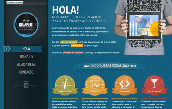
The bright hues repeat in different sets of categories across the page, including the color scheme of each section, which in turn changes the fixed navigation to the left as you scroll along. Everything looks bright, crisp, and snappy with the mix of ribbons, colors, and illustrations.

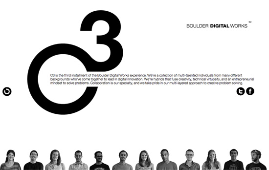
The row of people in the footer is actually the navigation itself, which is clever. Then each person in that row actually designed the slide he/she is on. It’s a little chaotic at times and sometimes the transition from black and white to color on the navigation is drowned out but it’s you end up on a screen that’s just as clear as where you first started.

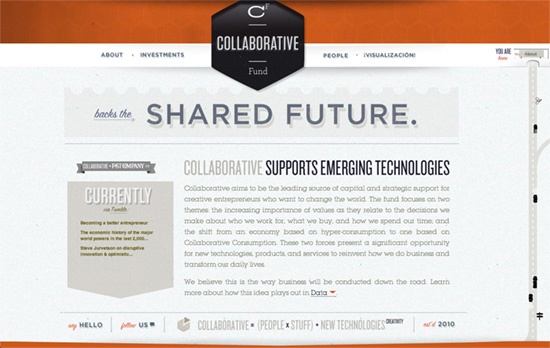
Instead of literal navigation this page uses a symbolic indicator of the projected amount of funds raised for the charity. The parallax design combines illustrations, photos, and abstract backgrounds to distinguish one slide from the next, all while a pipe runs through the “underground” background.

There’s a running hexagon shape theme in this design, from the logo to the header background to the hover indicators. The marker on the right side is wonderfully done, especially the cut-out space for the label, much like a an automotive dial. I wish the menu items used anchor links instead of pure JavaScript though.
Social Media Weekly
Ready to go out and design your next website? Try building with the Catalyst Framework.
CSS – The open/closed principle applied to CSS
“With so much abstracted and shared CSS, simple changes to a base object can have massive ramifications across whole projects; how do you deal with that?”
HTML5, Accessibility – HTML5 Accessibility Chops: When to use an ARIA role
“There has been discussion of late on whether authors should be allowed to include an ARIA role value on an HTML element that matches the default implicit ARIA role as defined in HTML5.”
User Experience – Effective Presentation of a Website’s Navigation
“Browsing – moving through a multi-faceted content structure – is made easier when information architects present users with an intuitive navigation hierarchy. This article discusses two techniques to that end.”
Productivity – Desk exercises: 3 easy routines for designers
“Sit up straight, and pay attention! Designer boot camp starts now, and we’re here to put paid to poor posture, and ensure your remain in tip top condition at your desk.”
