This week’s Friday Focus tackles exactly what it says on the tin: designs featuring imagery molded into the silhouettes of large type. Unfortunately all of them still use images to achieve the effect instead of actual text, but all are still noteworthy designs.
Designs of the Week

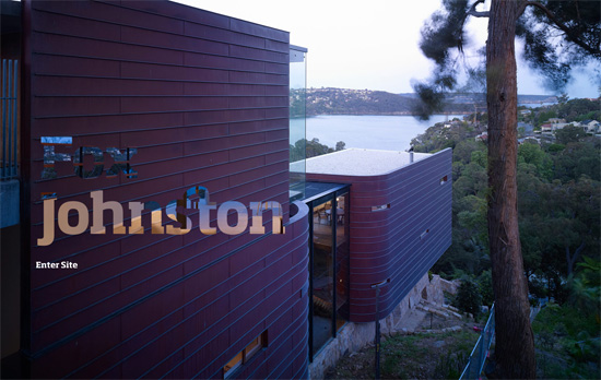
Two photos switching in and out, one becomes the background while the other becomes the “content” of the masked text. What’s a little weird is that the “photo text” is in the same dimensions as the full-size images, with the rest of its canvas transparent—instead of using absolute positioning. Also, while I don’t mind that some parts of the text aren’t easily readable, I kind of wish there were more pictures. Of course the possible explanation for that is this is only a splash page, and perhaps the question I should be asking is: should it even still exist in 2011?

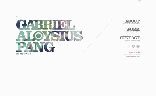
There’s a little aliasing going on in the edges in my browser, but if you check the source images, including the smaller navigation headers at the right, you don’t find them there, so it could be due to JavaScript. There are a few small shapes used here and there, including triangles, double dots, plus signs, and dashes. Not to mention a slash to divide the content area from the navigation area, which is quite popular among designy portfolios.

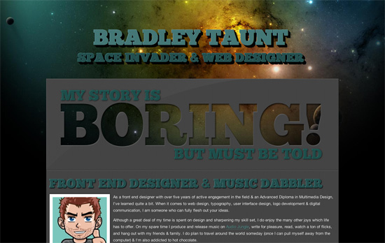
The combination of the colorful space background with the chunky and carved out foreground is a simple technique but creates a stunning look. I think a bit more tweaking is needed with some of the paddings and margins andparagraph text (especially for a wide, one-column layout). The taller text shadow on hover effect is another technique you can easily pull off with CSS3.
Social Media Weekly
Design, Business, Identity – The Personification of Design
How well designed and well maintained is your online persona via your social media profiles?
CSS – The future of CSS layouts
A discussion of new CSS3 modules for better control over laying out content.
User Experience – Think Outside the Box, but Don’t Forget the Box Exists
Have fun, but still be consistent and considerate!
