• Home
  • About
  • Contact
  • Advertise

Devlounge

Design, Develop, and Grow

ateşli sevgilisi fantezisini yaşamak istediğini söyler porno ona arkadaşları varken onunla gizli saklı seks yapmak istediğini sikiş söyleyen kız hafta sonu için gelen arkadaşının görmediği bir sikiş açıdan sakso çekmeye başlayınca adamın yarağını bu altyazılı porno şekilde indiremez ve açık şekilde salonda sikişimeye sex izle başladıklarında misafir kızı da bu sekslerine rokettube konuk ederler seks yapacağını düşünmeyerek onun sex izle oyun oynadığını zanneder sabah olur ve herkes uyanır hd porno bu sırada yanında şişme mankenini de getiren sapık erotik hikayeler genç sınav haftası ders çalışan genç adam üvey annesinin sikiş eve gelmesiyle hayatının şokunu yaşar

  • Home
  • Code
  • Design
  • Design Focus
  • Interviews
  • Publishing
  • Strategy
  • Webapps
  • Extras

Friday Focus 02/17/12: Page Flips

February 17, 2012 By Sophia Lucero

This week’s featured designs on Friday Focus are all about books of the online variety, complete with the animated page-turning effects.

Designs of the Week

Want your site to be as good-looking and inspirational as these? Start by choosing a well-designed theme from ThemeForest.

Steve Heady's website
Steve Heady

I think the book pages need a sprinkle more of depth but the mix of textures both in it and in the background look great. Every spread is a section with a different look.
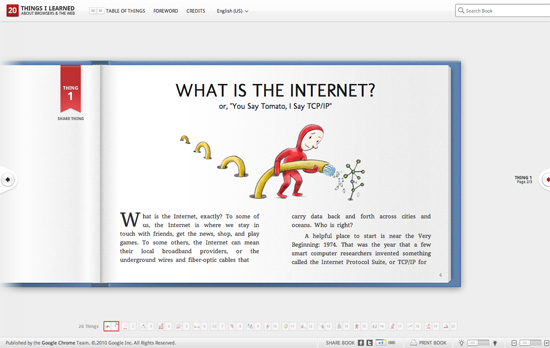
20 Things I Learned About Browsers and the Web website
20 Things I Learned About Browsers and the Web

If you’ll notice, this layout only uses the right side of the book once you open it. To the left is a red bookmark which lets you share the current page you’re on. What really drives the book interface home here, in my opinion, are the illustrations. Some of which happen to be animated. The table of contents (“things” actually) is not a list of chapter titles and numbers, but thumbnails containing such illustrations, which you can also find below the book. I think this site has the most natural and aesthetically pleasing page-turn effect of the bunch.
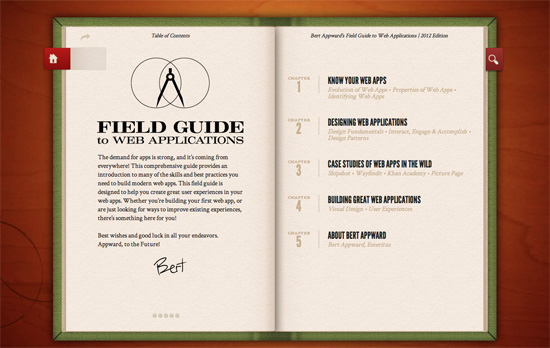
Bert Appward's Field Guide to Web Applications website
Bert Appward's Field Guide to Web Applications

More familiar techniques going on when imitating a real world look: the cloth cover of hardbacks, tabs that are almost always in red, off-white paper, all on a wooden surface with coffee stains to boot. It’s interesting to find the ability to skip to a chapter at the footer of a page, and something you don’t find in real-life books: search.

Pagelines lets you build WordPress websites and it’s as easy as drag and drop, go check it out!

Social Media Weekly

Need help in promoting your site? INeedHits has been in the search engine marketing since 1996!

CSS, Web Standards – The Impending CSS Vendor Prefix Catastrophe
“At that point, webkit properties will become the de facto standard regardless of any W3C specification. Game over: the open web is closed.”

Design, Content Strategy – Structure First. Content Always.
“Let’s be really clear about this. It is unrealistic to write your content – or ask your client to write the content – before you design it. Most of the time. Content needs to be structured and structuring alters your content, designing alters content. It’s not ‘content then design’, or ‘content or design’. It’s ‘content and design’.”

HTML – HTML5 Please
“Look up HTML5, CSS3, etc features, know if they are ready for use, and if so find out how you should use them – with polyfills, fallbacks or as they are.”
Friday Focus 09/02/11: Over the Moon

September 2, 2011 By Sophia Lucero

This week’s Friday Focus features designs that incorporate the moon in them.

Designs of the Week

Ryan Lottering's website
Ryan Lottering

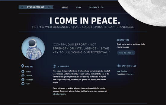
Let’s talk about the moon and how it’s in the top right, in the foreground, spinning oh so slowly—just enough for people to notice it’s moving. Overall look seems simple, but I think it’s effective and still makes an impact. I think it’s interesting that the site labels the homepage as the About page at the same time. One nit to pick, while not visual, is that there are two different email addresses being used in three email links.

BlackMoon Design website
BlackMoon Design

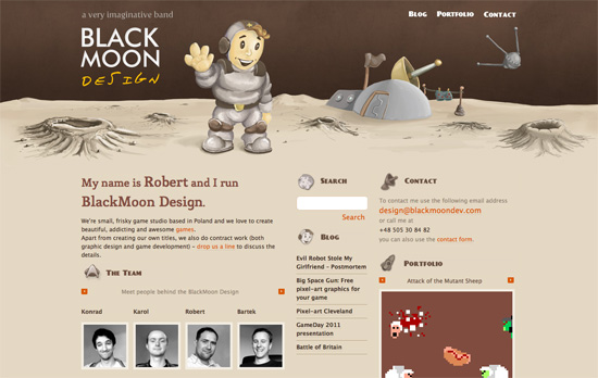
It’s funny how this site also uses the Star Trek logo as one of its icons in keeping with the outer space theme. I love the illustrated, painted look in the header, including the word “design” in the logo (which doesn’t look like just another handwritten typeface). It’d be nice to have the headings as real web fonts now instead of images, but then I discovered that the whole design—and I mean every graphic you see on the page—is one big sprite, so kudos to that!

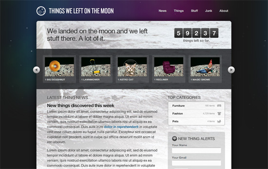
Things We Left on the Moon website
Things We Left on the Moon

This is just a demo site created by Dan Cederholm for An Event Apart Seattle 2010, but there are a lot of neat things to be inspired by here, particularly CSS3 features in the hover effects and typography. Love the idea of the halftoned moon landing picture as a background. The use of purple is also a nice touch, since it’s easy to just reach out for midnight blue when depicting skies and space.

Social Media Weekly

Mobile Web Design, E-Commerce – Add to Cart: 5 Ways to Improve Shopping on the Mobile Web
Five steps to optimizing online shopping on mobile devices.

HTML5 – The Current State of HTML5 Forms
Check out the latest browser support and techniques for using form attributes in HTML5.

CSS3 – Sizing with CSS3′s vw and vh units
Another set of measuring units included in CSS3, this time based on viewport dimensions.

CSS – The Minimum Page Project
Another iteration on the CSS resets out there. The idea is to avoid redundancy due to broad-sweeping resets.

Design, CSS – Adapted
Reflections on the challenges and options in adapative, responsive web design.

Design, User Experience – Thoughts On Communicating Design
“Communicating design, in general, needs to be less about documentation and more about clear, concise and ongoing two-way communication.”

Friday Focus 08/05/11: Masked Text

August 5, 2011 By Sophia Lucero

This week’s Friday Focus tackles exactly what it says on the tin: designs featuring imagery molded into the silhouettes of large type. Unfortunately all of them still use images to achieve the effect instead of actual text, but all are still noteworthy designs.

Designs of the Week

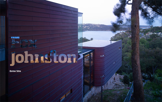
Fox Johnston website
Fox Johnston

Two photos switching in and out, one becomes the background while the other becomes the “content” of the masked text. What’s a little weird is that the “photo text” is in the same dimensions as the full-size images, with the rest of its canvas transparent—instead of using absolute positioning. Also, while I don’t mind that some parts of the text aren’t easily readable, I kind of wish there were more pictures. Of course the possible explanation for that is this is only a splash page, and perhaps the question I should be asking is: should it even still exist in 2011?

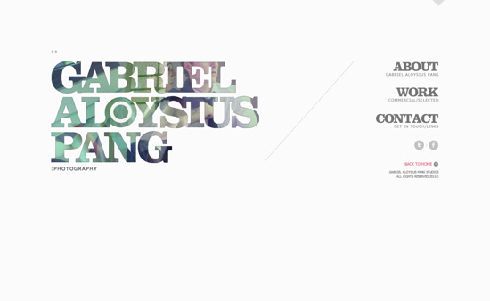
Gabriel Aloysius Pang website
Gabriel Aloysius Pang

There’s a little aliasing going on in the edges in my browser, but if you check the source images, including the smaller navigation headers at the right, you don’t find them there, so it could be due to JavaScript. There are a few small shapes used here and there, including triangles, double dots, plus signs, and dashes. Not to mention a slash to divide the content area from the navigation area, which is quite popular among designy portfolios.

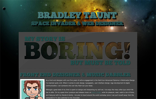
Bradley Taunt website
Bradley Taunt

The combination of the colorful space background with the chunky and carved out foreground is a simple technique but creates a stunning look. I think a bit more tweaking is needed with some of the paddings and margins andparagraph text (especially for a wide, one-column layout). The taller text shadow on hover effect is another technique you can easily pull off with CSS3.

Social Media Weekly

Design, Business, Identity – The Personification of Design
How well designed and well maintained is your online persona via your social media profiles?

CSS – The future of CSS layouts
A discussion of new CSS3 modules for better control over laying out content.

User Experience – Think Outside the Box, but Don’t Forget the Box Exists
Have fun, but still be consistent and considerate!

Friday Focus 07/22/11: Over and Under

July 22, 2011 By Sophia Lucero

The featured designs on this week’s Friday Focus take out the bore of having to scroll through several thousands of pixels as you’re rewarded with cool animations, layer effects, and the information you need presented in an appealing and compelling way.

Designs of the Week

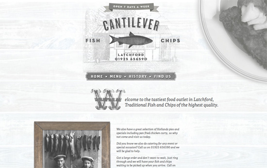
Cantilever Fish & Chips website
Cantilever Fish & Chips

What really caught my eye here is the chalkboard-style menu, complete with the yellow piece of chalk at the left side and the black textured background. The drop caps in each section are also quite lovely!

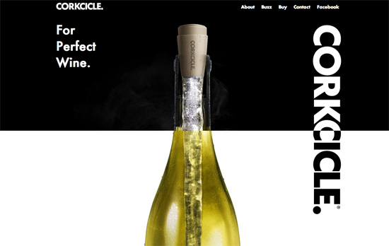
Corkcicle website
Corkcicle

I have some screen flickering issues at the top half of the page, but as you get to the bottom of the page you’ll find something really neat: a wine-pouring effect to the right (completely with the translucent effect), and and a grape vine stem to the left—both of which are in the foreground.

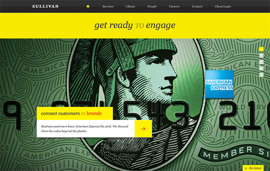
Sullivan NYC website
Sullivan NYC

I like that the portfolio “slideshow” is vertical, takes up the whole screen, and yes, supports keyboard navigation. Diagonal stripes in both directions are used everywhere and of course there’s tons of yellow in this design.

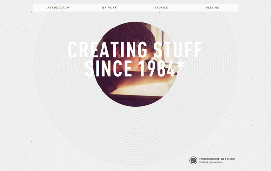
Two Fish Illustration & Design website
Two Fish Illustration & Design

I like the really subtle use of a backslash as a marker on the menu for which section you’re currently at. Of course my favorite has to be the peekaboo picture of the artist when he was still a kid, surrounded by thin concentric cirlces.

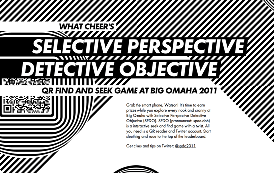
Selective Perspective Detective Objective website
Selective Perspective Detective Objective

This looks comes on a little too strong for my taste, but I appreciate the optical illusions at work here. You can simulate movement by simply moving over a striped background.

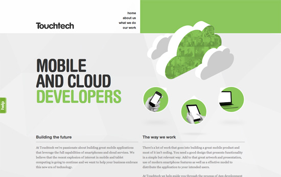
Touchtech website
Touchtech

I like the photo masking effect you see on the green cloud, which also appears in the What We Do section. It’s a nice twist when you need to add icons to your design.

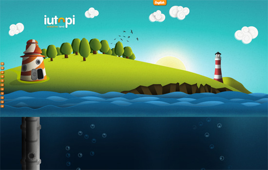
iutopi website
iutopi

I’ve lost count of how many sites look like this, but it’s still interesting to see the illustration styles and addressing the usual issues. I really like how the clouds look. I like the sea level indicator and the gauge at the right. In those screens, however, the body text looks really small and could fill up the screen better. I also think the left-side navigation arrows could use variation and retain the hover per screenful.

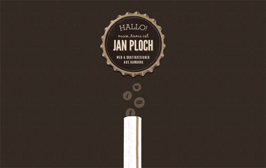
Online Portfolio von Jan Ploch website
Online Portfolio von Jan Ploch

This site is basically a fun ride down a beer bottle! Bonus points for the quick links as bubbles atop the straw and a translucent texture for the lightbox background. I just wish the contact link weren’t a mere mailto: because I would have liked to see how the designer would integrate a contact form into the beer motif.

Fingerbilliards website
Fingerbilliards

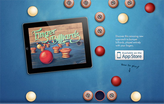
Here’s another clever concept: by scrolling the page the red ball in the middle reaches and sinks into the hole and plays a sound. A live demo of the app they’re selling, no video needed! As you scroll even further, you get a description of the game and instructions in the same vintage feel the game has. No unncessary content here.

MOSO Unfinished Business School website
MOSO Unfinished Business School

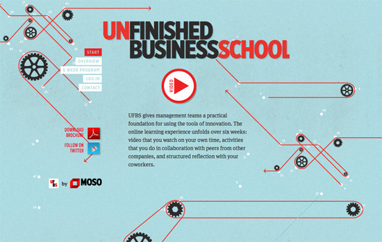
I think the background illustrations are teetering on the brink of being distracting, but I do like every single one, especially the overview section explaining their process with infographics.

Social Media Weekly

CSS – Responsive images right now
Gist: hide the small image from desktop users and hide the big background image from mobile users.

HTML – The New and Improved Way to Create Forms with HTML5
HTML5 is chock full of new form elements and attributes; use them wisely!

CSS – CSS3 Radial Gradients
Mastering linear gradients is one thing, but radial gradients are whole other beast.

Friday Focus 05/27/11: Icon-centric

May 27, 2011 By Sophia Lucero

This week on Friday Focus, we’re looking at sites that revolve around iconized representations of their content.

Designs of the Week

eBiene

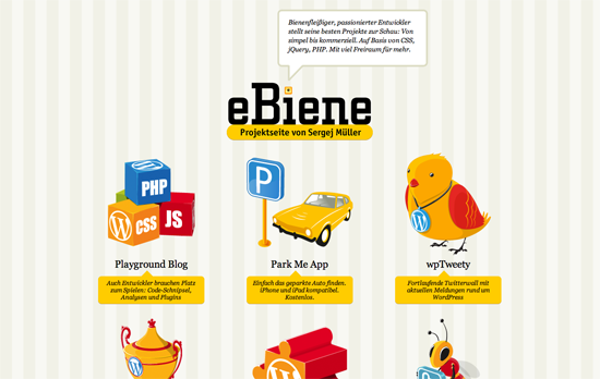
This has quite the preschool room feel (down to the background wallpaper), probably because of the primary colors. If icon illustration is your strength, best to flaunt it this way.

2010 Annual Report - St. Luke's Duluth

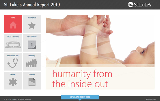
Clean, straightforward brochure site with subtle design touches here and there. One advantage of having larger icons for main navigation is a bigger area to click on.

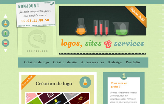
Création de logo et de site web

Love the colors. One has to ask, though, if the choice of laboratory glassware for each content section makes sense (how does a set of beakers relate to site creation, actually?).

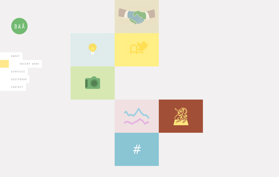
Bärnt & Ärnst

The challenge in using icons at the forefront is keeping the look cohesive. Here, one of the projects in the portfolio sticks out a little bit and could have been a tad more muted, although overall it still looks great. But I’m not a fan of the <br> overuse.

Social Media Weekly

CSS – dom3d: rendering 3d with CSS3
“There are a few benefits to this approach: you get to manipulate the elements with normal CSS, and you can overlay 3d objects onto pages and still let the user interact with the page.”

CSS – Styling ordered list numbers
“The key is using CSS generated content to create and insert the counter numbers after removing the default numbering from the list.”

Web Browsers – In IE, iFrames on Pages in Quirks Mode Also in Quirks Mode
“If you are creating a page using HTML5 and you think there is some reasonable chance that someone may embed this page on another via iframe, you should use the HTML5 shim on it for all version of IE.”

Design – Crash Course: Design for Startups
“I’ve learned why my work nowadays is better than from years past. I am aiming to somehow share some of these thoughts brewing in my head with this post today.”

Next Page »

Code & Tutorials

Which Front-End Development Languages Will Grow in 2017?

Your Guide to Leveraging APIs as a Developer

Bitcoin Processing Website Integration For Web Developers

Website Security For 2016 That All Developers Need To Know

5 Reasons You Need to Be Using jQuery

About Devlounge

Want to read more about Devlounge, or maybe you want to contact us, or even advertise? Oh, and don't forget to subscribe to updates!

The Best of Devlounge

How to Personalize Forms with CaptainForm

Search