The featured designs on this week’s Friday Focus take out the bore of having to scroll through several thousands of pixels as you’re rewarded with cool animations, layer effects, and the information you need presented in an appealing and compelling way.
Designs of the Week
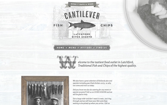
What really caught my eye here is the chalkboard-style menu, complete with the yellow piece of chalk at the left side and the black textured background. The drop caps in each section are also quite lovely!
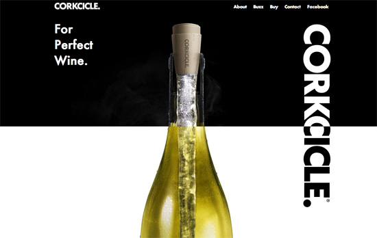
I have some screen flickering issues at the top half of the page, but as you get to the bottom of the page you’ll find something really neat: a wine-pouring effect to the right (completely with the translucent effect), and and a grape vine stem to the left—both of which are in the foreground.
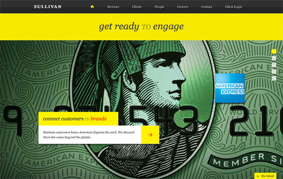
I like that the portfolio “slideshow” is vertical, takes up the whole screen, and yes, supports keyboard navigation. Diagonal stripes in both directions are used everywhere and of course there’s tons of yellow in this design.
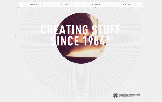
I like the really subtle use of a backslash as a marker on the menu for which section you’re currently at. Of course my favorite has to be the peekaboo picture of the artist when he was still a kid, surrounded by thin concentric cirlces.
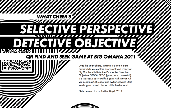
This looks comes on a little too strong for my taste, but I appreciate the optical illusions at work here. You can simulate movement by simply moving over a striped background.
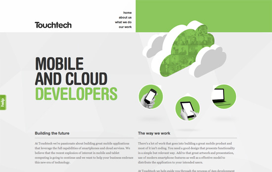
I like the photo masking effect you see on the green cloud, which also appears in the What We Do section. It’s a nice twist when you need to add icons to your design.
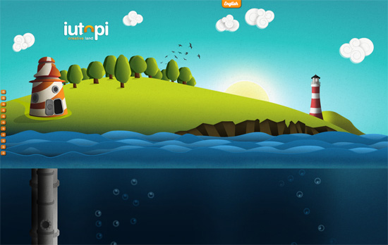
I’ve lost count of how many sites look like this, but it’s still interesting to see the illustration styles and addressing the usual issues. I really like how the clouds look. I like the sea level indicator and the gauge at the right. In those screens, however, the body text looks really small and could fill up the screen better. I also think the left-side navigation arrows could use variation and retain the hover per screenful.
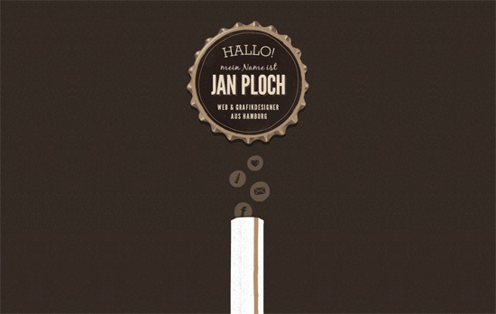
This site is basically a fun ride down a beer bottle! Bonus points for the quick links as bubbles atop the straw and a translucent texture for the lightbox background. I just wish the contact link weren’t a mere mailto: because I would have liked to see how the designer would integrate a contact form into the beer motif.
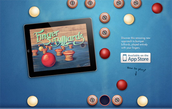
Here’s another clever concept: by scrolling the page the red ball in the middle reaches and sinks into the hole and plays a sound. A live demo of the app they’re selling, no video needed! As you scroll even further, you get a description of the game and instructions in the same vintage feel the game has. No unncessary content here.
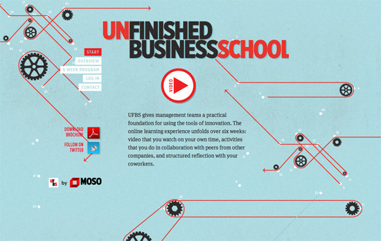
I think the background illustrations are teetering on the brink of being distracting, but I do like every single one, especially the overview section explaining their process with infographics.
Social Media Weekly
CSS – Responsive images right now
Gist: hide the small image from desktop users and hide the big background image from mobile users.
HTML – The New and Improved Way to Create Forms with HTML5
HTML5 is chock full of new form elements and attributes; use them wisely!
CSS – CSS3 Radial Gradients
Mastering linear gradients is one thing, but radial gradients are whole other beast.
