This week’s crop of website designs boast of stunning typography and that vintage poster look, it almost feels like you’re in a different decade, all the while taking advantage of what today’s web technologies have to offer. Welcome to this week’s Friday Focus!
Designs of the Week
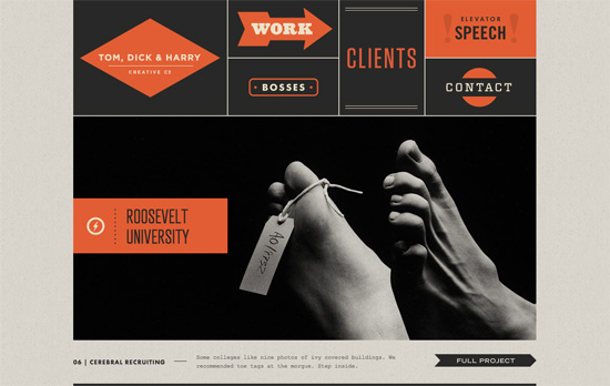
My favorite part has to be the top menu, bento-style and each item typeset differently. In the news section, even though I’m not a fan of Courier New, and the size is a tad small, the look works. Lots of different fonts used on this page, but they come together harmoniously. The photos and map blend in with the background by getting their own textures, while the company’s different departments have their own seals, how awesome is that?

Yellow and black, distressed elements, and many different arrow styles at play. This is another site that’s got a lovely designed map, and even a QR vCard.
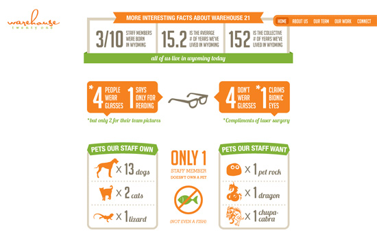
Love the infographics on the homepage, as well as the bright orange and green color scheme everywhere. I think the sub-sections per page guided by left and right arrows on opposite sides of the website are a nice idea, makes things feel horizontally oriented and almost slideshow-like. The logo and main menu are fixed on either side of the page and out of the way as the content scrolls beneath.
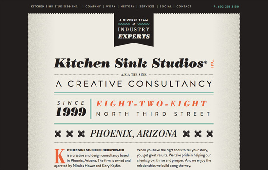
There are lovely little details here like the sheared “paper” edges and the variety of icons representing this designs studio’s services, but it’s really the typography that takes centerstage here, transforming this site into one long poster I’d love to hang up on my wall. I have to wonder though, where is their logo?
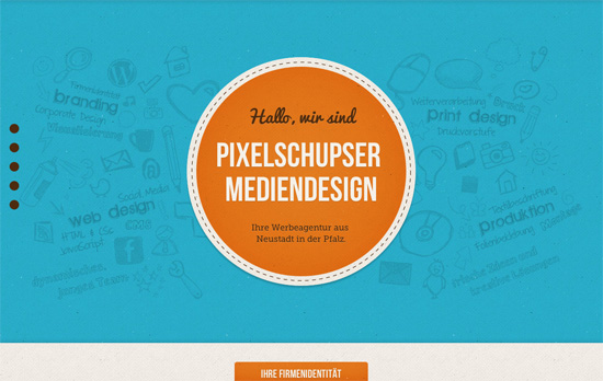
Nice use of bright blocks of primary and secondary colors, combined with some hand-drawn background watermarks and you get a playful look. However, I do think the layout in the 3 middle pages could be further improved if they weren’t all the same three circles, and perhaps used different shapes instead. Scrolling back and forth between those may look confusing as the only differentiator would be color. Other trends at play: one diagonal line int the last section, and the over-under + parallax effect.
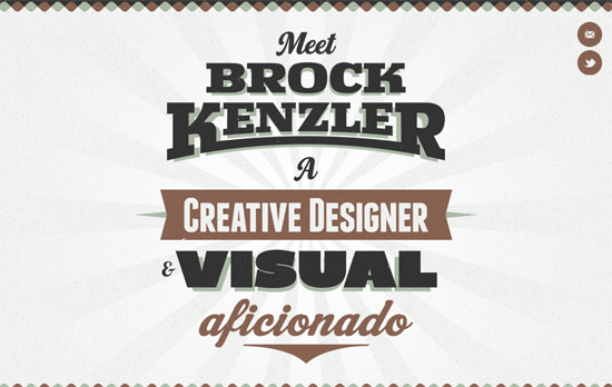
This one’s also fit for a poster, although on screen it would be nicer if the intro text could be resized automatically for smaller resolutions. Despite the big and detailed look, the site seems to be lacking in branding and navigation in the inner pages, apparently because the portfolio frame, which is a browser window, has a back button which is supposed to serve that purpose. Still, that doesn’t explain why there isn’t any other indicator of what the page is about; breadcrumbs and all the familiar navigation patterns have been established in the web design world for a reason.
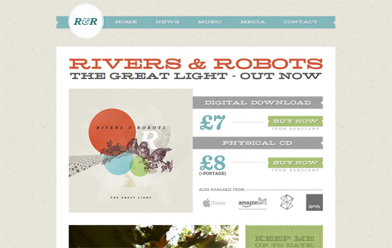
I like how much of the graphic elements on the site are inspired by tickets, both the shapes and dotted lines, and of course the paper-y textures. You can also see how closely the site color scheme matches the album of the artist.
Social Media Weekly
HTML, Mobile – Anatomy of a HTML5 Mobile App
“Can HTML5 do the job? Absolutely, but…” Find out what you need to know to build an HTML5-powered mobile app.
JavaScript – Convert a Menu to a Dropdown for Small Screens
Exactly what it says.
Usability – Search Fields — What To Do and What Not To Do
ZURB investigates different search boxes and tells you what to emulate and avoid.
Software – The perfect web design app… and why it doesn’t exist
Find out which apps certain designers use to create websites. What would a program build specifically for web design require?
