The last Friday Focus of the year goes back in time before we move into the future. Happy New Year to everyone!
Designs of the Week
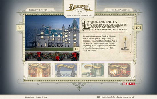
Beautiful graphic touches and type. This site is first split into “Day” and “Night”, then into “Awe”, “Inspiration”, “Joy”, and “Stories”. Each is further broken down into sub-slideshows. Every section on this site slides into the framed panel either vertically or horizontally.
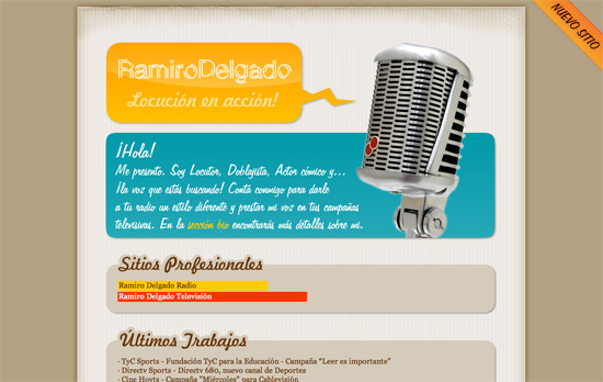
I like the bold colors and the big graphics put together, but I’m not too sure about using two different script fonts on the same page.
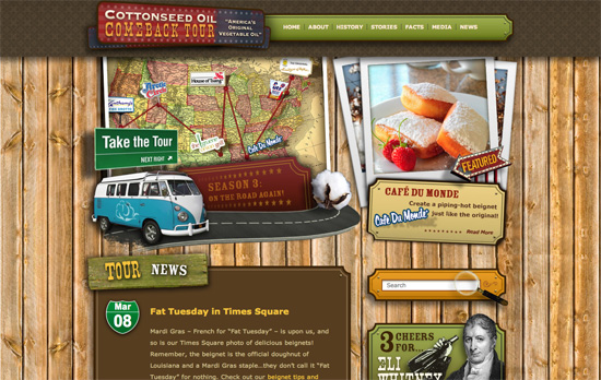
Another strong set of colors at play here, not to mention lots of different things grabbing your attention at once, which could be a bit of a turn off for some.
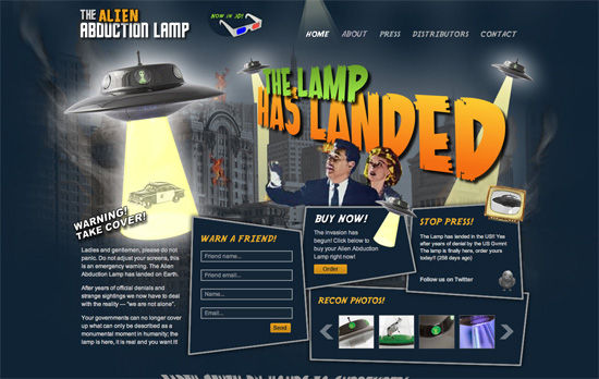
The texture/quality of the text isn’t quite the same as the photo but I like the skewed edges on the boxes and the lighting effects everywhere.

Lots of elements that drive the look home such as the sparkles, sunbursts, 3D box, and of course the cursive font. I really like the arrow/button although the alignment of the text is a little off.
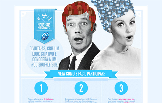
Love the idea of using patterns to replace the hair sections! There’s quite a bit of folding going on here, as well as stripes as backgrounds and shadows, and the blue that grounds everything makes the photos pop all the more.

Even the slideshow and dropdown menus carry the dirt and smudges you see all over the page. There’s also a significant number of typefaces being used here in a way that’s not chaotic at all.
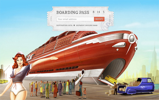
There’s not a lot going on here, but it’s a wonderful look. The background illustration is perfect while the signup form in the foreground has a good number of details to look like a real ticket. I think my only question is if it’s a good choice to keep that form up there instead of the usual center alignment you see on “coming soon” pages. Once you hit submit (Notify) the whole box flips over to signal confirmation.
Social Media Weekly
User Experience – Beyond Bandwidth: UI Performance
“UI performance tips have been disseminated throughout the community for years, but often as an aside, with bandwidth and latency concerns much more at the forefront.”
Design – A simpler and faster alternative to wireframes
“In my opinion there’s a better, faster, and easier way to accomplish that goal: prioritized lists.”
Typography – Public Service Announcement: Watch Your @font-face font-weight
“The problem is the font is muddier than you originally saw it, and it’s all about font-weight.”
