 Images are great for blog posts and chunks of text in general. Even if they’re just remotely relevant, they’ll add some space and make the content more accessible. You want to spice your texts up with images.
You can position images however you like, of course, but a nice feature is to have the floating to the left or right, with the text flowing around them.
Like the one on the right here, using the following code:
[html] [/html]
Nice huh?
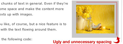
Well, it could be better. You see, using the align="right" floats the image to the right, but the vspace and hspace values are around the full image, which looks a little weird with the right side of the image not being in line with the content’s right side.
Like so:

What you should do is use CSS to float your images instead. Add these classes to your stylesheet:
[html].align-right { float:right; margin: 0 0 15px 15px; }
.align-left { float:left; margin: 0 15px 15px 0; }[/html]
The margin will make sure that there’s no space where it isn’t needed, in other words, you won’t get that nasty spacing problem like the one in the image above.
Use it like this:
[html] [/html]
While we’re at it, why not add this to the stylesheet as well:
[html].frame { padding: 5px; border: 1px solid #aaa; }[/html]
Now you can add the frame class to your images for a nice looking border around your images. So if we want to float an image to the right with a border, we’ll do it like this:
[html] [/html]
 Take a look to the right. There you have it, floating correctly and all, looking a lot better than the first one, right?
You know what the best part with this is? If you’re a WordPress users, this is version 2.5 compliant code. They’ve finally switched to using CSS for aligning images, about time I’d say.
There you have it, easy handling of images, looking a little better, and being a lot more flexible should you want to change spacings, border colors and such.
