This week’s crop of design inspiration all carry a traditional, handcrafted air about them with illustrations used in textbooks, journals, and storybooks.
Designs of the Week
Build on DIYThemes’ Thesis Framework for rock solid SEO and great layout customization options.

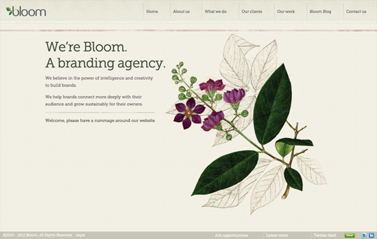
Most designs prefer the rough, monochrome illustrations to really push that vintage look, but it’s also nice to see bold color in such graphics, and in this case the images straddle both the highly detailed and the outline-only. Each section on the site has a corresponding plant, which are featured as icons in the drop-down menu. The way the plant is placed in the logo is so lovely and elegant, too. One more neat thing about this website: at the very bottom of the page there’s a selection of biscuits you can choose from should you wish to pay their studio a visit!

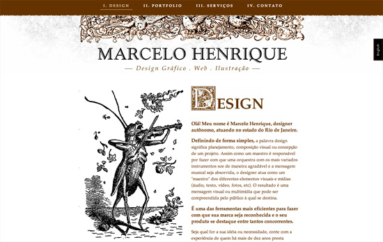
Two-column layouts that are split right in the middle are gaining popularity and we continue to see why it works. Nice touch with the traditional initials too.

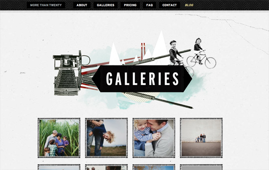
Love the fabric patterns applied everywhere, including the header logo and the form fields.

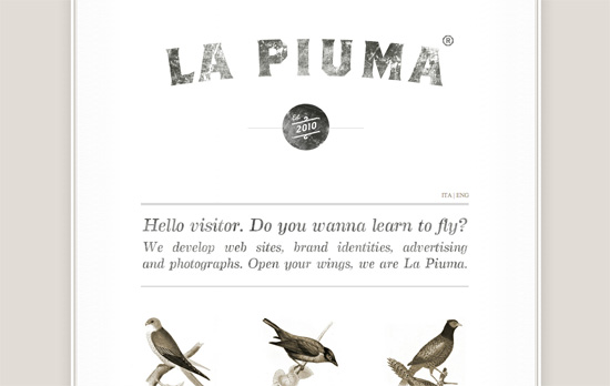
Each section fades out as you scroll down, which is an interesting technique to keep focus (I believe the opposite fade in effect is also in vogue right now). It’s also nice that the icons and text have texture. I’m just a little concerned using the illustrations in the works section (the birds) that way is less effective since they sacrifice content for aesthetics.
Social Media Weekly
Need help in promoting your site? INeedHits has been in the search engine marketing since 1996!
Responsive Web Design – Which responsive images solution should you use?
“To choose which technique is right for you and your project these questions may help as a guide. Many of the questions may apply to your project, so you’ll have to sort out which techniques fit what scenarios and find the overlap.”
Typography – Type Study: Pairing typefaces
“Let me rip off the bandaid quickly: there are no clear formulas for pairing typefaces. There are no absolute rights and wrongs. But, this is good news. Without formulas, you can create beautiful surprises so your websites won’t look exactly like the one you have open in your browser three tabs over.”
CSS, JavaScript – How I’m implementing Responsive Web Design
“I don’t pretend to have all the answers. But, clever use of the tools available to us can make it a much easier pill to swallow.”
