How many times have you found yourself subscribing to the next big web 2.0 applications’ launch mailing list, and then never getting a single email? Or joining a weekly newsletter that is completely disorganized and has more information than a month worth of site content? Just like websites, newsletters can be essential and extremely useful when used the right way, or damaging if their purpose goes to waste. Which direction are you going to head in with yours?
A Newsletter
news‧let‧ter – a written report, usually issued periodically, prepared by or for a group or institution, as a business firm, charitable organization, or government agency, to present information to employees, contributors, stockholders, or the like, and often to the press and public.
First, it’s important to understand what exactly a newsletter is. A dictionary.com search reveals that the meaning behind a newsletter is a written report published for the publics convenience.
And yes, breaking the word down into two parts would reveal two individual words: news and letter.
While all this seems like a pointless English lesson, it seems like many people have forgotten that a newsletter is intended to contain news. Because of this, other names get thrown around such as “mailing list”. No matter what you happen to be calling the damn thing, the bulk of the content is and should be in some way – news. Whether it’s straight from site content, announcements and updates, or information on a launch, it’s all still news to the reader. Let’s try not to forget that.
Design
Getting a visitor to pay attention to a newsletter requires a bit of design and organizational skills next to the ability to include something worthy of reading. The days of plain text email are dying away, with most email providers allowing html based emails. HTML allows you to do everything you could do with a regular site, including structuring an emails fonts, colors, and layout with css and remotely hosted images.
Don’t sit there saying “what makes a good newsletter design?”, because the question can be both answered and solved simply by looking around. Emails just appear in a persons inbox – they are no different than sites.
A good place to start is by mimicking your own site design in a newsletter design. This doesn’t mean if your site is split across 9 columns and two thousand pixels wide that your newsletter should be the same, but pull the colors, logos, link styling, and fonts from your actual site layout to let the reader get a feeling like they’re at the site themselves without leaving their inbox.

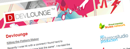
When Devlounge first launched, we had our own newsletter which was styled to match the design at the time. Split into two columns, the left featured a few of the latest post excerpts and the right contained a feedburner subscribe now link as well as links to Astereo and 9rules. It wasn’t incredibly advanced, but it matched the site well enough that I thought its purpose was served.
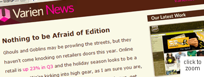
The list of where to get quality newsletter inspiration from goes on and on. I like to grab some inspiration from the Campaign Monitor Blog, which always features some excellent examples of in use newsletter designs. Take a look at this gem I found on the blog while I was writing this. Very well organized, and very well designed.

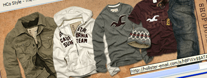
Depending on the type of newsletter, designs can range from simple to highly advanced. Hollister usually sends around extremely simple newsletter showcasing a new product or two for men and women. Nothing over the top, but effective at the same time.

Next we’ll get into creating and publishing your newsletter and getting subscribers and keeping them.
