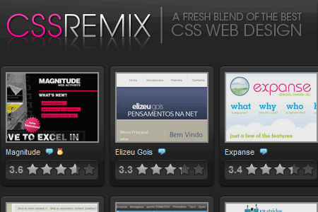
I’m thinking about opening my own css gallery in the coming weeks – this one will be brand new, with some features you won’t see anywhere else: thumbnails, voting, and commenting – oh my! I even plan on showcasing the same sites that every other css gallery is showing, maybe even at the same time!
A word to the wise, css galleries are over.
The (Lack of) Need for Galleries
Each day, new CSS Galleries pop up all over the net. They get submitted to digg, score a fair to high amount of diggs, and instantly have more feedreaders than Devlounge. How is this possible? CSS Galleries appeal to many because it’s free site promotion. To the webmaster, it’s an opportunity to get thousands upon thousands of site owners to submit their sites, and stack up traffic in a very short period of time, without much effort.
But with such a surge in the creation of css galleries, is there a need for any more? Certainly, people think so, because they continue to pop up all over the place, with promises of being so much different than all the others.
Centralizing Submissions
The need for CSS Galleries also was derailed with the launch of none other than Css-galleries.com, a site using rss to showcase sites featured at 20 popular galleries. 20 galleries all on one site! Why subscribe to any other one again? (I can only imagine the feedreaders on CG, since I see individual css gallery sites with hundreds.) CG was a killer idea, and an absolute must alternative to visiting every single site to check if your site was showcased or not.

Standing Out in an Overcrowded Field
Still convinced that you can start a css gallery than will blow people away? It is extremely hard, but consider a few of these keys if you believe your gallery will lead you to greatness.
- Be original! When 20+ other galleries are all showcasing the same design within a few days of each other, that’s nothing but major overkill. Keep your visitors wanting to come back by featuring sites no one else has.
- Narrow down your selections to one topic. I came across a css gallery a few weeks back that showcased only horizontal scrolling sites. I thought that was a great idea, because it wouldn’t lead to the same old repetitive showcased designs found on every other site. Create your own random niche, and find sites that fit into it. Uniqueness matters people.
- More Features – Commenting and voting is boring, because every gallery offers it now, and still, not many people take advantage of it. Come up with something new, like daily head to head battles between the days showcased sites, where the highest voted site wins S.O.T.D or something like that.
- Update frequently … or, infrequently. Having fresh content is important, but at the same time, sometimes leaving a while before adding new submissions keeps people coming back. Look at Stylegala. Even with a new owner, the frequency of accepted submissions remains very low, but yet, I doubt the traffic has dropped much. Of course, SG has other features to get people returning, but it’s main purpose – being a design gallery – has really taken the backseat.
My Favorites
Some of my favorite galleries are Tom.ma, which is a “screenblog”, which serves its purpose. Simple, effective, and to the point. No extra goodness, just thumbnails and larger image screenshots.
Others include cssremix, and of course, cssgalleries to put them all together.

