Web design has become an extremely lucrative and competitive industry with thousands of new developers springing up across the globe. We are now in a new industrial era where businesses are not confined to local service providers but now have access to a global marketplace through sites like oDesk and Freelancer.com. The playing field is open and anyone who plays their cards right can land a web design contract.
Unfortunately, quality doesn’t necessarily come with quality and with the flood of designers on the scene we also see many mistakes being made in web design. Whether it’s from lack of experience, detail or vision. Therefore, despite the abundance of designers, your success will depend on how you view competition, your adherence to standards and trends and what you’re willing to do to stand out.
Before you get into the do’s and don’ts, check out this hilarious video Google made to show what poor web design is really like for users. You’ll get a laugh and a clearer perspective of what many users endure because of lack of vision on the developers’ part.
Here are some vital do’s and don’ts that many web designers and firms continue to get wrong. Mastering and executing these will help you to build a unique portfolio to attract new clients.
Don’ts
These should never be found in modern web design:
Animated GIF Text
Talk about a blast from the past! Flashing GIF animated text will destroy your website’s image in a flash and scare away viewers. Not to mention how distracting these elements can be from your real content. Remember, you’re not running a casino.
Traffic Counters
Page counters add zero value to your users. Nobody cares how many visitors your site is attracting. Just provide the content the expected readers desire. Not to mention that this is an added element that will only contribute to slowing down your site.
Forced & Hidden Downloads
Talk about appearing spammy and suspicious; forced downloads raise a multitude of alarms in this age of high tech malware. This is usually implemented as an advertising scheme from ad networks with the aim of making money for webmasters as they achieve ad clicks and downloads. Don’t be so greedy for ad earnings ignoring the real value of the website.
Background Music
Personally, if I’m hit unexpectedly with background music on a website, I’m gone! I don’t care whether you’re a video or music based site, give me the option to hit play and do not force it on me. That’s the typical feeling of the majority of the web. Don’t do it, it’s much too intrusive.
Pop-ups

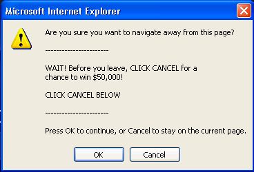
Although pop-ups are evolving beautifully, use these sparingly. Eliminate the use of the standard Javascript browser pop-ups with more attractive and user-friendly options such as a product like Optin Monster.
No Keyword Stuffing
Keyword stuffing will get your site killed by Google. I still see webmasters creating content to woo search engines. This no longer works in SEO and will not only drop you lower in search engine rankings and turn off your site visitors since the content is not properly geared towards them and is a pain to read and digest.
Multitude of Ads
I understand that you’re trying to secure revenue for yourself or client but you need to develop a better strategy for monetizing your websites that leverages your content and service offering. A site overpopulated with ads is usually a huge turnoff for visitors. If they have to comb through ads to get to your quality content then kiss them goodbye since nobody’s attention span is that large nowadays.
Copied Site Design & Templates
There’s nothing wrong with using website templates like the great ones you’ll find at 1&1 web templates as well as frameworks in your web design. Importantly, your finished design should be customized and express originality. You may be inspired by another developer’s work but never copy “word for word” what he or she has established. Be inspired and go a step further with your own signature.
Do’s
Let’s get into a few simple practices and elements that will make website design stand out.
Keep It Simple
More content is not always better. Get to the point quickly. If you have a lot of content working with, devise a hierarchical page and menu structure that leads users to additional content in a logical flow. Minimalism can be very beautiful when executed right.

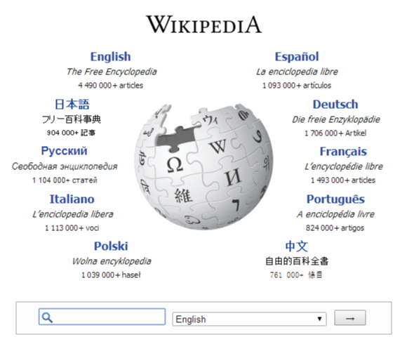
For example, Wikipedia.org has more content than you or any team of local developers could manage in lifetime and yet their front page consists of a simple search bar. They’ve built an image that invokes users to search without being overwhelmed. Google is another example of this.
Be Consistent with your Design
There’s no overarching rule where consistency is concerned since you can get quite creative with how you design the various pages of your website. The main approach is to ensure that each page’s theme relates seamlessly to the overall goals and message of your website. Therefore, choice of colors, fonts, content, images and style should connect to the next.
Viewable Resolutions & Responsive Design
If your website is not responsive and viewable on mobile devices then you’ve got the entire thing wrong. Many websites are reporting that more than 60% of their traffic is from mobile devices. It is imperative that your website is viewable on both mobile and desktop and is presentable in the broad spectrum of screen resolutions on the market.

Use Safe & Relevant Colors
Color is powerful and has various psychological effects on your users. Ensure that your choice of colors align with the goals and messages you’re trying to deliver with your site. Read Neil Patel’s article on How Color Affects Conversion Rates.
Stick to the Site’s Purpose & Theme
The website should convey a clear message to the user about the business or the product and the best way to do is to focus on the core objectives. Design the layout and choose colors and fonts that are in tune with the business. For example, if you are designing a lawyer’s website, you may consider using a more minimal design approach, highlighting the firm’s attorneys and content. Keep it professional and do your best to convey trust and integrity. On the other hand, you will have more freedom of design with a heavy metal band’s website, for example. Users should feel the quality of the business within the first 3 – 5 seconds.
Conclusion
Think logically as you design and develop your website. Think about your own experiences on the web, identify what even annoys you and get into the mind of the average web user. Great web design is essentially good customer service. You’re giving users what they want through seamless experiences and valuable content. Let this be your design motivation.
