We’re not talking about eco-friendly sites but designs that have taken a liking to this lush hue, now more than ever.
Designs of the Week
Pagelines lets you build WordPress websites and it’s as easy as drag and drop, go check it out!
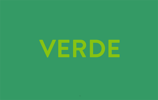
For the minimalists, this is the equivalent of a big photograph, illustration, or video as the homepage header. It color-changes to different shades of green, sometimes coming off too strong for my taste, but one quick swipe downwards and the green disappears into a free-form arrangement of portfolio screens.
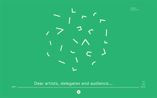
I like how the logo is broken down into parts and scattered into a circle in the header, then drops down to form it when you scroll down. It also plays with layering a bit by hiding behind the photos in the following screen, and repeats the pattern in the tickets and a couple of other backgrounds. White on blue is a little easier to read than white on green, but these days, the latter is very popular.
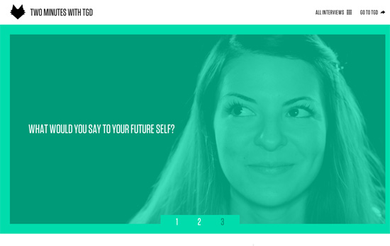
That tall and narrow type definitely reminds me of those movie poster credits, which fits with the video theme of the site. Elsewhere it becomes predominantly black and white, while the lighter shade of green becomes the accent color.
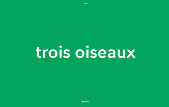
Notice exactly two links in the area, info and projects, sliding in their respective directions. Like the first site featured above it does an uncover as you move on to the portfolio.
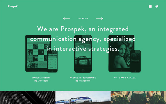
Another site that plays with layering: the devices in the first screen are not stuck to the background but go to the foreground and gain full color on hover. The opposite happens to the images below and get a green-and-black treatment. Their 3-column, full-width layout carries over to the rest of the pages, including their blog.
Social Media Weekly
Build on DIYThemes’ Thesis Framework for rock solid SEO and great layout customization options.
Typography – Whats the Closest Google Font?
“We have all received design from a client with non-web safe fonts. The client does not want to pay the licensing, and you don’t want to break the law. So you are stuck trying to find a needle in the haystack that is the Google Web Fonts. Stop searching.”
User Experience – What We Mean When We Say “responsive”
“I can tell you how to do Responsive Web Design. How we make things “responsive” is up to us. All of us.”
