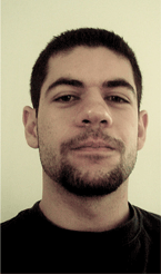
Devlounge: Welcome Fernando! It’s a pleasure to be chatting with you today; I’ve been a fan for a long time. For our casual reader, mind introducing yourself?
Fernando Lins: Sure, my name is Fernando Lins, I’m 20 years old and I live in São Paulo, Brazil. Currently I study Graphic Design at the Belas Artes university during night time, and work as a freelance illustrator, graphic and interface designer during the day. My website is fernandolins.com .
DL: Now on to the obvious and most repetitive question I’ve ever had to ask: How did you get started in design? (And how long have you been doing it for, etc)
FL: I’ve always been a great fan of technology, grew up watching Transformers and Macross reruns, playing video-games, listening to dance(!) music. And since I’m the youngest of 3, with 10 and 12 years of difference between my siblings and I, I had to find ways to have fun alone. So besides my MTNT toys and Lego, I used to draw all day long. I would watch Disney movies, pause them, and draw the characters on paper, then color them and make an exhibition in my room, or make collages with them on backgrounds I’d paint myself with gouache.
My illustrations are mostly a way to express myself without rules, so I like it very much, and I’m trying to incorporate that into my “real” designs more
When my sister went to college to study Industrial Design, and had to work on websites (that back in 1995) to make a living, that got me interested. I liked to watch her “create” images on Photoshop and make them interactive. I had no idea what Photoshop was, but from watching her I learned the basics, just enough to open an image and paint over it, play with brushes and so on. I also decided to learn how to make a website a few years later (1997) and learned HTML and Javascript.
The Internet evolved, and from looking for cool sites I got in touch with the work of amazing graphic designers like Mike Cina and Mike Young from WeWorkForThem, DesignGraphik and TrueIsTrue, Jemma Gura from Prate, Joshua Davis of Praystation, and studios like Me Company, The Designers Republic, Attik, Tomato, etc. That combined with my interest in electronic music grew on me the need to use that new, incredible language to express myself.
My first professional piece of work was for a canadian DJ, whom I e-mailed asking if I could re-design his site, and he was really happy about the offer. A few years later we worked together on a huge project called Progressive Vibe, but it was cancelled due to financial problems. That was in 2001 so I can say I do some sort of design work for almost 7 years now.

DL: Illustration is one of your strong points, but you’ve also done some great looking logo and icon work. If you had to pick a specific type of work as a favorite, what would it be?
FL: That’s quite hard for me to choose, I think each of them has a different pleasure, if I can put it that way, attached to it. My illustrations are mostly a way to express myself without rules, so I like it very much, and I’m trying to incorporate that into my “real” designs more. Branding is my favorite part of graphic design, I love to create an identity for a company or a person, think of an strategy and then smell that amazing scent of paper when you print business cards and brochures. On the interface side, I like working with icons because they are all about metaphors, and they’re universal. Making a symbol that people from around the globe must understand is tough. I guess that if one day I have my own studio with lots of employees, I’ll keep the branding services for myself, it’s probably the one I like the most.
DL: For the latest Devlounge design, you played a major role in the constructing of the layout of the site by creating fresh, original illustrations to replace our outdated collection we had used for the past 3 versions. If you could give a brief overview of your three main pieces you’ve contributed so far (at the time of writing this interview) and the inspiration behind them…
FL: Starting by the red one, which I recently named “Dragon Battle”, I wanted something that incorporated the red inside the Devlounge logo. It is not the same color, but that’s from where I began. You probably won’t be able to see it, but there is an outline of an open hand in the middle of the piece, and that was the first object. I then made a liquid, gradient outline for it and that naturally evolved into a full piece. I can’t quite explain how it happens, I just grab my stylus and start to create these lava, swirly, liquid shapes. I dunno, I guess I like molten things.

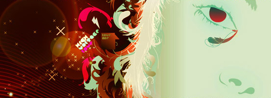
“High Voltage Love” was inspired by an issue of the Vogue magazine saying something about the 80’s look being back for the Brazilian summer (*audible gasp*), so I thought it’d be fun to work with some kitsch elements, like the sad woman face, the rounded “pacman” font – which I designed myself – and the vibrant colors.
“On” is a great piece, and lots of people have been asking me about it. It’s just a bunch of brushes under a levels adjustments layer, there, I said it. It was inspired by a picture I saw on Flickr of the power button of an iBook. I then got a very similar picture on a stock pictures site and started working on top of it. I think it’s the one that most says “motion”, and I really like the mix of blue and green on black.

DL: Since we’re on the topic of illustration work, do you use any special techniques and/or tools, such as a tablet, or is it mainly the mouse doing all the work?
FL: I have many, many illustrations done solely with the mouse. Actually all my work prior to 2006 is all “mouse-made”. I bought my tablet on the beginning of 2006 and it’s all I use today. The liquid aspect of my illustrations exists because I do it with the tablet, as well as the light beams on illustrations like “On”, mentioned above. For some of the illustrations I’ll draw elements on paper with ink and scan them, making a virtual pastiche in Photoshop.
DL: What do you like to do in your free time when you’re away from the desk?
FL: “Free time” is something I haven’t had for a while now, but when I get a chance to escape I like to walk around the city with my camera, and sometimes without it. I’m a big walker, so I’ll take the day to visit places, eat in new restaurants, listen to good music live, and take as many pictures as I can. It’s a great exercise, not only for the body but for the mind, as a designer you can’t know enough things, so I’m always looking for new things. During the week, which is when I’m busier, it all comes down to being near my loved one and reading some books.
DL: Out of all your clients and all your various types of work, what project do you think you’ve had the most fun working on?
FL: I’ve had a lot of fun working on all of my projects, but what you see in my portfolio is just the start. I’ve been working on some really great projects lately that mix all of my abilities, so I guess they are the most fun so far, but unfortunately I can’t name them. They’ll be on my *cough*new*cough* site soon. Working on the Devlounge illustrations set was really exciting, it’s not often that I get to do illustration work with such freedom, and it really helped me instigate my artistic vein.
