Ah, the New Year is here. The first day of a new year always brings in countless promises you make to yourself, in hopes that you can be better person over the course of the upcoming year.
From “I want to quit smoking” to “I want to lose 20 pounds”, New Year’s resolutions fly around like mosquitoes in the middle of a summer evening. But what about the web? How can you improve your work ethic, designing habits, and increase business in the upcoming year?
How would I suggest you get started? By forgetting just about everything you heard, saw, and learned in 2006.
What 2006 Was
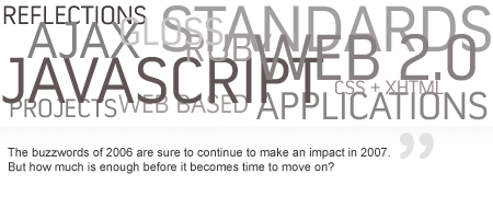
You’re probably saying, “are you serious buddy, or are you hungover from New Years Eve activities?”. Of course I’m serious, because 2006 was a year full of overly used trends and designing techniques; a year where we saw innovation at its best, but a lack of innovating those innovations.

Trends – First 2006 was a year full of trends. Designers around the web followed in the footsteps of the person in front of them simply because it worked. The design world isn’t Hollywood people, and there’s no need to do something one way simply because that’s what everyone else is doing.
For example, you probably saw a lot of web applications launch in 2006 that used the same “37Signals” inspired design layout – a banner / logo about the project and brief description, followed by a few boxes on the left and right sides of the page with screenshots and feature descriptions about the project. The originality was unfortunately very lacking.
A new year gives you a blank canvas to experiment on. Experimental layouts can sometimes work out extremely well and pay off in the long run. Forget about “what’s worked” recently and start your own layout trends that others will be grabbing hold to come December of 2007.
Gloss, Gloss, and more Gloss – 2006 was also a year about gloss. Who knew that adding a gradient to give a “shiny” effect to just about anything would make such a strong impact in the web world? When someone went so far as to create a web 2.0 logo generator that was simply text with a reflection and gloss, and worse, people actually used it for their logos, you knew there was a problem.
And it’s not like this “glass-like” technique was just created over the past year, because it has really been around for ages, but it just took until recently before it could “explode” onto the design scene. So I’ll tell you my friends, you don’t need it, and using it, especially all over the place, doesn’t make you any better of a designer just because you see it everywhere.
Web 2.0 Nonsense – Yes, our favorite word or phrase (whatever you’d like to call it) that was thrown around like crazy in 2006 was Web 2.0. Whatever you think about the word, it’s time you rip it up, burn it, or even spit on it, because there is no meanings behind the phrase.
With everyone you ask – and sometimes even every time you ask the same person – you get different responses. I’ve given up trying to define a phrase with such wide-openness as “web 2.0”. If you payed attention in 2006, there were countless requests on forums for a “web 2.0” style design for all different types of sites, and I’d just sit their asking myself “what the [explicit] do these people expect?”. I never would have thought that having “web 2.0” skills would be a requirement for so many freelancing jobs.
Stop labeling and just get busy designing. Putting a term like that on design really limits a persons imagination, because new talent coming into the industry thinks that’s the only way to work if they plan to be successful, which of course is not true at all. Use the new year to let your imagination flow, and don’t worry to much if it might not be considered “the norm” these days.
Beta doesn’t spell better – Finally, I noticed so many places tagging themselves in a “beta” stage that it started to make me sick. The term, which in terms of computers and the internet means “preliminary or testing stage of a software or hardware product; “a beta version”; “beta software”” was stuck on sites just for the hell of it to make them seem “cool”. Can’t you think of any other word to describe a new site or application? “New” is always a good choice, and even “public preview”. To use a word meant to describe software and hardware on newly launched sites was just ridiculous, especially because it was so damn overused.
What you should carry over in ’07
The only advancement worth carrying over in 2007 is the use of standards. Proudly, we saw a tremendous rise in standards based design with less table usage and more concern about cross-browser compatibility and accessibility. This is the direction we need to continue to head in and follow in 2007, regardless of all the other things that occurred in 2006.
Use the new year as a chance to start fresh, and to expose your own creativity without worry about “is this what everyone likes right now?”. Get out there and kick 2006 in the ass and break away from the form that became the standard in 2006. Happy 2007 everyone. Let is be a healthy year and one for your own expression to overrule over the general ideas of the public.

